"Static positioning" pertains to the standard page layout flow that we've been using thus far. The CSS Box Model, floats, and flexbox layout systems all function within this "static" flow. However, CSS offers alternative positioning schemes beyond this.
The other three positioning types are "relative," "absolute," and "fixed." With each of these, you have the ability to manually position elements using precise coordinates, as opposed to the more semantic approaches in flexbox and floats. Instead of instructing, "Place this box in the center of its container," advanced positioning empowers you to state things like, "Position that box 20 pixels above and 50 pixels to the right of its parent's origin."
The static flow of the page should be the primary layout method for the majority of elements on a web page. These alternative positioning schemes become relevant when you need to perform more advanced tasks, such as fine-tuning the position of a specific element or animating a UI component without disrupting the arrangement of surrounding elements.
This chapter is divided into two sections. First, we'll delve into the nuances of relative, absolute, and fixed positioning on their own. Afterward, we'll consolidate our knowledge by applying it to the creation of an elaborate dropdown menu.
Setup
Begin by establishing a new project directory named "advanced-positioning" and creating a new file within it named "schemes.html" with the subsequent HTML code:
<!DOCTYPE html>
<html>
  <head>
    <meta charset='UTF-8'/>
    <title>Positioning Is Easy!</title>
    <link href='styles.css' rel='stylesheet'/>
  </head>
  <body>

    <div class='container'>
      <div class='example relative'>
        <div class='item'><img src='images/static.svg' /></div>
        <div class='item item-relative'><img src='images/relative.svg' /></div>
        <div class='item'><img src='images/static.svg' /></div>
      </div>
    </div>

    <div class='container'>
      <div class='example absolute'>
        <div class='item'><img src='images/static.svg' /></div>
        <div class='item item-absolute'><img src='images/absolute.svg' /></div>
        <div class='item'><img src='images/static.svg' /></div>
      </div>
    </div>

    <div class='container'>
      <div class='example fixed'>
        <div class='item'><img src='images/static.svg' /></div>
        <div class='item item-fixed'><img src='images/fixed.svg' /></div>
        <div class='item'><img src='images/static.svg' /></div>
      </div>
    </div>

  </body>
</html>
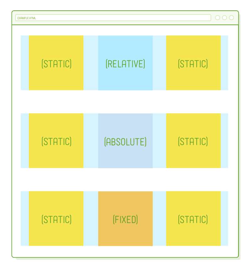
We have three examples to explore, all sharing the identical HTML structure. Altering the positioning behavior within each one will yield significantly distinct outcomes.
This page depends on certain images to enhance the clarity of our example. When unzipping the files into your project, ensure that you retain the parent "images" folder, as indicated above. Also, make certain to create a "styles.css" file and include the essential base styles in it.
* {
  margin: 0;
  padding: 0;
  box-sizing: border-box;
}

body {
  height: 1200px;
}

.container {
  display: flex;
  justify-content: center;
}

.example {
  display: flex;
  justify-content: space-around;

  width: 800px;
  margin: 50px 0;
  background-color: #D6E9FE;
}

.item img {
  display: block;
}
Nothing groundbreaking here, just employing some well-known flexbox techniques to establish a grid of items. The sole unusual aspect is the specified height on the <body> element, which will enable us to scroll the page up and down to showcase different positioning behaviors.
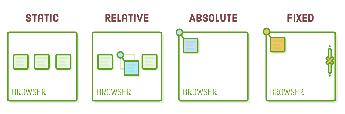
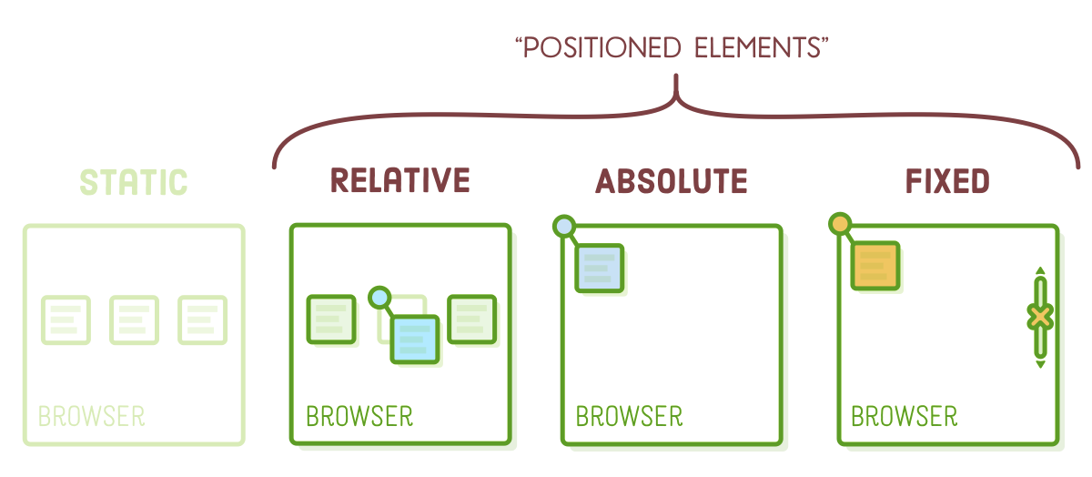
Positioned Elements
The CSS "position" property provides the means to modify the positioning scheme of a specific element. Its default value, as one might expect, is "static." When the position property of an element is set to any value other than "static," that element is referred to as a "positioned element." Positioned elements are the focus of this entire chapter.
Combining various positioning schemes is a viable approach. Once more, the majority of your web page should employ static positioning, but it's customary to encounter relatively and absolutely positioned elements nested within other elements that conform to the standard page flow.
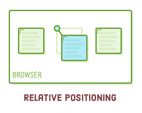
Relative Positioning
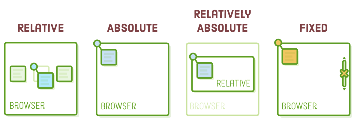
"Relative positioning" relocates elements in relation to their standard placement within the static page layout flow. This is advantageous for making slight adjustments to the positioning of boxes when the default layout is slightly askew.
Let's transform the `.item-relative` element in the "schemes.html" file into a relatively positioned element. Insert the following rule into "styles.css":
.item-relative {
  position: relative;
  top: 30px;
  left: 30px;
}
The addition of the "position: relative;" declaration turns it into a positioned element, and by utilizing the "top" and "left" properties, you can determine its offset from its default position. This is akin to specifying (x, y) coordinates for the element.
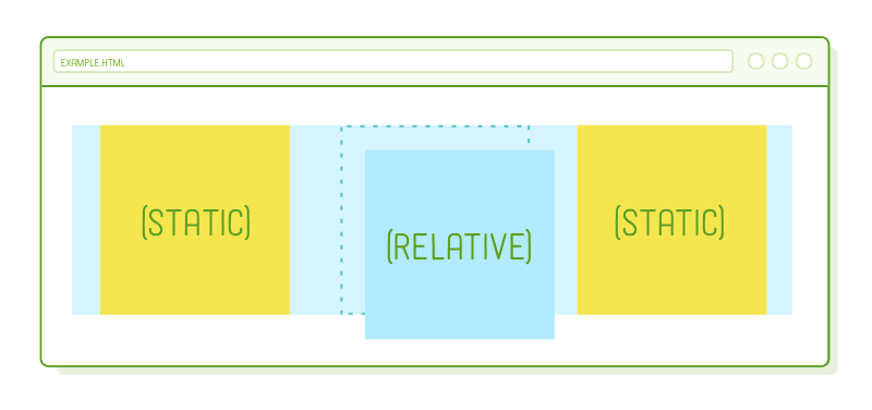
Relative positioning operates in a manner similar to margins, with a significant distinction: neither the adjacent elements nor the parent element are influenced by the "top" and "left" values. All other elements are rendered as if `.item-relative` remained in its initial position. Visualize these offsets as being applied after the browser has completed the page layout.
The "top" property measures from the original box's top edge, while the "left" property measures from the original box's left edge. We can apply offsets relative to the other edges using the "bottom" and "right" properties.
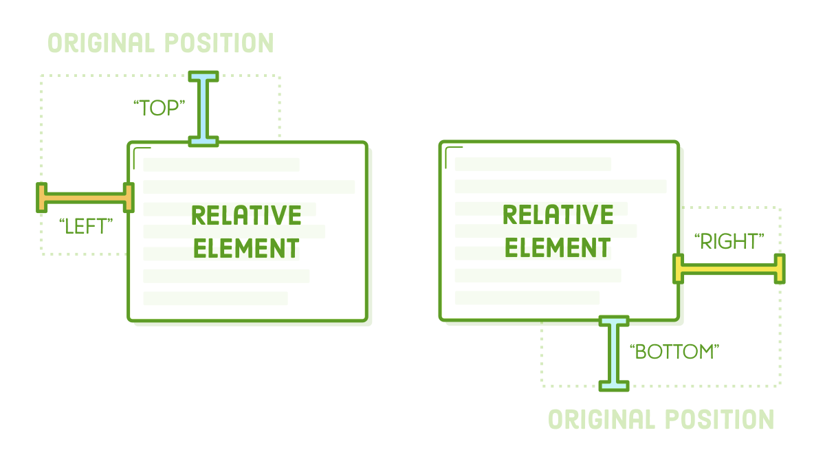
For instance, the following code will shift the box in the opposite direction:
.item-relative {
  position: relative;
  bottom: 30px;
  right: 30px;
}
It's worth noting that these properties accept negative values, allowing for two ways to define the same offset. In place of the "bottom: 30px;" declaration above, we could have just as easily used "top: -30px;".
Absolute Positioning
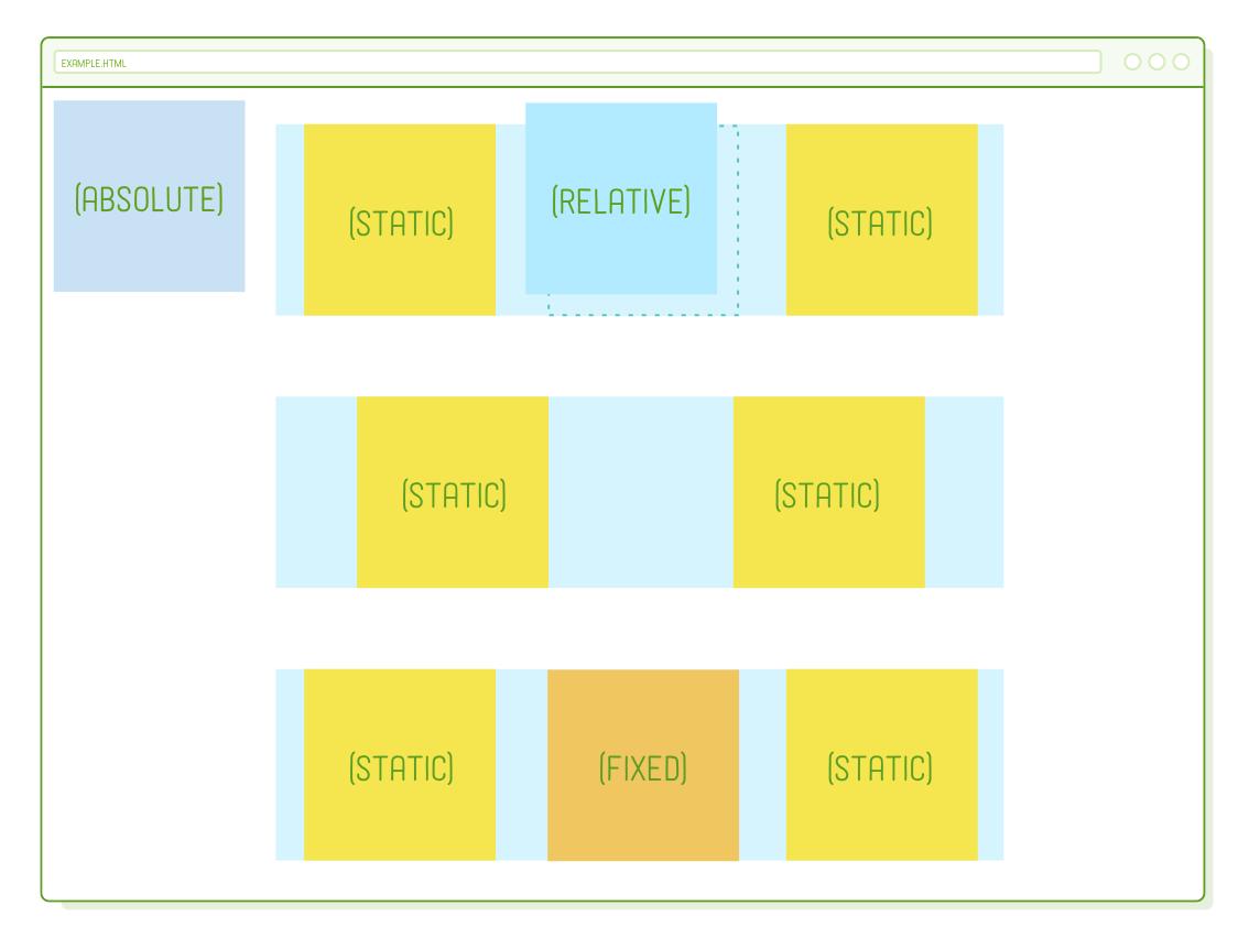
"Absolute positioning" functions similarly to relative positioning, but the offset is determined in relation to the entire browser window rather than the element's original position. As there is no longer any connection to the static flow of the page, this can be regarded as the most manual approach to positioning an element.

Let's illustrate this by incorporating the following rule into our stylesheet:
.item-absolute {
  position: absolute;
  top: 10px;
  left: 10px;
}
Our HTML structure remains unchanged from the previous example, but this will position the purple image at the top-left corner of the browser window. You can experiment with setting a "bottom" or "right" value to gain a better understanding of the positioning.
Another intriguing aspect of absolute positioning is that it entirely removes an element from the regular flow of the page. To observe this more clearly, let's momentarily alter the "justify-content" property in our ".example" rule to left-align the elements:
.example {
  display: flex;
  justify-content: flex-start;  /* Update this */
  /* ... */
}
In our relative positioning example (the first row), there is still a space where the positioned element used to be. However, with absolute positioning, that space disappears completely. It's as if .item-absolute doesn't exist for its parent and the elements around it. Please remember to change the "justify-content" back to "space-around" before proceeding.
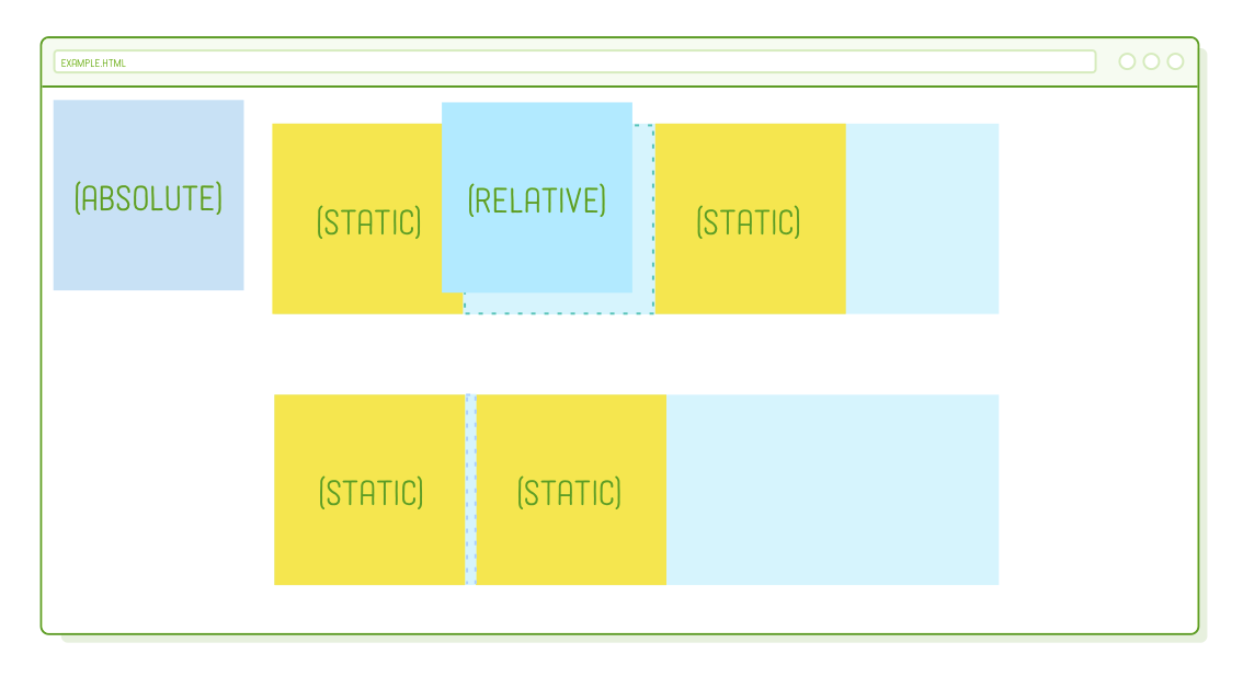
This behavior isn't particularly practical in most cases because it would require everything on your page to be absolutely positioned. Otherwise, you'd end up with unpredictable overlaps between static elements and absolute elements. So, why does the absolute positioning exist?
[Relatively] Absolute Positioning
Absolute positioning becomes significantly more useful when it's relative to another element that's part of the static flow of the page. Luckily, there's a way to alter the coordinate system for an absolutely positioned element.

Coordinates for absolutely positioned elements are determined relative to the nearest container that is itself a positioned element. Only when none of its ancestors are positioned does it revert to being relative to the browser window. Thus, if we make the parent element of .item-absolute relatively positioned, it should now be positioned in the top-left corner of that container rather than the browser window.
.absolute {
  position: relative;
}
The .absolute div follows the regular flow of the page, allowing us to manually reposition our .item-absolute element as needed. This flexibility is beneficial because if we decide to modify the standard flow of the container, such as for a mobile layout, any elements positioned absolutely will adjust accordingly.
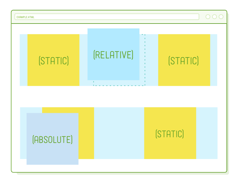
You might have noticed that we didn't specify any offset coordinates for .absolute. Instead, we're employing relative positioning solely to reintegrate our absolute element into the regular flow of the page. This is how we effectively combine absolute positioning with static positioning without causing conflicts.
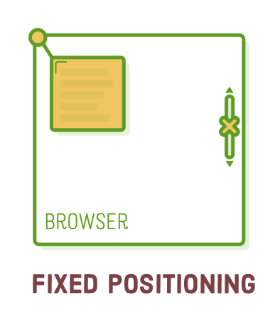
Fixed Positioning
"Fixed positioning" shares many similarities with absolute positioning: it involves manual control, removes the element from the normal flow of the page, and uses a coordinate system relative to the entire browser window. The crucial distinction is that fixed elements remain stationary and do not scroll with the rest of the page.
Feel free to modify our third example to utilize fixed positioning:
.item-fixed {
  position: fixed;
  bottom: 0;
  right: 0;
}
This change will position the red image in the bottom-right corner of the screen. When you scroll the page, you'll notice that it remains fixed in place while the absolutely positioned purple image moves along with the rest of the elements on the page.
This allows you to design navigation bars that remain fixed on the screen and those persistent pop-up banners that don't disappear.
Positioned Elements for Animation
While this tutorial primarily focuses on HTML and CSS, not JavaScript, animation is a significant application for relative and absolute positioning. Let's get a glimpse into the future by adding animation to one of our elements.
These advanced positioning techniques enable JavaScript to manipulate elements without affecting surrounding elements. For example, you can copy and paste the following code into schemes.html after the third .container element. Make sure to place the <script> element as the last item within the <body>.
<script>
  var left = 0;

  function frame() {
      var element = document.querySelector('.item-relative');
      left += 2;
      element.style.left = left + 'px';
      if (left >= 300) {
          clearInterval(id)
      }
  }

  var id = setInterval(frame, 10)
</script>
The JavaScript code provided creates a basic animation that continuously updates the left property of the .item-relative element. Upon reloading the page, you will observe the blue image moving towards the right edge of its container.
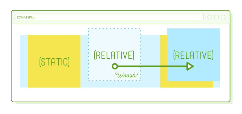
This is a basic example, but it illustrates how this technique can be used for more complex UI animations. If you were to attempt the same effect by adjusting the margin or padding properties, you would unintentionally affect both the statically positioned boxes and the containing .example element.
Positioned Elements for Menus
Now that we've covered all these techniques, let's put them to use in an advanced project! The remaining part of this chapter will apply these skills to create an intricate navigation menu with an interactive dropdown for one of its links. We'll construct this page from the ground up.
With fixed positioning, we can ensure the menu stays at the top of the page, and by using relative positioning, we'll establish an anchor point for the absolutely positioned dropdown. Additionally, we'll delve into navigation menu best practices and observe practical uses of the pseudo-classes we discussed in CSS Selectors.
To begin, let's create a new web page named menu.html, which includes a header and a straightforward top-level menu:
<!DOCTYPE html>
<html lang='en'>
<head>
<meta charset='UTF-8'/>
<title>Awesome!</title>
<link href='menu.css' rel='stylesheet'/>
</head>
<body>
<div class='header'>
<div class='logo'><img src='images/awesome-logo.svg'/></div>
<ul class='menu'>
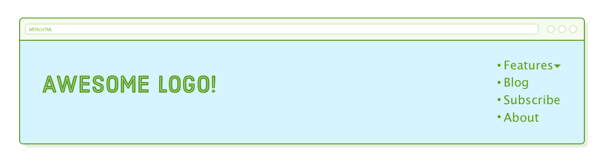
<li class='dropdown'><span>Features ▾</span></li>
<li><a href='#'>Blog</a></li>
<li><a href='#'>Subscribe</a></li>
<li><a href='#'>About</a></li>
</ul>
</div>
</body>
</html>
Navigation menus are typically structured as <ul> lists rather than a series of <div> elements. This semantic approach enhances the accessibility of your site's navigation, making it more search engine-friendly. Additionally, we're getting ready for our dropdown menu by assigning a class attribute to the first <li> element in the list. This <span> will help us distinguish the label from the submenu it unveils.
Next, let's create a new stylesheet named menu.css to give our .header a more distinct header-like appearance, among other style adjustments:
* {
  margin: 0;
  padding: 0;
  box-sizing: border-box;
}

body {
  height: 1200px;
  font-size: 18px;
  font-family: sans-serif;
  color: #5D6063;
}

a:link,
a:visited {
  color: #5D6063;
  text-decoration: none;
}
a:hover {
  text-decoration: underline;
}

.header {
  position: fixed;
  display: flex;
  justify-content: space-between;

  width: 100%;
  padding: 50px;
  background: #D6E9FE;
}
These styles should look familiar, but take note of the fixed positioning applied to the .header element. This ensures that our navigation menu remains on top of any content added to the page.
Inline Menu Items
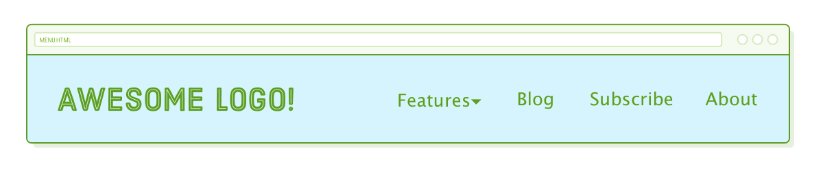
Even though we use unordered lists in the markup, navigation menus on websites often don't visually resemble lists. To address this, we can change the list items to behave as inline boxes rather than block boxes using the display property. Add the following code to menu.css:
.menu {
  margin-top: 15px;
}

.menu > li {
  display: inline;
  margin-right: 50px;
}

.menu > li:last-of-type {
  margin-right: 0;
}
In this case, we use child selectors instead of descendant selectors because we specifically want to select the <li> elements that are directly within the .menu. This distinction becomes crucial when we introduce our submenu, which has its own set of <li> elements that we don't want to style with this rule. Additionally, the snippet adds margins to all list items but removes them from the last <li> element using the :last-of-type pseudo-class. This is a common approach to create spacing between items.
SubMenus
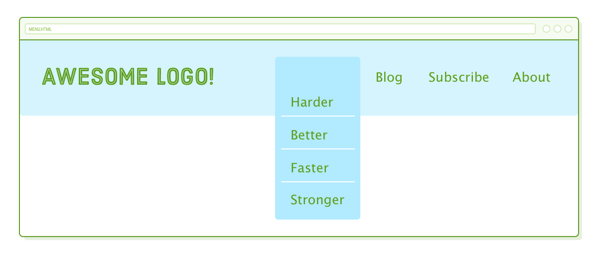
Our submenu will have a similar appearance to the top-level menu, but it will be nested inside a list item. Modify the .menu element as follows, ensuring that the entire .features-menu list is enclosed within the first <li> element of the .menu element.
<ul class='menu'>
  <li class='dropdown'><span>Features ▾</span>
    <ul class='features-menu'>           <!-- Start of submenu -->
      <li><a href='#'>Harder</a></li>
      <li><a href='#'>Better</a></li>
      <li><a href='#'>Faster</a></li>
      <li><a href='#'>Stronger</a></li>
    </ul>                                <!-- End of submenu -->
  </li>
  <li><a href='#'>Blog</a></li>          <!-- These are the same -->
  <li><a href='#'>Subscribe</a></li>
  <li><a href='#'>About</a></li>
</ul>
This structure is essential for search engines as it conveys important information. It enables search engines like Google to understand that these new items are related to the "Features" label and constitute a distinct section of our website. When dealing with intricate navigation menus, it's advisable to use this type of markup.
Regarding the CSS, we'll tackle the interactive dropdown aspect later. At this point, let's focus on getting our submenu's appearance just right. We'll add some basic styles to make sure we can visualize the box we intend to position:
.features-menu {
  display: flex;
  flex-direction: column;
  background: #B2D6FF;
  border-radius: 5px;
  padding-top: 60px;
}

.features-menu li {
  list-style: none;
  border-bottom: 1px solid #FFF;

  padding: 0 40px 10px 20px;
  margin: 10px;
}

.features-menu li:last-of-type {
  border-bottom: none;
}
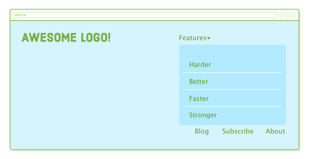
The submenu itself has the correct styling, but its placement is incorrect, causing significant disruption to the layout of our top-level menu items. This outcome is expected because it's currently using static positioning, which means it interacts with its parent and neighboring elements.
To achieve the layout we want, we'll put our recently acquired CSS positioning skills to use.
(Relatively) Absolute SubMenus
Let's attempt to make our other top-level menu items display as if the submenu wasn't present, essentially replicating the behavior of absolutely positioned elements. To do this, add the following lines to the .features-menu rule:
.features-menu {
  display: flex;
  flex-direction: column;
  background: #B2D6FF;
  border-radius: 5px;
  padding-top: 60px;

  position: absolute;      /* Add these */
  top: -25px;
  left: -30px;
}
Excellent! We've successfully removed the submenu from the normal page flow, restoring our top-level menu items to their original appearance. Now, our task is to position the submenu beneath the "Features" label. Fortunately, we've just acquired the skills to do just that!
The submenu is contained within the <li class='dropdown'> element. Converting this into a positioned element should alter the coordinate system used by our absolutely positioned `.features-menu`:
.dropdown {
  position: relative;
}
Alright, onto the next issue. Our submenu is correctly positioned, but it's currently overlapping the Features label.
Z-Index
Now we encounter a new challenge related to depth. In our previous work, HTML elements naturally stacked on top of or below one another based on their order in the HTML structure. However, for our advanced layout, we can't solely rely on the browser to decide the stacking order of elements.
The z-index property provides control over the depth of elements on a webpage. Visualize your screen as a 3D space, where negative z-index values move elements farther into the page, while positive values bring them closer or forward on the page.
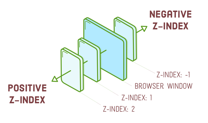
To clarify, the .features-menu element should have a lower z-index value than the Features label. By default, elements have a z-index of 0. So, let's assign higher values to both of them. We've conveniently enclosed the Features label within a <span>, enabling us to style it using a child selector like this:
.dropdown > span {
  z-index: 2;
  position: relative;  /* This is important! */
  cursor: pointer;
}

.features-menu {
  /* ... */
  z-index: 1;
}
The Features label should now be displayed above the submenu. It's important to mention that the position: relative; line is necessary because only positioned elements take into account their z-index property. This is a crucial detail to remember for future situations where you encounter depth-related problems and your CSS rules don't seem to be working as expected.
We included an example of the cursor property to make it appear as a link when the user hovers over the label. You can find more information about this property on w3schools.com.
Pseudo-Classes for Dropdown Menus
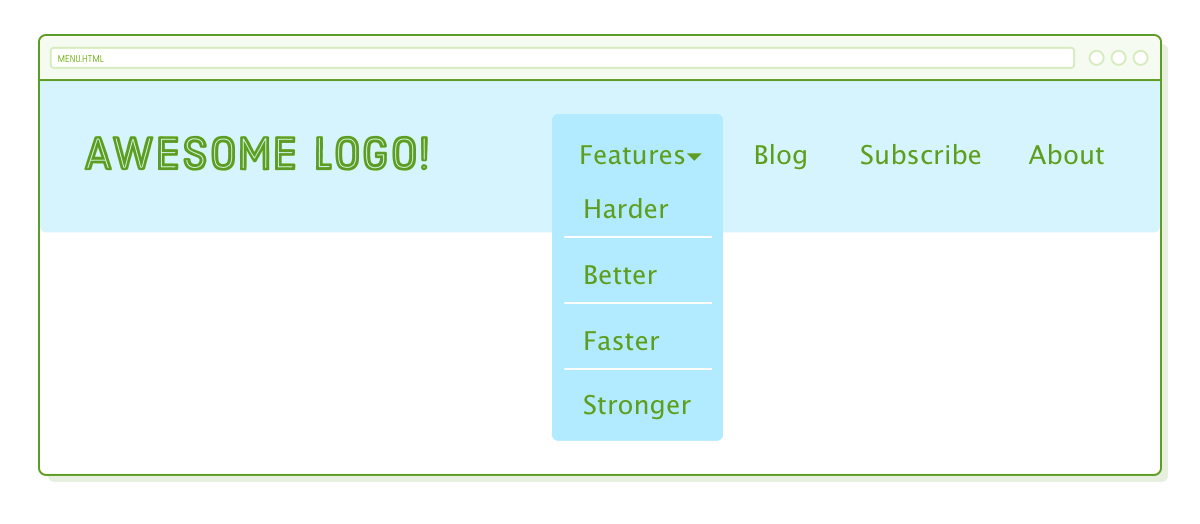
Great! The submenu is complete. Our last step is to hide it until the user hovers over it. Recall the :hover pseudo-class from the CSS Selectors chapter? We can utilize that to transform our submenu into an interactive dropdown.
To start, we should modify our existing .features-menu rule so that it only displays the submenu when the user hovers over it. This can be achieved by adding a :hover descendant selector. Update the .features-menu selector to match the following:
.dropdown:hover .features-menu {    /* This used to be `.features-menu` */
  display: flex;                    /* Leave everything else alone */
  flex-direction: column;
  background: #B2D6FF;
  /* ... */
}
Next, we should hide the submenu by default using the display property. To do this, add a new rule to menu.css:
.features-menu {                    /* Add this as a new rule */
  display: none;
}
By utilizing the combination of descendant selectors and pseudo-classes, we can conditionally hide or show an element. In this case, we initially hide the .features-menu using display: none, and when the user hovers over it, we override this with display: flex in the :hover rule, effectively instructing the browser to show the .features-menu again.
Summary
In this chapter, we explored four distinct CSS layout schemes:
- Relative positioning
- Absolute positioning
- Relatively Absolute (Static) positioning
- Fixed positioning
Relative positioning allowed us to fine-tune an element's position without impacting the neighboring boxes. Absolute positioning removed elements from the normal flow of the page, positioning them relative to the browser window. In contrast, relatively absolute positioning enabled us to reintegrate elements into the static flow of the page. Lastly, fixed positioning enabled the creation of elements that remained stationary even when scrolling the page.
We utilized these advanced positioning techniques to construct a complex navigation menu. If it seemed intricate, that's because it was. However, there's no need to stress over memorizing the HTML and CSS code for our menu. Your aim should be to revisit this example in three months and have a solid understanding of the purpose of those position: relative; and position: absolute; declarations.
This menu served as a solid illustration of how beginning with HTML markup can simplify the process. Initially, we established the semantic structure we desired, and subsequently, we crafted CSS to precisely position the elements. When confronted with a complex mockup and uncertain about where to begin, this approach proves to be quite effective.
Our menu still faces a significant challenge: it's not optimized for mobile devices. Mobile devices like smartphones and tablets lack hover functionality, and our current layout doesn't adapt well when the browser's width is below 960 pixels. Addressing the former issue would involve some JavaScript wizardry (or advanced CSS techniques), which we'll save for another tutorial. However, we can address the latter problem by implementing responsive design in the upcoming chapter.