"Web typography" encompasses the visual presentation of text throughout your website. This encompasses essential CSS text attributes such as font selection and italicization, but typography extends beyond these basics. It encompasses aspects like letter and word spacing, line spacing, the relative sizes of different text sections, and the historical context of each font family.
Many of your typography choices will be guided by a designer. However, typography is a somewhat intangible art form. To truly comprehend what your designer is requesting, you must be capable of perceiving typography from the same perspective as they do.
This chapter goes beyond the technical aspects of integrating web fonts into your website or manipulating text with CSS properties. It also delves into the effective utilization of these tools to craft stunning, polished web designs. By the chapter's conclusion, you'll not only comprehend terms like "Can we increase the leading of that paragraph?" when spoken by a designer but also grasp the underlying reasons behind such requests.
While you might not retain the exact CSS properties, the typographic principles we're about to explore will remain ingrained in your understanding for a lifetime. These principles aren't arbitrary rules; they are rooted in functionality. They enhance the readability of your content and facilitate more effective communication of your message.
A Brief History of Web Fonts
To commence this chapter, our initial focus will be on mastering the art of presenting your web pages with custom fonts, as this represents one of the most captivating facets of contemporary web typography. Nevertheless, web fonts have undergone significant transformations in recent years. Therefore, before we delve into constructing our illustrative example, it's essential to gain a basic understanding of the diverse font formats prevalent on the internet.
Web Safe Fonts
In the distant past, web developers were limited to using "web safe fonts." These fonts comprised a small selection, perhaps a dozen or so, that were pre-installed on most computers. Custom font files that could be transmitted to browsers for use on websites were not yet a possibility.
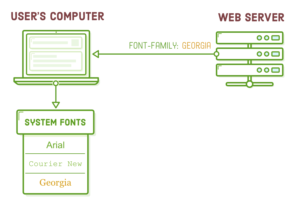
In the event that you required a unique font, your sole recourse was to create an image containing the desired text and then incorporate it into your web page using an <img/> element. This approach posed severe limitations for web designers and led to some rather unconventional workarounds for developers. Frankly, it's quite astonishing how everyone managed to navigate through that era of HTML and CSS.
Custom Web Fonts
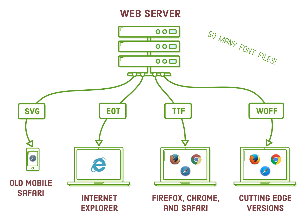
Approximately in the year 2010, browsers started to embrace custom web fonts, marking a significant advancement. However, a significant challenge emerged: each browser and device demanded a distinct file format. Consequently, most websites had to supply four distinct web font files:
- Embedded OpenType (EOT) for Internet Explorer
- TrueType Font (TTF) for Firefox
- Web Open Font Format (WOFF) for Chrome, Safari, and Opera
- WOFF2 for Chrome, Safari, and Opera
This gave rise to the "Bulletproof @font-face syntax," a concept you're likely to encounter during your journey in web development.
WOFF Fonts
In recent times, the industry has adopted the Web Open Font Format (WOFF) as a standard, making matters a bit more straightforward for us. Currently, more than 90% of modern browsers endorse .woff fonts, and there's a growing acceptance of its successor, .woff2. WOFF2 closely resembles the original WOFF format but delivers substantial reductions in file size, resulting in enhanced performance.
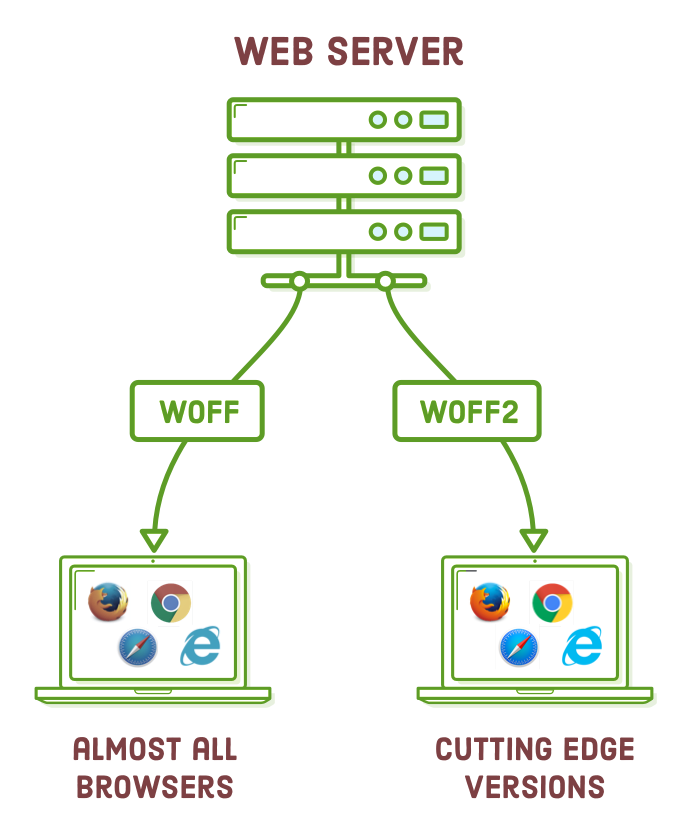
In the future, it's likely that supporting only WOFF2 will suffice. However, at present, we recommend offering both WOFF and WOFF2 web fonts to ensure reasonable compatibility with older browsers while achieving better performance on modern ones. Unless a significant portion of your target audience still relies on legacy browsers, formats like .ttf, .svg, and .eot fonts are becoming obsolete.
Where to Find Web Fonts
Numerous websites on the internet offer the option to download web fonts, including both free and premium choices. Below, we've highlighted our top three favorites. While the decision regarding which font to use often rests with your designer and their budget, as a developer, it's valuable to comprehend the trade-offs associated with these options.
| Website | Price | Quality | Selection |
|---|---|---|---|
| Font Squirrel | Free | Hit-or-Miss | Huge |
| Google Fonts | Free | Good | Decent |
| Fontspring | Expensive | Excellent | Huge |
It's important to point out that Font Squirrel and Fontspring provide access to both web fonts and desktop fonts (.otf and .ttf files). WOFF fonts are tailored specifically for the demands of contemporary web usage, while desktop fonts come with additional functionalities designed for graphics editing applications such as Adobe Illustrator. Ensure that you obtain or purchase the web font version of your desired fonts, rather than solely opting for the desktop version.
Setup
Alright! We're all set to explore web fonts. For this exercise, we'll be constructing an example website. To save you from starting from scratch, we've prepared the initial project for you to download. Simply unzip it and access the "web-typography" folder using your preferred text editor.
We've provided you with 6 HTML documents, each of which employs the same "typo.css" stylesheet. We'll illustrate different typographic principles by incorporating distinct page-specific styles into each of these HTML files.
When you open any of the HTML files in a web browser, you'll notice that our initial project closely resembles the final example, with the exception of the web fonts and additional CSS typography properties, which are yet to be added.
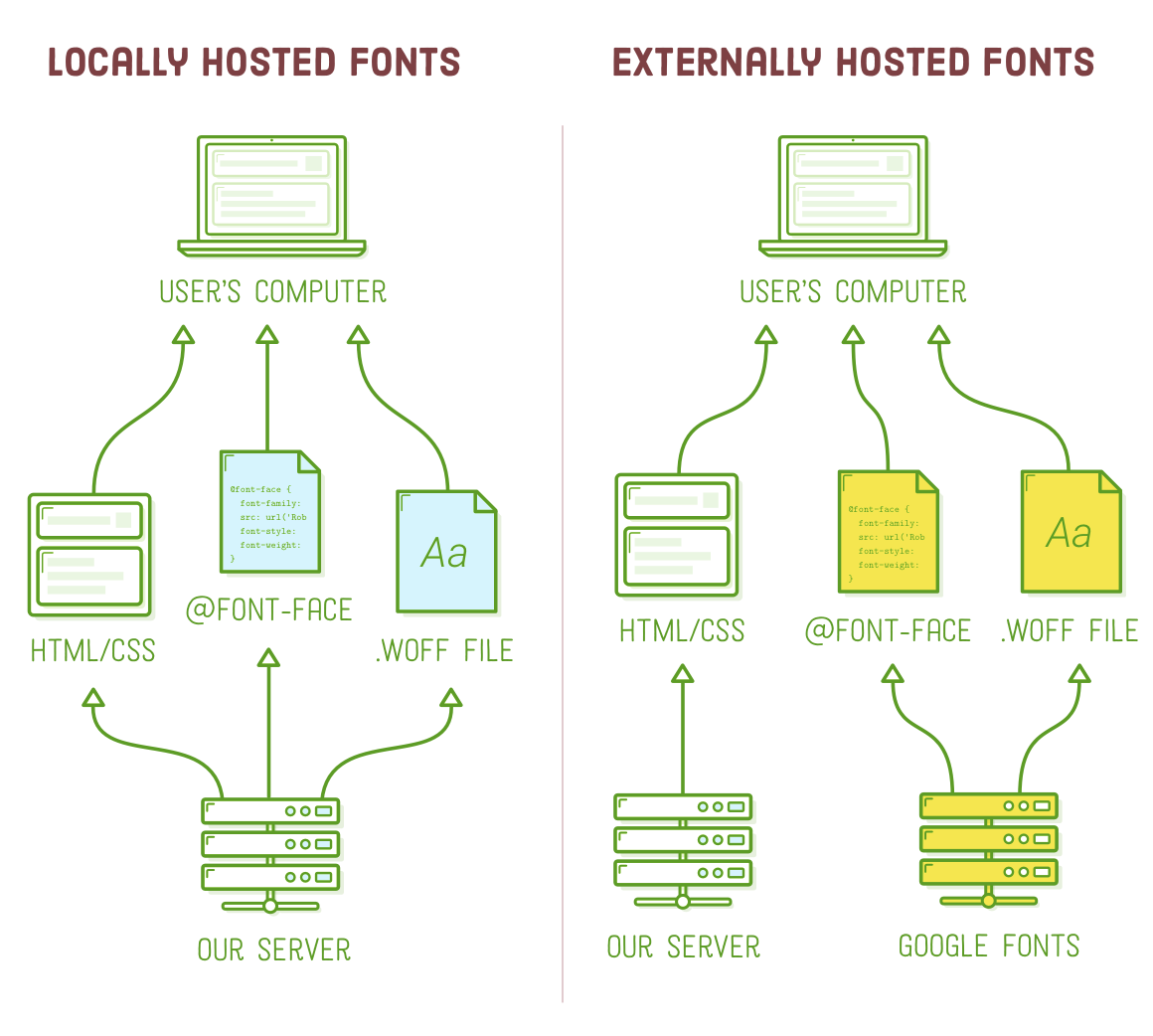
Locally Hosted Web Fonts
There are two primary approaches to incorporate web fonts into your website: local hosting and external hosting. In this chapter, we will explore both methods. To begin, we'll integrate a locally hosted web font into our example project, which involves a three-step process:
- Download a web font and include it in your project.
- Incorporate the web font into your stylesheet.
- Apply the font in other parts of your stylesheet.
We will conduct our experiments in the "web-fonts.html" and "typo.css" files. If you haven't already, please open them in your text editor.
Hosting a WOFF File
Now, let's acquire a web font. For our example, we're utilizing the free Roboto font, which you can obtain from Font Squirrel. Be sure to access the "Webfont Kit" tab instead of clicking the "Download TTF" button. Deselect all the formats except for WOFF, as that's the sole format we'll be using, and then proceed by clicking the "Download @font-face Kit" button.
Upon clicking the "Download @font-face Kit" button, you will receive a ZIP file containing a license, instructions, and a web fonts folder with numerous subdirectories. The Roboto font encompasses various font faces such as light, regular, bold, italic, and condensed, each residing in a distinct folder. We are interested in the "roboto_light_macroman" folder. Please open this folder and copy the "Roboto-Light-webfont.woff" file into our "web-typography" project.
Embedding a Web Font
Great! We now have a WOFF file. To utilize it in our web page, we must incorporate it into our stylesheet using the "@font-face" at-rule. Remember that web fonts should always be placed at the beginning of a stylesheet. Therefore, please insert the following code snippet right at the start of the "typo.css" file:
@font-face {
  font-family: 'Roboto';
  src: url('Roboto-Light-webfont.woff') format('woff');
}
The "font-family" property specifies the name we'll use to reference this font in the future. Think of it as an internal label, and you can choose any name you prefer. It doesn't have to match the font's official name, but it's generally more intuitive if it does. However, for clarity, it's often advisable to keep the name relatively generic, such as "Roboto" instead of "Roboto Light," as we'll see shortly.
Moving on, we encounter the "src" property, which specifies the file path to the .woff file using the url() syntax. This path can be absolute, relative, or root-relative. In the case of a relative path, as demonstrated here, it's always relative to the .css file's location, not the HTML document. The "format()" notation is used to indicate the web font file format to browsers.
When you reload the web-fonts.html page, you won't notice any changes because the @font-face declaration only makes our .woff file available for use. To see the font in action, we need to apply it elsewhere in our stylesheet.
Using a Web Font
As a reminder from the section on "Defining Fonts," the CSS font-family property specifies the font to be used for a particular HTML element. With our @font-face declaration in place, we can now use "Roboto" as a valid value for font-family in any other part of our stylesheet.
To set Roboto Light as the default font for our entire example project, let's update the font-family within the "body" selector in typo.css:
body {
  font-family: 'Roboto', sans-serif;   /* Add 'Roboto' here */
  font-size: 18px;
  line-height: 1.8em;
  color: #5D6063;
}
To ensure our comparison with the sans-serif system font in web-fonts.html is restored, let's add a page-specific style to the <head> of our web-fonts.html file:
<style>
  .system-fonts {
      font-family: sans-serif;
  }
</style>
The .system-fonts class is assigned to the second box in web-fonts.html. The rule above takes priority over the body rule in typo.css. As a result, when you view web-fonts.html in a browser, you will observe our Roboto Light web font in the top box and the default system font in the bottom box:
Font Families and Font Faces
Within a font "family," there exist various font "faces," with each face representing a distinct weight or style within the family. "Weight" signifies the level of boldness for a specific face, while "style" indicates whether it is roman (upright), italic, condensed, extended, or another variation within the family.
In our example, Roboto Light is just one of the font faces within the Roboto family. The ZIP file we downloaded earlier contains a total of 17 different faces, which can be thought of as various representations of the Roboto family.
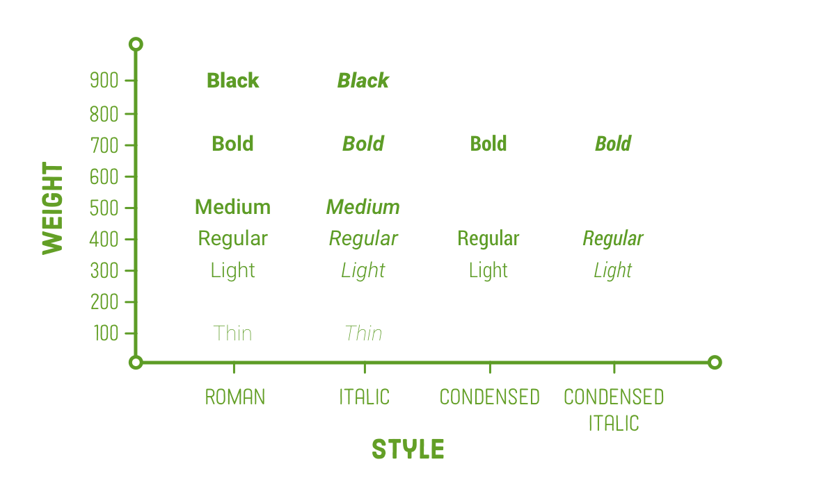
In CSS, font weights are typically represented as numerical values ranging from 100 to 900. Thankfully, there are commonly accepted, user-friendly terms for these numerical values. For instance, "Black" typically corresponds to 900, "bold" to 700, "regular" to 400, and so on. As shown above, not all font families provide a font face for every possible weight. In the case of Roboto, it lacks "extra light" (200), "semi bold" (600), and "extra bold" (800) variations.
It's important to emphasize that every combination of style and weight is meticulously crafted as a unique font face. In a well-crafted font family, the condensed styles aren't just compressed versions of the regular faces, and the bold face isn't merely a thicker variation. Each character in every font face is carefully designed to maintain a consistent and harmonious appearance in text.
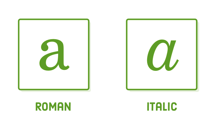
This contrast becomes especially evident when comparing the italic and roman versions of many serif fonts. Take, for instance, the lowercase letter "a" in Century Schoolbook FS (the font you're currently reading) – its shape undergoes a significant transformation when rendered in italics.
Fakin' It
Why is this information about weight and style important for us? Well, in website design, we often use various font faces from the same font family. Therefore, it's essential to understand how to include multiple .woff files that correspond to different styles and weights within that family.
Before we dive into embedding multiple font faces, let's examine the consequences of not providing various faces. Modify the left-hand paragraph in web-fonts.html to include both an <em> and a <strong> element:
<section class='section section--gray'>
  <h2>Web Fonts</h2>

  <p>This paragraph is using a web font call <em>Roboto Light</em>. It’s a
  little more refined and lends some <strong>unique character</strong> to
  the web page.</p>
</section>
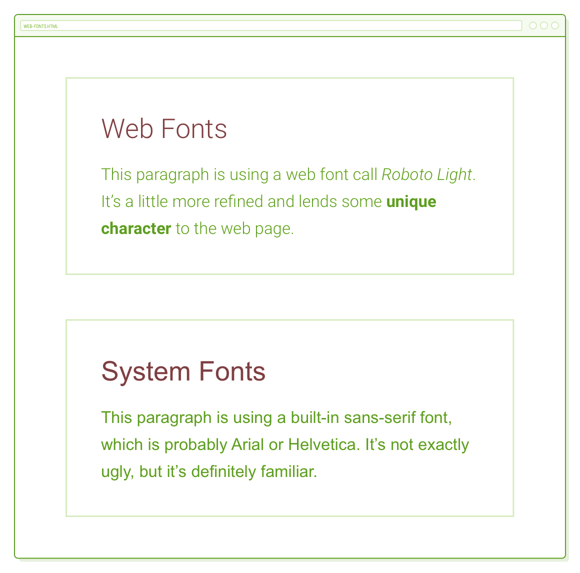
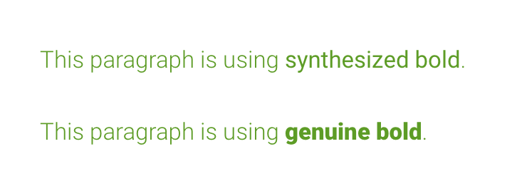
Upon reloading the page, you'll observe that the bold text doesn't appear significantly bold. This is because it's being synthesized. Since we didn't provide a bold font face for the <strong> element, the browser is attempting to simulate it by transforming Roboto Light into a thicker style. The same situation applies to the italics in the <em> element, although it might be less noticeable. This automatic transformation usually leads to subpar typography.
To confirm that the bold and italic faces are indeed being synthesized, you can experiment with the following rule in typo.css. The font-synthesis property controls whether a browser is permitted to simulate these styles or not. It's worth noting that, as of the time of this writing, only Firefox actually considers the font-synthesis property, so this adjustment won't have an effect in Chrome or Safari:
/* This will only work in Firefox */
em, strong {
  font-synthesis: none;
}
If you open web-fonts.html in Firefox with this adjustment, you'll observe that the <em> and <strong> elements will no longer appear italic or bold; instead, the entire paragraph will be rendered in the default Roboto Light font.
Multiple Font Faces (The Wrong Way)
Let's incorporate Roboto Light Italic and Roboto Bold font faces into our example project. To do this, copy the following files from the Roboto ZIP file we downloaded earlier into our web-typography folder:
- roboto_bold_macroman/Roboto-Bold-webfont.woff
- roboto_lightitalic_macroman/Roboto-LightItalic-webfont.woff
One way to embed these new WOFF files would be to add more @font-face declarations and adjust the font-family and src properties accordingly. You can try adding the following code to the beginning of typo.css:
/* DON'T NAME FONT FAMILIES LIKE THIS */
@font-face {
  font-family: 'Roboto Light Italic';
  src: url('Roboto-LightItalic-webfont.woff') format('woff');
}

@font-face {
  font-family: 'Roboto Bold';
  src: url('Roboto-Bold-webfont.woff') format('woff');
}
To utilize these font faces for our <em> and <strong> elements, we require the following CSS rules:
/* THIS IS A LITTLE AWKWARD */
em {
  font-family: 'Roboto Light Italic', serif;
}

strong {
  font-family: 'Roboto Bold', serif;
}
This should function as intended, and upon reloading web-fonts.html in your browser, you'll observe correct italic and bold fonts. The issue lies in the manual specification of font-family each time we wish to employ an italic or bold font, which can be somewhat unconventional. Instead, we should utilize the CSS font-style and font-weight properties for this purpose.
Our current predicament arose due to how we integrated our new .woff files. By employing distinct font-family values in @font-face, they appear as if they are entirely distinct font styles, which doesn't accurately represent their association with the Roboto font family.
Due to this consideration, it's advisable not to utilize the method described above for embedding multiple font faces within the same font family. Please proceed by removing both of the aforementioned code snippets before proceeding.
Multiple Font Faces (The Right Way)
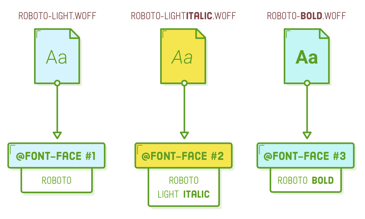
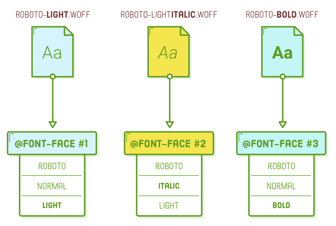
In order to preserve the familial connection among our three font styles, it is essential that they all employ the common "Roboto" value for their font-family property. To differentiate between the light, italic, and bold styles, we will incorporate font-style and font-weight properties into the at-rule. Replace all the @font-face declarations in typo.css with the following code:
@font-face {
  font-family: 'Roboto';
  src: url('Roboto-Light-webfont.woff') format('woff');
  font-style: normal;
  font-weight: 300;
}

@font-face {
  font-family: 'Roboto';
  src: url('Roboto-LightItalic-webfont.woff') format('woff');
  font-style: italic;
  font-weight: 300;
}

@font-face {
  font-family: 'Roboto';
  src: url('Roboto-Bold-webfont.woff') format('woff');
  font-style: normal;
  font-weight: 700;
}
Consider each @font-face at-rule as a representation of the corresponding .woff file. The initial @font-face indicates that it's a Roboto font with a roman (normal) style and a font weight of 300 (referred to as "light"). The second at-rule similarly identifies it as part of the Roboto family with a weight of 300, but with an italic style. Lastly, the third at-rule informs the browser that Roboto-Bold-webfont.woff contains the 700-weight (referred to as "bold") roman style.
Informing the browser about the relationship between our font styles enhances the clarity of our CSS. We can establish the default font family and weight within our body selector. Subsequently, when we wish to apply italics or bold formatting to a specific element, we can merely indicate a font-style or font-weight, and the browser will retrieve the relevant .woff file:
body {
  font-family: 'Roboto', sans-serif;
  font-weight: 300;
  /* ... */
}

em {
  font-style: italic;
}

strong {
  font-weight: bold;  /* Or 700 */
}
These happen to correspond to the default font-style and font-weight settings for <em> and <strong> elements, so there's no real necessity to incorporate the final two rules in this context. It's worth noting that the only easily recognizable keywords for font-weight are "normal" (equivalent to 400) and "bold" (equivalent to 700). Any other levels of boldness must be specified numerically.
Externally Hosted Web Fonts
Alright! The previous process was quite intricate. Now, let's delve into the simpler approach of employing web fonts hosted externally through Google Fonts. This eliminates the need for the initial two steps involved in locally hosting fonts. Instead of integrating .woff files into our project and embedding them with @font-face, we can delegate this task to Google Fonts.
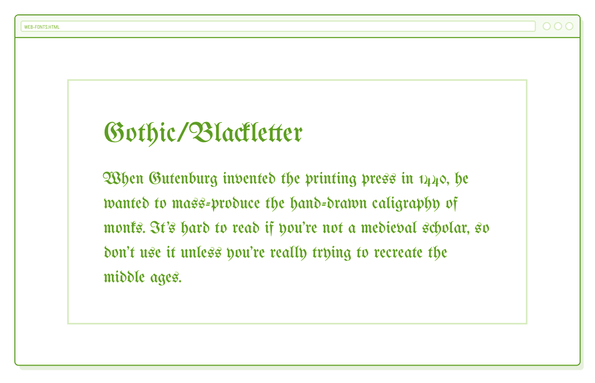
In this part, let's focus on history.html, so please open that file in both your text editor and a web browser. If you're interested in a concise overview of typography history, starting from the invention of the first printing press, you can quickly skim through the provided example text. Currently, every section in history.html is utilizing Roboto Light as the font, but our goal is to adapt them to reflect the historical periods they discuss.
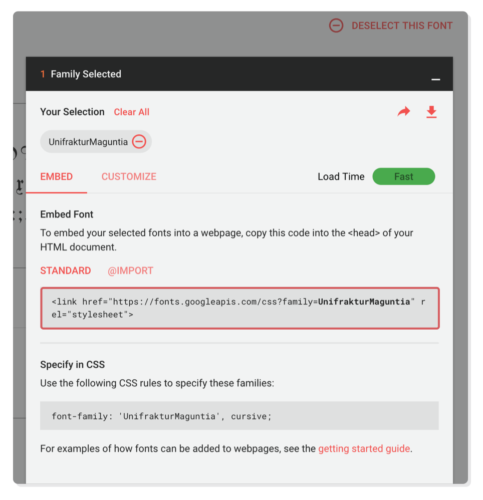
To get started, let's modify the font for the Gothic/Blackletter section. Head over to Google Fonts and search for "UnifrakturMaguntia." This font has the appearance of something a monk might have written during the Middle Ages. Once you've found it, click on "Select this font." In the pop-up menu, you'll encounter a <link/> element. Copy this element and paste it into the <head> section of your history.html file, placing it above the <link/> element that includes our typo.css stylesheet.
<link href="https://fonts.googleapis.com/css?family=UnifrakturMaguntia" rel="stylesheet">
Keep in mind that the tag is the method we use to import an external stylesheet, and that's precisely what the HTML code above accomplishes. However, instead of linking to a local CSS file, it's integrating CSS provided by Google Fonts. If you were to paste the href value into your browser, you'd discover the same @font-face declaration that we employed in the previous section—except this time, we didn't have to manually write it. That's a win!
Now that we've successfully incorporated the UnifrakturMaguntia web font, we can employ it to customize the appearance of any HTML element we desire. Insert the following code into the <head> section of history.html:
<style>
  .blackletter {
      font-family: 'UnifrakturMaguntia', cursive;
  }
</style>
The initial section contains a class='blackletter' attribute, so it should now be displayed in Gothic lettering:
Google Fonts provide a convenient and swift solution, yet for professional websites, it's usually advisable to employ locally hosted web fonts. This approach offers greater flexibility, as it isn't restricted to Google's font selection, and it can yield performance and reliability benefits when other aspects of your website are optimized correctly.
Too Many Font Files
Speaking of optimizing performance, let's discuss a less efficient approach. On our history.html page, there are ten additional sections, and we aim to assign a distinct web font to each of them. We have the option to embed multiple fonts within a single <link/> element, so let's modify our Google Fonts stylesheet to include the remaining fonts:
<link href="https://fonts.googleapis.com/css?family=Alfa+Slab+One|Droid+Sans+Mono|Lato|Libre+Baskerville|Lobster|Questrial|Rokkitt|Rufina|Sorts+Mill+Goudy|UnifrakturMaguntia" rel="stylesheet">
It's worth mentioning that you can generate this code in Google Fonts by selecting multiple fonts before copying the <link/> element. Following that, incorporate all of these newly added fonts into the <style> element of history.html:
.old-style {
  font-family: 'Sorts Mill Goudy', serif;
}
.transitional {
  font-family: 'Libre Baskerville', serif;
}
.didot {
  font-family: 'Rufina', serif;
}
.slab {
  font-family: 'Rokkitt', serif;
}
.fat-face {
  font-family: 'Alfa Slab One', cursive;
}
.grotesque {
  font-family: 'Roboto', sans-serif;
}
.geometric {
  font-family: 'Questrial', sans-serif;
}
.humanist {
  font-family: 'Lato', sans-serif;
}
.display {
  font-family: 'Lobster', cursive;
}
.monospace {
  font-family: 'Droid Sans Mono', monospace;
}
Presently, each section within history.html is displayed in a font that corresponds to the era it discusses. This serves as a valuable demonstration of the historical significance of various fonts. However, it's crucial to emphasize that including this many web fonts on an actual web page is strongly discouraged.
It's important to keep in mind that each web font corresponds to an actual .woff or .woff2 file that your browser must fetch before it can display the webpage. The presence of multiple fonts translates to extended loading times. The key to using web fonts successfully is to strike a balance between performance (fewer web fonts) and achieving an elegantly typeset document (more web fonts).
That covers everything you might need to know about web fonts. The remaining part of this chapter transitions into fundamental typographic principles. These are straightforward guidelines, accompanied by uncomplicated CSS implementations, that frequently distinguish between a professionally designed web page and an amateur one.
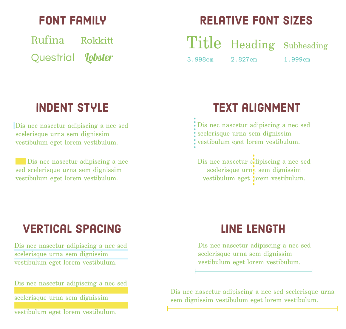
Paragraph Indents
Distinguishing between paragraphs is a fundamental aspect of typography. There are two widely recognized approaches: employing a first-line indent or introducing a margin between paragraphs. Your readers (presumably) possess the ability to discern when a new paragraph begins, so it's unnecessary to utilize both an indent and a margin simultaneously. Doing so would be redundant.
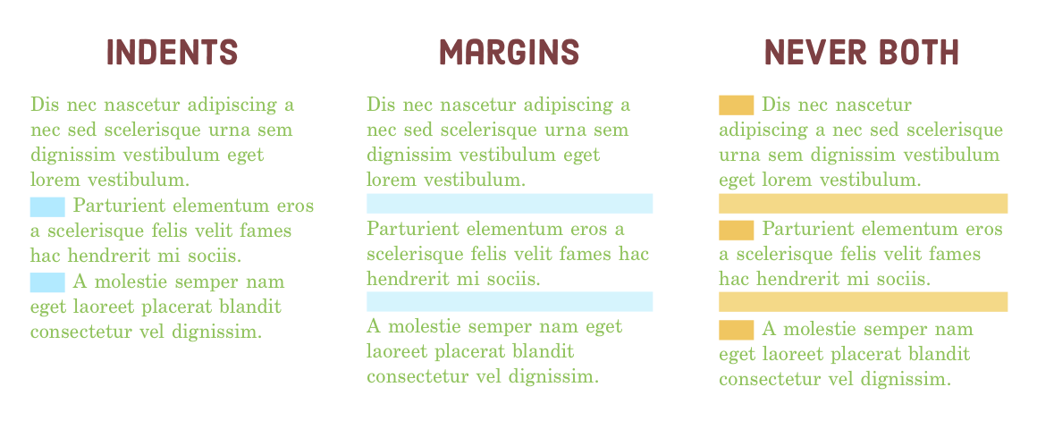
The CSS property known as text-indent is used to specify the extent of the first-line indent for a specific element, typically a <p> element. We can experiment with this concept in our indents.html page. Feel free to replace the current bottom margin styles in the initial section with an indent by incorporating the following rules into the <style> element:
<style>
  .paragraph-indent p {
      text-indent: 1em;
      margin-bottom: 0;
  }
  .paragraph-indent p:first-of-type {
      text-indent: 0;
  }
</style>
It's important to note that the initial paragraph following a heading should generally not have an indent. This is because it's typically quite evident that it marks the beginning of a new paragraph. In such cases, the :first-of-type pseudo-class can be quite handy.
Now, let's take a look at an example of what we should avoid. Incorporate the following code into the page-specific styles within indents.html to illustrate what not to do:
/* DESIGNERS WILL JUDGE YOU FOR THIS */
.never-both p {
  text-indent: 1em;
  margin-bottom: 1em;
}
While it may appear trivial, we're entirely serious when we emphasize that skilled designers will assess your work based on this aspect.
Text Alignment
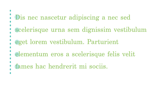
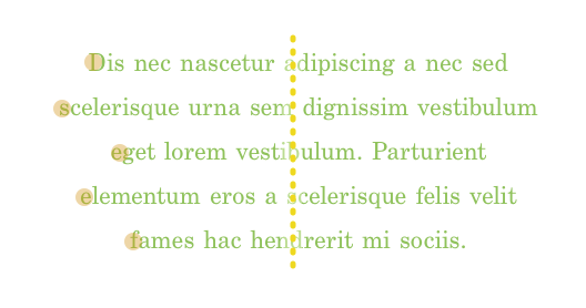
Text alignment subtly influences your reading experience. While reading a paragraph, your eyes don't move smoothly; instead, they jump between words and lines, fixating on some spots and skipping others. This phenomenon often goes unnoticed.

In a carefully crafted HTML document, text alignment isn't random. It considers human physiology, and well-executed text alignment provides readers with reference points for their eyes as they transition from one line to another. This enhances readability.
The following sections will clarify when to apply left, center, right, and justified text alignment. These examples depend on the text-align property, which manages the alignment of text within specific HTML elements. Our example project includes alignment.html, featuring practical scenarios for illustration.
Left Alignment
The majority of your text should use left alignment as it provides readers with a consistent vertical reference point on each line. Especially for long passages of text, left alignment is usually the preferred choice. However, for shorter text portions and headings, there's some flexibility in your alignment choices.
Left alignment serves as the default setting for text-align. However, for added clarity, we can include the following rule in the <style> element of our alignment.html file:
<style>
  .left {
      text-align: left;
  }
</style>
Certainly, if you're designing a website for a language that reads from right to left, such as Arabic, you can apply the guidance provided in the Right Alignment section below instead of the advice mentioned earlier.
Center Alignment
Text aligned in the center lacks a consistent vertical anchor, which can make it more challenging for the eye to transition smoothly to the next line. This alignment is most appropriate for short line lengths (more details on this later) and for specific types of content such as poems, lyrics, and headings.
Feel free to apply a page-specific style to center-align the second paragraph in alignment.html.
.center {
  text-align: center;
}
You might observe a slight disconnect in the page's overall flow. The center-aligned second paragraph interrupts the continuity established by the left-aligned first paragraph. In general, it's advisable to maintain consistency in text alignment across your web page. If you opt to center-align a heading, it's best to center-align all your headings for a harmonious appearance.
Right Alignment
Another factor to keep in mind when selecting text alignment is the interaction it establishes with nearby elements. As an example, let's examine the third section in alignment.html. Our goal is to reposition the caption of the image to the left of the image and align it to the right, creating the impression that it's connected to the image.
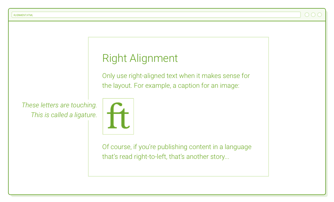
Since our example image is enclosed within a <figure> tag, and the caption text resides in a <figcaption> tag, adding the following code to the <style> element of alignment.html should produce the layout described above.
figcaption {
  display: none;
}
@media only screen and (min-width: 900px) {
  figure {
    position: relative;
  }
  figcaption {
    display: block;

    font-style: italic;
    text-align: right;
    background-color: #FFFFFF;

    position: absolute;
    left: -220px;
    width: 200px;
  }
}
This also serves as an excellent illustration of advanced positioning. The <figure>'s relative position establishes the coordinate system for the absolute positioning of the <figcaption>. By shifting the caption 220px to the left and specifying a width of 200px, we achieve a pleasing 20-pixel gap between the image and its accompanying caption.
Similar to centered text, right alignment is typically best suited for specific design situations because its uneven left edge can make it more challenging for readers to locate the beginning of the next line.
Justified Alignment
Justified text is achieved by delicately adjusting word and letter spacing and hyphenating long words as needed to ensure each line has uniform width. However, without a proficient hyphenation engine, justified text can lead to unwieldy gaps between words, creating uneven spacing that hinders smooth horizontal reading.
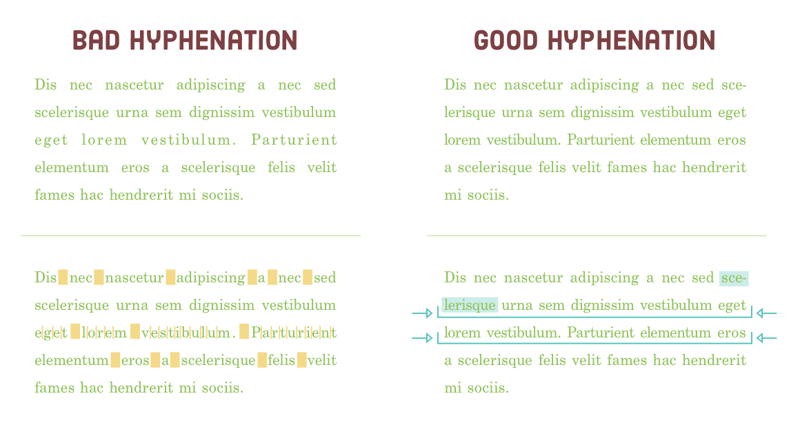
Regrettably, the majority of web browsers lack a built-in hyphenation engine. Hence, it's advisable to steer clear of justified text in HTML documents. We can examine this further by including an additional text-align rule in our alignment.html file.
.justify {
  text-align: justify;
}
Now, contrast this with the left-aligned paragraph. The difference is subtle, but the left-aligned paragraph appears more consistent and welcoming.
Vertical Text Spacing
Just as text alignment is a deliberate choice, so is the spacing between text. In this section, our focus is on the judicious utilization of three CSS properties:
- margin-top (or padding-top)
- margin-bottom (or padding-bottom)
- line-height
The first two properties should be quite familiar at this point, as they specify the vertical gap between individual paragraphs. The recently introduced line-height property dictates the spacing between lines within the same paragraph. In classic typography, line-height is referred to as "leading" because printers used small lead strips to increase the spacing between lines of text.
Collectively, these properties manage the "vertical rhythm" of a webpage. Numerous techniques exist for determining the "optimal" vertical rhythm for a specific layout, but the fundamental principles include:
- Provide adequate room for items to have sufficient breathing space.
- Maintain uniform spacing across the entire page.
To illustrate this, we will disrupt the vertical rhythm in the latter part of our spacing.html page. Feel free to incorporate the following page-specific styles into spacing.html:
<style>
  .messy {
      line-height: 1.2em;
  }
  .messy h2 {
      line-height: .9em;
  }
  .messy:last-of-type {
      line-height: 1.5em;
  }
  .messy:last-of-type h2 {
      margin-bottom: .3em;
  }
  .messy .button:link,
  .messy .button:visited {
      margin-top: 0;
  }
</style>
Minor adjustments to line height, padding, and margins can significantly enhance the page's quality:
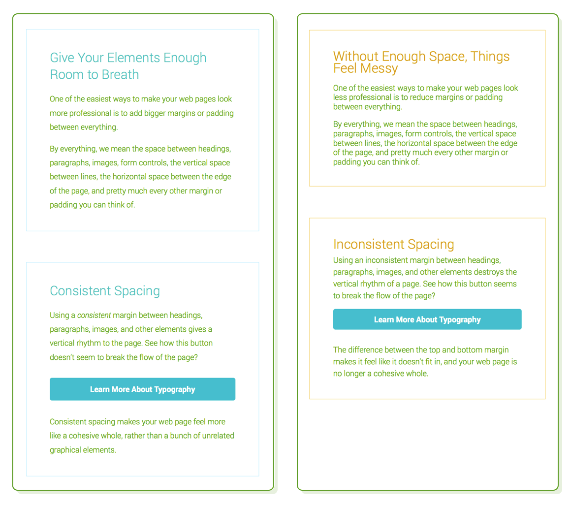
Calculating a page's vertical rhythm involves a substantial blend of mathematics and psychology, primarily handled by your designer. Your role as a developer is to be well-versed in the CSS properties necessary to execute their requests. What's crucial to grasp is that your designer places great importance on these details, so meticulous attention to margin, padding, and line-height properties is essential.
Line Length
Considering that vertical text spacing is purposeful, it's logical that horizontal spacing follows suit. "Line length" or "measure" pertains to the horizontal span of your text, which can be likened to the number of characters or words accommodated within a single line. Measure directly relates to the following CSS properties:
- width
- margin-left (or padding-left)
- margin-right (or padding-right)
A practical guideline is to restrict the number of characters per line to approximately 80. Similar to text alignment, this has a subtle impact on the readability of your content. The act of shifting your gaze from the left edge to the right edge of a paragraph demands effort, and the farther your eye needs to travel, the quicker it tires. Longer lines can also increase the likelihood of losing your place when transitioning from the end of one line to the beginning of the next.
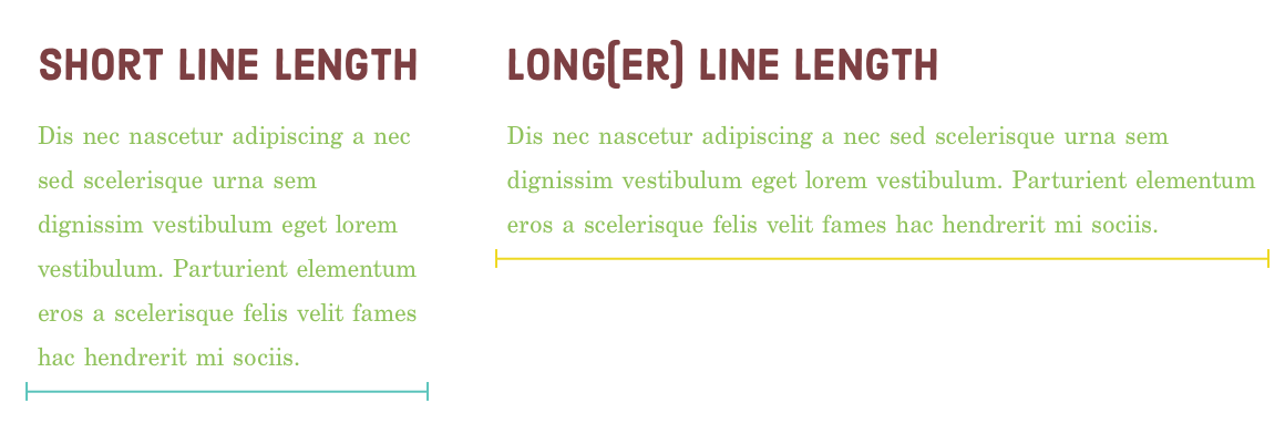
These considerations explain why numerous websites, including this one, employ fixed-width layouts or segment content into multiple columns on wider screens. Without imposing constraints on the page's width or breaking it into more manageable columns, line length can become excessively elongated, impairing readability.
In our sample project, the line-length.html file maintains a reasonable line measure. Let's observe the impact of altering the lower portion of the page by including the following code in its <head>:
<style>
  @media only screen and (min-width: 580px) {
      .not-so-manageable {
          max-width: 100%;
          margin-left: 2em;
          margin-right: 2em;
      }
  }
</style>
Presently, the second section extends to occupy the entire width of the browser window. This makes it appear somewhat less approachable due to the extended line length. Once more, the objective of effective web typography is to maximize the ease with which visitors can consume your content.
Other Basic Typography Guidelines
These insights should provide you with a solid foundation for achieving high-quality web typography. Typography is a vast field, and what we've covered here merely touches the surface. Delving further into it would venture more into design than web development. As a parting note, here are a few additional guidelines to consider:
- Opt for a font size ranging from 14px to 20px for the body element.
- Utilize "curly quotes" and apostrophes using HTML entities such as &rsquo, &lsquo, &rdquo, and &ldquo.
- Incorporate correct dashes (&ndash, &mdash) and other symbols like © for display on a web page.
- Avoid employing text-decoration: underline unless it's for hover states.
- Choose genuine italic fonts instead of synthesized ones unless it places an excessive strain on performance.
If you're intrigued by this topic, Practical Typography offers an excellent compilation of fundamental rules for typesetting documents.
Summary
The objective of this chapter had a dual purpose:
- Acquire knowledge about web font mechanics and fundamental CSS typography attributes.
- Grasp the thought process of designers when it comes to typography.
After completing this chapter, you may not have the ability to craft a gorgeously typeset web page from the ground up, but that wasn't the primary aim. It was to introduce you to the concealed world of typography. You should now possess the terminology to discuss topics like font families, faces, weights, and styles, along with leading, measure, and vertical rhythm.
The key takeaway from this chapter is the understanding that nothing within a thoughtfully designed web page is arbitrary. Font sizes, indent styles, text alignment, line spacing, margins, and every minute detail of the page underwent deliberate contemplation. Each decision served a specific purpose.
In essence, all the CSS properties we've discussed in this tutorial are quite straightforward. At their core, we've essentially been manipulating boxes, adjusting colors, and modifying text presentation. The significance of these actions derives from the overarching design principles and the business objectives of the website you're building.
However, that's a topic for another tutorial. Surprisingly, you've now completed the Demystified HTML & CSS tutorial. We've explored all the necessary HTML elements and CSS properties for constructing polished web pages. The only element lacking is practical experience. Your next move should be to apply these newfound skills by creating numerous web pages entirely from the ground up.
Keep an eye out for additional tutorials!