"Responsive design" is the concept that your website should provide an optimal user experience across various devices, including wide monitors and mobile phones. It's an approach to web design and development that blurs the line between the mobile and desktop versions of your site, making them essentially identical.
Responsive design is achieved using CSS "media queries," which can be thought of as a method for selectively applying CSS rules. These queries instruct the browser to either disregard or implement specific rules based on the user's device.
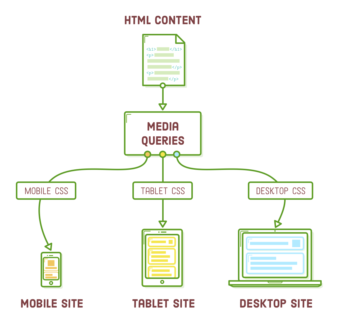
Media queries allow us to present a single set of HTML content with different CSS layouts. Instead of managing separate websites for smartphones and desktops, we can utilize the same HTML markup and web server for both. This ensures that any updates or modifications made to our HTML, such as adding articles or fixing typos, are instantly applied to both mobile and widescreen layouts. This underscores the importance of separating content from presentation.
In this chapter, we'll explore how media queries are essentially a straightforward extension of the CSS concepts we've been using. As we delve into it, you'll see that creating a responsive layout is quite manageable. (Responsive Images, however, present a distinct challenge of their own).
Setup
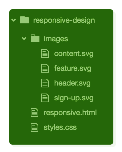
Start a new project named "responsive-design" and include a new file named "responsive.html." While it may appear minimal, this web page will serve a crucial role in illustrating an important concept in the upcoming section:
<!DOCTYPE html>
<html lang='en'>
  <head>
    <meta charset='UTF-8'/>
    <title>Responsive Design</title>
    <link rel='stylesheet' href='styles.css'/>
  </head>
  <body>
    <!-- There's nothing here! -->
  </body>
</html>
You should also download a set of images for later use in this chapter. After extracting the contents, ensure that the "images" folder remains in the same directory as your responsive.html file. Your project structure should resemble the following before proceeding:
CSS Media Queries
Let's begin with a basic step: adjusting the background color of the <body> element depending on the device width. This simple change will help us confirm that our media queries are functioning correctly before we delve into more intricate layout adjustments.
To distinguish between narrow, medium, and wide layouts, we'll create a new stylesheet named styles.css and insert the following code:
* {
  margin: 0;
  padding: 0;
  box-sizing: border-box;
}

/* Mobile Styles */
@media only screen and (max-width: 400px) {
  body {
    background-color: #F09A9D; /* Red */
  }
}

/* Tablet Styles */
@media only screen and (min-width: 401px) and (max-width: 960px) {
  body {
    background-color: #F5CF8E; /* Yellow */
  }
}

/* Desktop Styles */
@media only screen and (min-width: 961px) {
  body {
    background-color: #B2D6FF; /* Blue */
  }
}
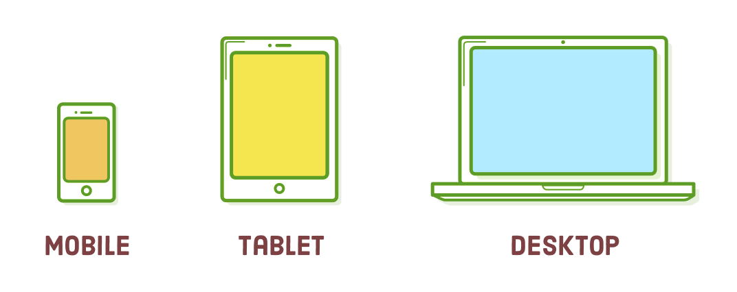
As you adjust the size of your browser window, you'll notice three distinct background colors: blue when the width is greater than 960px, yellow when it falls between 401px and 960px, and red when it's less than 400px wide.
Media queries typically start with the "@media" at-rule, followed by a conditional statement enclosed in curly braces. Inside these braces, you define regular CSS rules. These rules are applied by the browser only if the specified condition is satisfied.
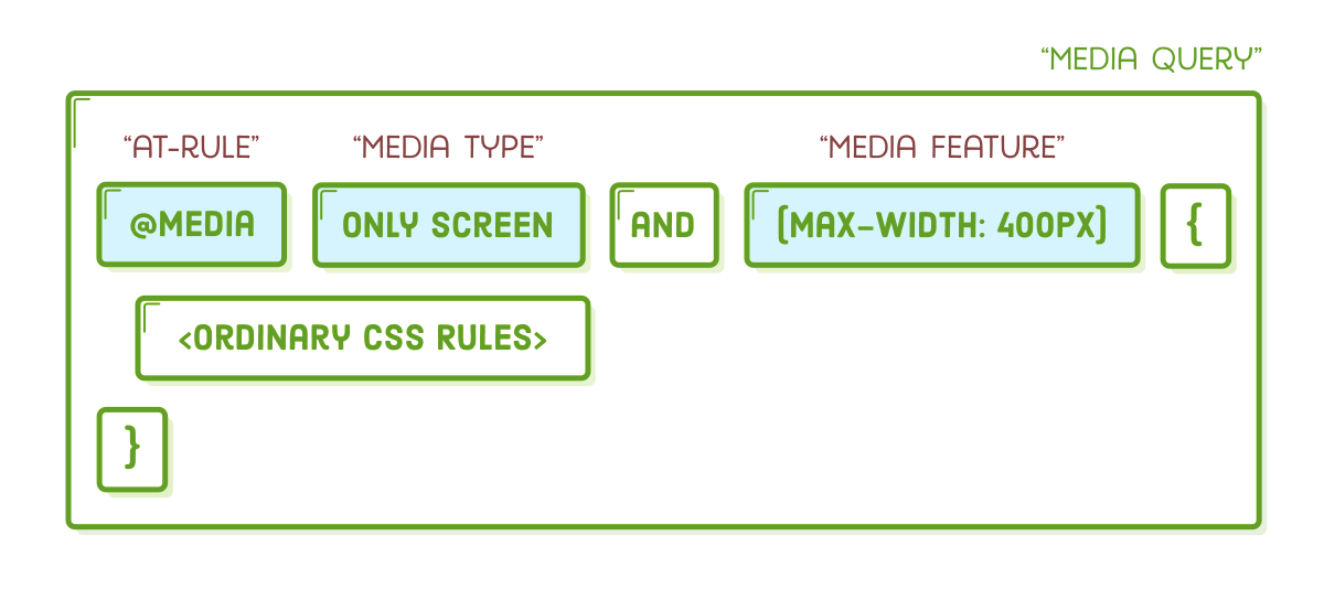
The "only screen" media type indicates that the enclosed styles should exclusively apply to devices with screens, as opposed to situations like printing a document. The terms "min-width" and "max-width" are known as "media features," and they define the device dimensions you are targeting.
The media queries shown above are the most frequently used ones, but there are numerous other conditions you can examine, such as whether the device is in portrait or landscape mode, the screen resolution, and the presence of a mouse, among others.
Some Notes on Design
Alright, so @media is how we establish various layouts for specific device widths, but what layouts are we aiming to create? The sample web page for this chapter will resemble something like this:
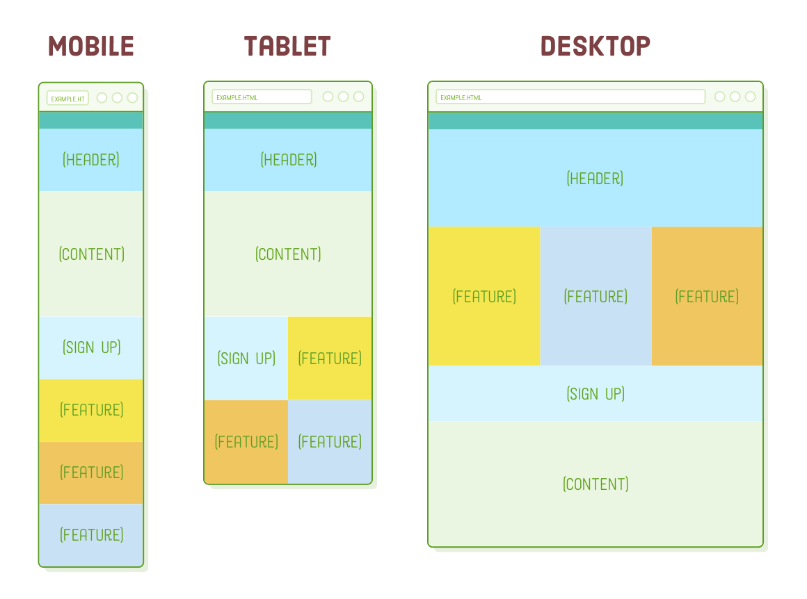
In practice, it's the responsibility of your web designer to provide you with these types of mockups. Your role as a developer is to execute the different layouts by utilizing media queries to segregate the distinct CSS rules relevant to each one.
Several established patterns dictate how a desktop layout transforms into a mobile layout (we're employing the "layout shifter" approach). Many of these choices fall under the domain of design, which is beyond the scope of this code-focused tutorial. Nevertheless, two concepts are crucial for you to grasp as a developer:
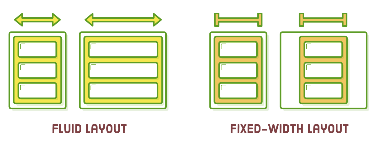
- A "fluid" layout is one that expands and contracts to occupy the available screen width, similar to the flexible boxes we discussed in previous chapters.
- A "fixed-width" layout remains constant in width regardless of the screen dimensions, as opposed to a fluid layout that adjusts to the available screen width. We created an example of a fixed-width layout in the CSS Selectors chapter.
In our example web page, the mobile and tablet versions adapt fluidly to different screen widths, while the desktop version maintains a fixed width.
Choosing Breakpoints
Many responsive design patterns exhibit similar behavior, employing fluid layouts for mobile and tablet devices and opting for fixed-width layouts for wider screens. This consistency serves a purpose.
Fluid layouts enable us to address a spectrum of screen widths rather than targeting individual mobile devices. This holds significant importance for web designers. When designing a mobile layout, they aim to create a fluid layout that appears appealing across a range of screen widths, such as from 300 pixels to 500 pixels (or other relevant dimensions).
In simpler terms, the precise pixel values for the min-width and max-width parameters in a media query, often referred to as "breakpoints" in responsive design, aren't critical. Our website isn't concerned with the specific device the user is using. What matters is that it adjusts its layout to appear aesthetically pleasing at a particular width, such as 400 pixels (or any other relevant dimension).
Mobile-First Development
Let's begin by creating the designs shown in the screenshots above. It's a wise practice to begin with the mobile layout and gradually progress to the desktop version. Desktop layouts are usually more intricate than their mobile counterparts, and adopting this "mobile-first" strategy enables us to maximize the reuse of CSS across various layouts.
To start, let's populate the <body> element of responsive.html with some empty boxes, each containing an image to help distinguish them.
<div class='page'>
  <div class='section menu'></div>
  <div class='section header'>
    <img src='images/header.svg'/>
  </div>
  <div class='section content'>
    <img src='images/content.svg'/>
  </div>
  <div class='section sign-up'>
    <img src='images/sign-up.svg'/>
  </div>
  <div class='section feature-1'>
    <img src='images/feature.svg'/>
  </div>
  <div class='section feature-2'>
    <img src='images/feature.svg'/>
  </div>
  <div class='section feature-3'>
    <img src='images/feature.svg'/>
  </div>
</div>
Below the universal selector rule that resets margins and padding, make sure to add these base styles that should apply to all layouts (mobile, tablet, and desktop).
.page {
  display: flex;
  flex-wrap: wrap;
}

.section {
  width: 100%;
  height: 300px;
  display: flex;
  justify-content: center;
  align-items: center;
}

.menu {
  background-color: #5995DA;
  height: 80px;
}

.header {
  background-color: #B2D6FF;
}

.content {
  background-color: #EAEDF0;
  height: 600px;
}

.sign-up {
  background-color: #D6E9FE;
}

.feature-1 {
  background-color: #F5CF8E;
}

.feature-2 {
  background-color: #F09A9D;
}

.feature-3 {
  background-color: #C8C6FA;
}
If you narrow the browser window, you'll notice that we've achieved our complete mobile layout without the need for any media queries. This simplicity is why it's called "mobile-first" – the mobile version doesn't demand any special handling. Take note of the flex-wrap property within the .page div; it will greatly assist in creating our tablet and desktop layouts.
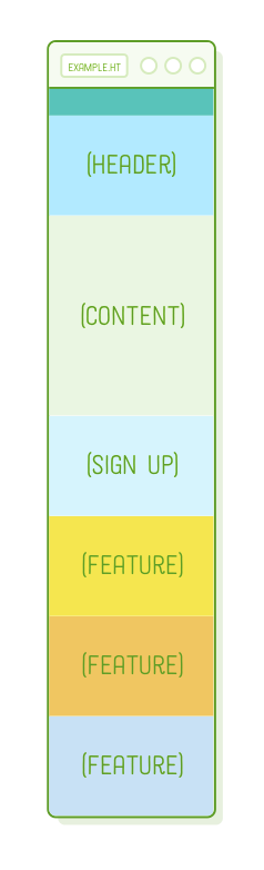
Placing these base styles outside of the media queries allows us to modify and extend them while implementing our unique layouts. This proves especially handy when, for instance, your designer wishes to adjust the color scheme for the entire website. Instead of searching for repetitive background-color declarations within multiple @media rules, you need only make the update here. This change will automatically propagate to the mobile, tablet, and desktop layouts.
Table Layout
Now, let's move on to the tablet layout. The sole distinction between the mobile and tablet mockups is that the Sign Up and Feature sections arrange themselves into a 2×2 grid instead of a single column.
Flexbox simplifies this process. You can easily achieve this by adjusting the widths of the flex items to half the screen, and flex-wrap will handle the rest. However, remember that we only want this behavior for tablet-sized screens, so it should be placed within an @media rule. Replace the existing /* Tablet Styles */ media query with the following:
/* Tablet Styles */
@media only screen and (min-width: 401px) and (max-width: 960px) {
  .sign-up,
  .feature-1,
  .feature-2,
  .feature-3 {
    width: 50%;
  }
}
To observe these modifications, ensure your browser window falls within the range of 400 pixels to 960 pixels in width, and then scroll down to the bottom of the page. You'll encounter a vibrant grid:
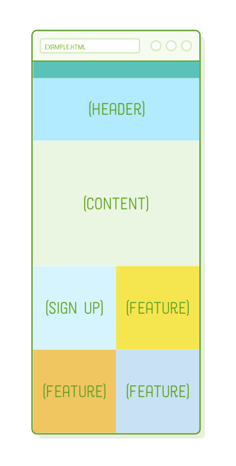
Once more, the precise screen width doesn't matter; this layout will dynamically adjust to any width within the media query's specified range. Our mobile layout is also fluid, so we've achieved a website that appears aesthetically pleasing (albeit somewhat sparse) on every device with a width smaller than 960px.
Desktop Layout
This is where our desktop layout plays a crucial role. We don't want our webpage to endlessly expand, so we'll assign it a fixed width and center it using auto-margins. As with the tablet styles, this modification should be placed within a media query. Replace the existing /* Desktop Styles */ media query with the following:
/* Desktop Styles */
@media only screen and (min-width: 961px) {
  .page {
    width: 960px;
    margin: 0 auto;
  }
  .feature-1,
  .feature-2,
  .feature-3 {
    width: 33.3%;
  }
  .header {
    height: 400px;
  }
}
This ensures that we have the correct widths for all elements, and with more screen space available, we've increased the height of the header a bit. We're almost there, but for our desktop layout, we need to make a reordering adjustment: the Sign-Up and Content boxes should be positioned below all the Feature sections.
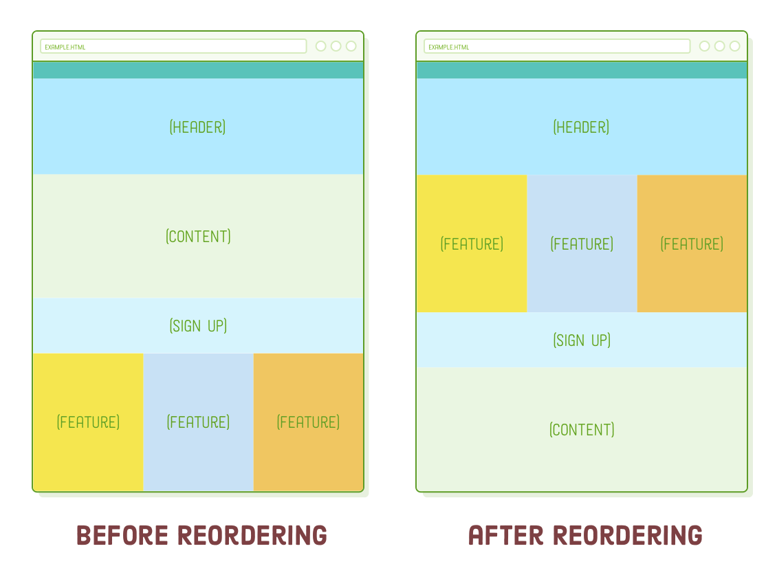
This is where flexbox truly excels. Attempting to achieve this combination of mobile and desktop layouts would be quite challenging with floats. Thanks to flexbox's order property, it only takes a few lines of CSS. Add the following rules to the desktop media query:
.sign-up {
  height: 200px;
  order: 1;
}
.content {
  order: 2;
}
There you have it! A responsive website! Quite impressive considering it required fewer than a hundred lines of CSS. What's even more important is that we didn't need to modify a single line of HTML to cater to our mobile, tablet, and desktop layouts.
This was just a single instance of designing a responsive website. You can employ these very techniques to realize a wide array of other designs. Begin with the foundational styles that are applicable to your entire site, then fine-tune them for different device widths by strategically applying CSS rules using @media. You might even consider adding another media query to, for instance, craft a specialized layout for ultra-widescreen monitors.
Disabling Viewport Zooming
We have one last job to complete for creating a responsive web page. In the era before responsive design became prevalent, mobile devices were limited to desktop layouts. To adapt to this, they would zoom out to encompass the entire desktop layout within their screen width, allowing users to zoom in when needed for interaction.
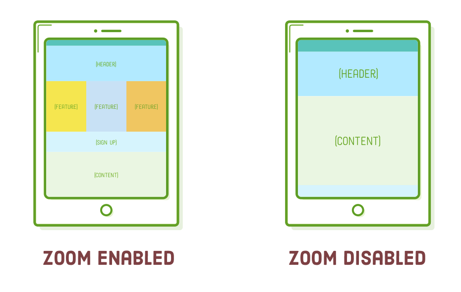
The default behavior of mobile devices, which can prevent them from using our mobile layout, is something we want to avoid. To disable this behavior, insert the following element into the <head> section of our document. Similar to <meta charset='UTF-8'/>, this is an essential element that should be included in every web page you build:
<meta name='viewport'
      content='width=device-width, initial-scale=1.0, maximum-scale=1.0' />
To witness this in practice, we'll need to emulate a mobile device within our desktop browser. While this might be a bit more advanced than our current level, we can give it a try. Here's how: Open responsive.html in Google Chrome, then go to View > Developer > Developer Tools from the menu. To simulate a mobile device, click on the Toggle Device Toolbar icon, which is highlighted below.

You should observe the diagram without zooming capabilities in your browser because it's currently mimicking a mobile device. (We'll reserve a detailed discussion of Chrome dev tools for a future tutorial.)
Summary
Believe it or not, that's all the essential information you need to create responsive websites. In essence, we focus on just three key aspects:
- The responsive design, which includes mockups for each layout,
- CSS rules for applying each of those layouts
- Media queries for selectively applying those CSS rules based on device dimensions
In this chapter, we began by exploring the distinction between fluid and fixed-width layouts. Subsequently, we crafted a mobile-first stylesheet, utilizing media queries to construct tablet and desktop layouts atop a common foundation of base styles. Lastly, we disabled the default viewport zoom functionality in mobile browsers.
So, that concludes the straightforward aspect of responsive design. In the upcoming chapter, we'll delve into the challenging aspect: images. While delivering distinct CSS to particular devices isn't overly complex, optimizing images for these devices demands more thoughtful consideration.