HTML form elements enable you to gather information from visitors to your website. Small websites often use them for tasks like managing mailing lists, receiving contact inquiries, and allowing blog post comments. However, for organizations that depend on their websites for revenue, forms hold significant importance and are treated with great respect.
Forms serve as the "key revenue drivers." They are instrumental in e-commerce platforms for selling products, SaaS companies for securing payments, and non-profit organizations for online fundraising. For numerous companies, a website's success is gauged by the efficiency of its forms, helping answer questions such as "how many leads were generated for our sales team?" and "how many users registered for our product in the past week?" Consequently, forms are frequently subjected to continuous A/B testing and enhancements.
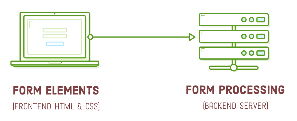
A functional HTML form comprises two key components: the frontend user interface and the backend server functionality. The frontend aspect encompasses the form's visual presentation, defined by HTML and CSS. Meanwhile, the backend aspect involves the code responsible for processing the form, which includes tasks like storing data in a database or sending emails. In this chapter, our focus will be exclusively on the frontend, with the discussion of backend form processing reserved for a future tutorial.
Setup
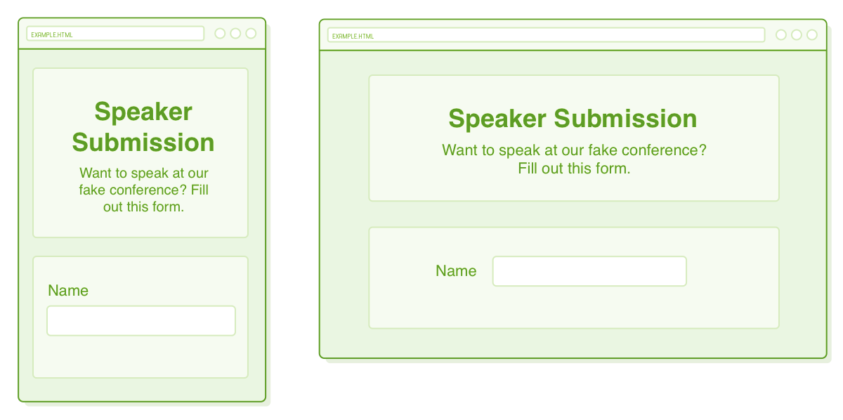
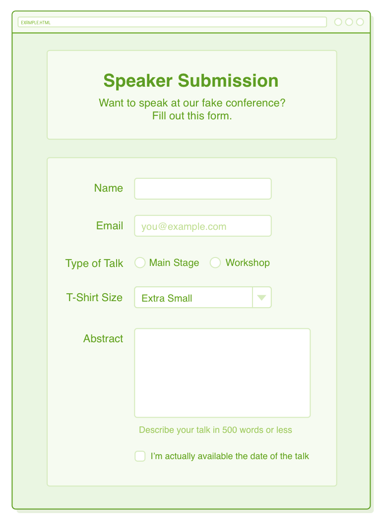
Regrettably, it's undeniable that styling forms can be a challenging task. It's essential to have a mockup that precisely depicts the page you intend to construct before you embark on the coding process, and this is especially crucial when working with forms. Therefore, the example we'll be crafting in this chapter serves as a practical illustration.
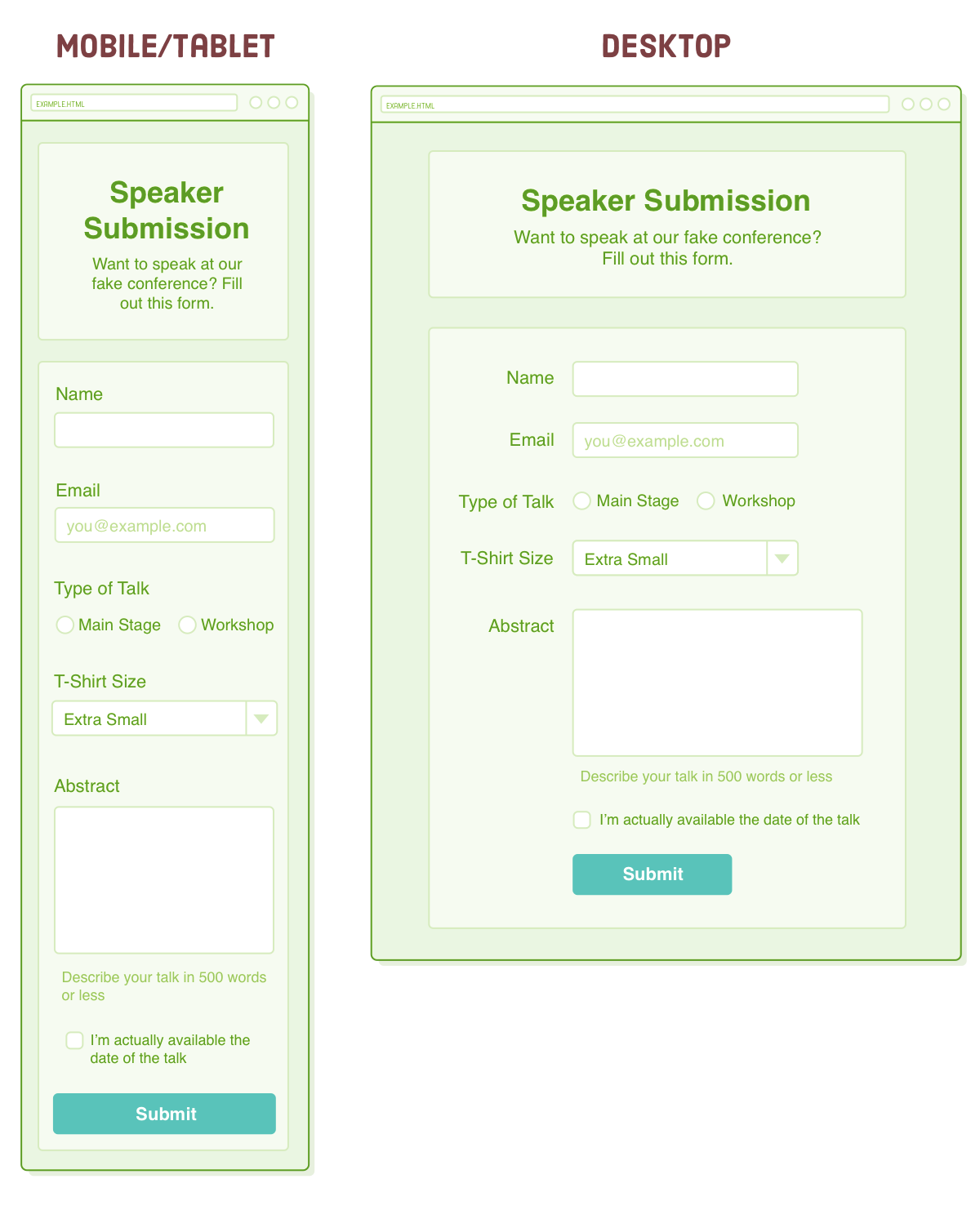
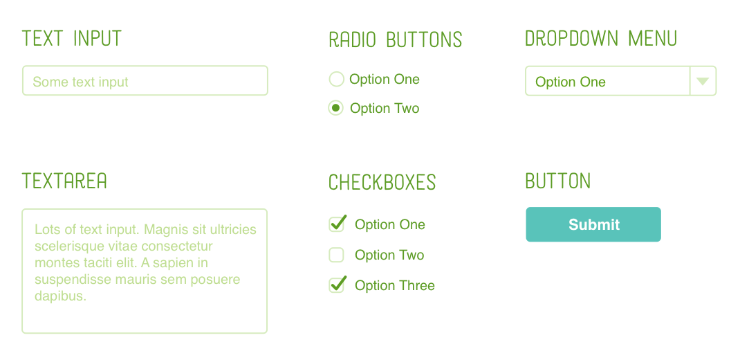
As observed, this represents a speaker submission form designed for a fictitious conference. It incorporates a comprehensive array of HTML form elements, including different text fields, a set of radio buttons, a dropdown menu, a checkbox, and a submission button.
Initiate a fresh project folder labeled "forms" and insert a new HTML file named "speaker-submission.html" within it. To begin, we'll include the markup for the header. (Notice that it employs some semantic HTML!)
<!DOCTYPE html>
<html lang='en'>
  <head>
    <meta charset='UTF-8'/>
    <title>Speaker Submission</title>
    <link rel='stylesheet' href='styles.css'/>
  </head>
  <body>
    <header class='speaker-form-header'>
      <h1>Speaker Submission</h1>
      <p><em>Want to speak at our fake conference? Fill out
        this form.</em></p>
    </header>
  </body>
</html>
Following that, generate a "styles.css" file and insert the provided CSS code below. This CSS utilizes a straightforward flexbox method to center both the header and the form, adapting to the width of the browser window seamlessly:
* {
  margin: 0;
  padding: 0;
  box-sizing: border-box;
}

body {
  color: #5D6063;
  background-color: #EAEDF0;
  font-family: "Helvetica", "Arial", sans-serif;
  font-size: 16px;
  line-height: 1.3;

  display: flex;
  flex-direction: column;
  align-items: center;
}

.speaker-form-header {
  text-align: center;
  background-color: #F6F7F8;
  border: 1px solid #D6D9DC;
  border-radius: 3px;

  width: 80%;
  margin: 40px 0;
  padding: 50px;
}

.speaker-form-header h1 {
  font-size: 30px;
  margin-bottom: 20px;
}
Take note that we are following the mobile-first development strategy, as explained in the Responsive Design section. These initial CSS rules establish our mobile layout and serve as a starting point for building the desktop layout as well. We will implement the media query for a fixed-width desktop layout in a subsequent section of this chapter.
HTML Forms
Now, let's dive into forms! Every HTML form starts with the appropriately named <form> element. While it can accept various attributes, the most crucial ones are "action" and "method." Feel free to insert an empty form into our HTML document, directly below the <header>:
<form action='' method='get' class='speaker-form'>
</form>
The "action" attribute specifies the URL responsible for handling the form. It determines where the data gathered from the form is directed when the user clicks the Submit button. Usually, this points to a dedicated URL set up by your web server, designed to handle data processing. Various backend technologies like Node.js, PHP, and Ruby on Rails are commonly used for form processing, but it's important to note that our focus in this chapter remains on the frontend.
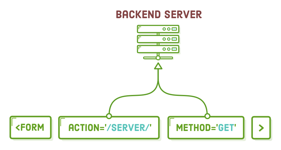
The "method" attribute offers two options: "post" or "get," each determining how the form is sent to the backend server. The choice between these methods largely depends on your web server's preferences. As a general guideline, "post" is typically used when you're altering data on the server, while "get" is reserved for retrieving data.
By keeping the "action" attribute empty, we are instructing the form to submit to the same URL. When combined with the "get" method, this allows us to examine the form's contents.
Styling Forms
Of course, we’re looking at an empty form right now, but that doesn’t mean we can’t add some styles to it like we would a container <div>. This will turn it into a box that matches our <header> element:
.speaker-form {
  background-color: #F6F7F8;
  border: 1px solid #D6D9DC;
  border-radius: 3px;

  width: 80%;
  padding: 50px;
  margin: 0 0 40px 0;
}
Text Input Fields
To effectively gather user input, we require a new element: <input/>. Place the following code within our <form> to generate a text field:
<div class='form-row'>
  <label for='full-name'>Name</label>
  <input id='full-name' name='full-name' type='text'/>
</div>
Initially, there's a container <div> that aids in styling, a practice commonly used for organizing input elements. Secondly, we encounter a <label>, which can be likened to other semantic HTML elements such as <article> or <figcaption>, but it's specifically designed for form labels. It's important to note that a label's "for" attribute must correspond to the "id" attribute of its associated <input/> element.
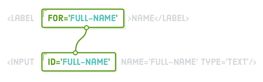
Next, the <input/> element generates a text field. It differs somewhat from the elements we've previously encountered because its appearance can vary significantly based on its "type" attribute. However, it consistently provides a means for users to interact and input data. As we progress through the chapter, we'll encounter various "type" attribute values. It's essential to keep in mind that using ID selectors is discouraged; in this context, the "id" attribute's sole purpose is to link it to a <label> element.
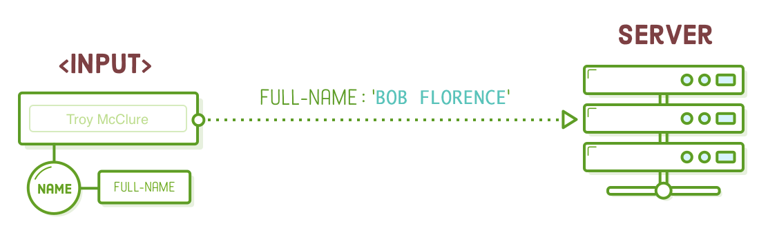
In essence, an <input/> element symbolizes a "variable" transmitted to the backend server. The "name" attribute specifies the name of this variable, while the "value" corresponds to the content entered by the user into the text field. It's worth mentioning that you can set an initial value by including a "value" attribute within the <input/> element.
Styling Text Input Fields
You can apply styling to an <input/> element just like you would with any other HTML element. We'll enhance its appearance by adding CSS to the "styles.css" file. This CSS incorporates principles from the "Hello, CSS," "Box Model," "CSS Selectors," and "Flexbox" chapters to achieve a more attractive design.
.form-row {
  margin-bottom: 40px;
  display: flex;
  justify-content: flex-start;
  flex-direction: column;
  flex-wrap: wrap;
}

.form-row input[type='text'] {
  background-color: #FFFFFF;
  border: 1px solid #D6D9DC;
  border-radius: 3px;
  width: 100%;
  padding: 7px;
  font-size: 14px;
}

.form-row label {
  margin-bottom: 15px;
}
The "input[type='text']" segment represents a novel CSS selector known as an "attribute selector." It exclusively selects <input/> elements that possess a "type" attribute set to "text." This precision allows us to specifically style text fields, distinguishing them from radio buttons, which share the same HTML element structure (""). For more information on attribute selectors, you can refer to w3schools.com.
All our styles are enclosed within a ".form-row" descendant selector. This practice of segregating styles for <input/> and <label> elements simplifies the process of designing diverse forms. We'll appreciate the convenience of steering clear of global "input[type='text']" and label selectors when we start working with radio buttons later on.
To complete our adjustments, let's refine these foundational styles to craft our desktop layout. Append the following media query to the end of our stylesheet.
@media only screen and (min-width: 700px) {
  .speaker-form-header,
  .speaker-form {
    width: 600px;
  }
  .form-row {
    flex-direction: row;
    align-items: flex-start; /* To avoid stretching */
    margin-bottom: 20px;
  }
  .form-row input[type='text'] {
    width: 250px;
    height: initial;
  }
  .form-row label {
    text-align: right;
    width: 120px;
    margin-top: 7px;
    padding-right: 20px;
  }
}
Take note of the clever utilization of the "flex-direction" property, which positions the <label> element above its corresponding <input/> element in the mobile layout, but shifts it to the left of the input in the desktop layout.
Email Input Fields
The "type" attribute of the <input/> element also provides the capability for basic input validation. To illustrate, let's introduce another input element that exclusively accepts email addresses instead of generic text entries:
<div class='form-row'>
  <label for='email'>Email</label>
  <input id='email'
         name='email'
         type='email'
         placeholder='joe@example.com'/>
</div>
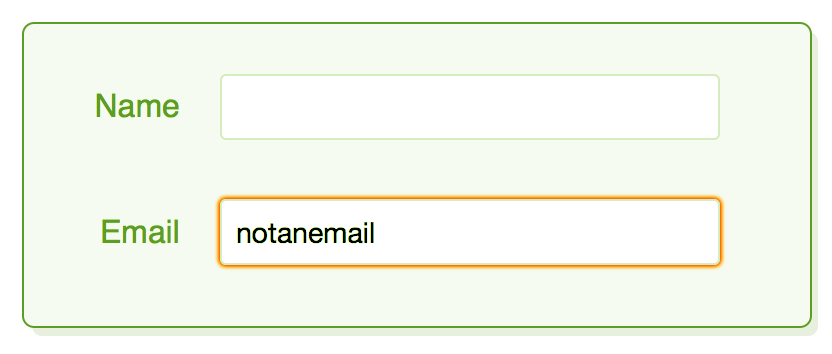
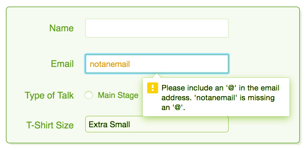
This operates in the same manner as the "type='text'" input, but it performs an automatic check to ensure that the user has entered a valid email address. In Firefox, you can experiment by entering something that doesn't resemble an email address, then clicking outside of the field to trigger its validation. In such cases, it should change to a red color to indicate that the value is incorrect. Chrome and Safari, on the other hand, delay validation until the user attempts to submit the form, which we'll explore further in this chapter.
However, this feature extends beyond mere validation. By specifying to browsers that we expect an email address, they can enhance the user experience. For example, when a smartphone browser encounters the "type='email'" attribute, it presents the user with a specialized email-oriented keyboard that includes easy access to the "@" character.
Additionally, take note of the recently introduced "placeholder" attribute, which allows you to exhibit default text when the <input/> element is devoid of content. This serves as a useful user experience (UX) technique to encourage users to provide their own input.
Apart from email address validation, there are numerous other built-in validation choices available, which you can explore further in w3schools.com's <input/> reference. Particularly noteworthy are attributes like "required," "minlength," "maxlength," and "pattern."
Styling Email Input Fields
To align our email field with the text field from the previous section, let's include an additional attribute selector within the existing rule for "input[type='text']," as follows:
/* Change this rule */
.form-row input[type='text'] {
  background-color: #FFFFFF;
  /* ... */
}

/* To have another selector */
.form-row input[type='text'],
.form-row input[type='email'] {
  background-color: #FFFFFF;
  /* ... */
}
Once more, it's essential to avoid utilizing a generic input type selector here because it would apply styling to all our <input/> elements, including the forthcoming radio buttons and checkboxes. This complexity underscores the challenge of styling forms. Mastering the CSS techniques to precisely target specific elements is a valuable skill in this context.
We shouldn't overlook our desktop styles. Modify the relevant rule for "input[type='text']" within our media query to align with the following code (keep in mind that we're preparing for upcoming sections that involve the "select" and "textarea" selectors):
@media only screen and (min-width: 700px) {
  /* ... */
  .form-row input[type='text'],
  .form-row input[type='email'],    /* Add */
  .form-row select,                 /* These */
  .form-row textarea {              /* Selectors */
    width: 250px;
    height: initial;
  }
  /* ... */
}
Now that we can distinguish between "correct" and "incorrect" input values, it's a good practice to communicate this to users. The use of ":invalid" and ":valid" pseudo-classes allows us to style these states separately. For instance, we might decide to display both the border and text in a custom shade of red when a user enters an unacceptable value. You can incorporate the following rule into our stylesheet, but ensure it's outside of the media query:
.form-row input[type='text']:invalid,
.form-row input[type='email']:invalid {
  border: 1px solid #D55C5F;
  color: #D55C5F;
  box-shadow: none; /* Remove default red glow in Firefox */
}
You'll only be able to observe this behavior in Firefox until we add a submit button, but it illustrates the concept. There's a corresponding pseudo-class called ":focus" that targets the element currently being filled out by the user. This provides a considerable degree of control over how your forms appear.
Radio Buttons
When you alter the "type" property of the <input/> element to "radio," it transforms into a radio button. Radio buttons are slightly more intricate to handle compared to text fields because they invariably function in groups, permitting the user to select a single option from several predefined choices.
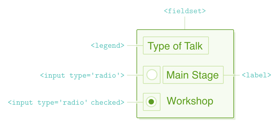
Consequently, it's essential to provide not only a label for each individual <input/> element but also a means to group the radio buttons and label the entire set. This is where the <fieldset> and <legend> elements come into play. For every radio button group you establish, remember to:
- Should be enclosed within a <fieldset> element, which is captioned using a <legend> element.
- Link a <label> element to each radio button.
- Apply the identical "name" attribute to all radio buttons within the group.
- Employ distinct "value" attributes for each radio button.
Our radio button example incorporates all of these elements. Insert the following code into our <form> element, right below the email field:
<fieldset class='legacy-form-row'>
  <legend>Type of Talk</legend>
  <input id='talk-type-1'
         name='talk-type'
         type='radio'
         value='main-stage' />
  <label for='talk-type-1' class='radio-label'>Main Stage</label>
  <input id='talk-type-2'
         name='talk-type'
         type='radio'
         value='workshop'
         checked />
  <label for='talk-type-2' class='radio-label'>Workshop</label>
</fieldset>
Unlike text fields, users can't input custom values into a radio button. That's why each radio button must have a defined "value" attribute. This value will be transmitted to the server when the user submits the form. Equally crucial is ensuring that each radio button shares the same "name" attribute; otherwise, the form wouldn't recognize them as part of the same group.
We've also introduced a new attribute called "checked." This is a "boolean attribute," which means it doesn't require a value; it either exists or doesn't exist on an <input/> element. If it is present on either a radio button or a checkbox element, that element will be automatically selected or checked by default.
Styling Radio Buttons
Several challenges present themselves when it comes to styling radio buttons. First, there are more elements to consider. Second, the default styles for the <fieldset> and <legend> elements are not particularly attractive, and there's a lack of uniformity in these defaults among different browsers. Third, as of this writing, <fieldset> doesn't provide support for flexbox.
But there's no need to worry! This situation highlights how floats can serve as a valuable alternative for dealing with legacy or problematic elements. You may have observed that we haven't enclosed the radio buttons within our existing `.form-row` class; instead, we've introduced a new `.legacy-form-row` class. This separation is intentional because it will function independently of our other elements, relying on floats instead of flexbox for styling.
Let's commence with the styles for mobile and tablet devices by incorporating the subsequent rules outside of our media query. Our objective here is to eliminate the default styles for <fieldset> and <legend> elements, and then employ float to align the radio buttons and labels so that they appear in a single line below the <legend>:
.legacy-form-row {
  border: none;
  margin-bottom: 40px;
}

.legacy-form-row legend {
  margin-bottom: 15px;
}

.legacy-form-row .radio-label {
  display: block;
  font-size: 14px;
  padding: 0 20px 0 10px;
}

.legacy-form-row input[type='radio'] {
  margin-top: 2px;
}

.legacy-form-row .radio-label,
.legacy-form-row input[type='radio'] {
  float: left;
}
To achieve the desired desktop layout, we must ensure that the <legend> element aligns with the <label> elements from the previous section. Hence, we include the line "width: 120px" to achieve this alignment. Additionally, we need to float all elements to the left so that they appear on the same line. Modify our media query to include the following code:
@media only screen and (min-width: 700px) {
  /* ... */
  .legacy-form-row {
    margin-bottom: 10px;
  }
  .legacy-form-row legend {
    width: 120px;
    text-align: right;
    padding-right: 20px;
  }
  .legacy-form-row legend {
    float: left;
  }
}
In terms of layouts, this presents a fairly effective cross-browser solution. However, when it comes to customizing the visual style of the actual radio button, it's a different challenge. It is achievable by leveraging the "checked" attribute, but the process can be somewhat intricate. We encourage you to explore this topic further by conducting a web search for "custom radio button CSS" and diving into the details on your own.
Select Elements (Dropdown Menus)
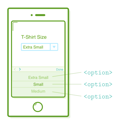
Dropdown menus provide an alternative to radio buttons, allowing users to choose one option from a list. The <select> element represents the dropdown menu and contains a series of <option> elements, each representing an individual item in the list.
<div class='form-row'>
  <label for='t-shirt'>T-Shirt Size</label>
  <select id='t-shirt' name='t-shirt'>
    <option value='xs'>Extra Small</option>
    <option value='s'>Small</option>
    <option value='m'>Medium</option>
    <option value='l'>Large</option>
  </select>
</div>
Similar to our radio button <input/> elements, we utilize "name" and "value" attributes that are sent to the backend server. However, instead of being confined to a single element, these attributes are distributed between the <select> and <option> elements.
Styling Select Elements
Similarly to our radio buttons, styling <select> elements can be quite challenging. However, there's a rationale behind this difficulty. Dropdown menus are a complex interactive component, and their behavior varies substantially across various devices. For instance, when you click a <select> element on an iPhone, it triggers a native scrolling user interface component, simplifying menu navigation.
Generally, it's advisable to allow the browser or device to decide the optimal way to present a <select> element. Therefore, we'll maintain a relatively straightforward CSS approach. However, it's worth noting that even seemingly basic adjustments can prove unexpectedly challenging. For instance, attempt to modify the font size of our <select> element:
.form-row select {
  width: 100%;
  padding: 5px;
  font-size: 14px;            /* This won't work in Chrome or Safari */
}
This adjustment will function correctly in Firefox but not in Chrome or Safari. To address this issue to some extent, we can employ a vendor-specific prefix for the "appearance" property:
.form-row select {
  width: 100%;
  padding: 5px;
  font-size: 14px;            /* This won't work in Chrome or Safari */
  -webkit-appearance: none;   /* This will make it work */
}
The "-webkit" prefix will exclusively impact Chrome and Safari, both of which rely on the WebKit rendering engine, while Firefox will remain unaffected. It's important to note that this approach is essentially a workaround, and even the Mozilla Developer Network (MDN) advises against using this CSS property.
Challenges with styling like this should be taken seriously when constructing a form. If you require customized styles, it might be more practical to opt for radio buttons or JavaScript-based UI components. Popular JavaScript solutions for enhancing select menus include Bootstrap Dropdowns and jQuery Selectmenus. In any case, you now have a grasp of the issue at hand. Further information about <select> challenges can be found here.
TextAreas
The <textarea> element generates a multi-line text field specifically designed for gathering substantial amounts of text from users. They are well-suited for tasks such as composing biographies, essays, and providing comments. Feel free to insert a <textarea> into our form, accompanied by a brief instructional message:
<div class='form-row'>
  <label for='abstract'>Abstract</label>
  <textarea id='abstract' name='abstract'></textarea>
  <div class='instructions'>Describe your talk in 500 words or less</div>
</div>
It's important to observe that the <textarea> element isn't self-closing like the <input/> element, so you should always include a closing </textarea> tag. If you intend to provide default text, it should be placed within the tags rather than using a "value" attribute.
Styling TextAreas
Thankfully, the process of styling textareas is relatively uncomplicated. Include the following code in our "styles.css" file (prior to the media query section):
.form-row textarea {
  font-family: "Helvetica", "Arial", sans-serif;
  font-size: 14px;

  border: 1px solid #D6D9DC;
  border-radius: 3px;

  min-height: 200px;
  margin-bottom: 10px;
  padding: 7px;
  resize: none;
}

.form-row .instructions {
  color: #999999;
  font-size: 14px;
  margin-bottom: 30px;
}
By default, numerous browsers allow users to resize <textarea> elements to their preferred dimensions. However, in this instance, we have deactivated this feature using the "resize" property.
We also require a minor adjustment in our desktop layout. The `.instructions <div>` should be positioned beneath the <textarea>, so let's shift it to the left by the width of the <label> column. Append the following rule to the conclusion of our media query:
@media only screen and (min-width: 700px) {
  /* ... */
  .form-row .instructions {
    margin-left: 120px;
  }
}
CheckBoxes
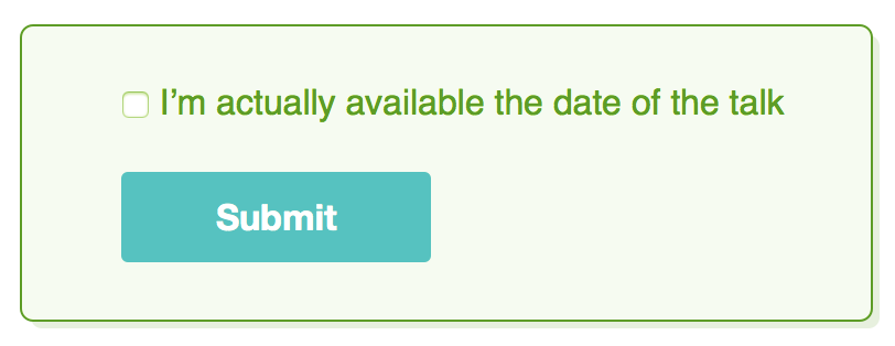
Checkboxes are somewhat similar to radio buttons, but unlike radio buttons, they allow the user to select as many options as they desire. This simplifies matters because the browser doesn't need to discern which checkboxes belong to the same group. In other words, we don't require a <fieldset> container or shared "name" attributes. To incorporate checkboxes, append the following code to the end of our form:
<div class='form-row'>
  <label class='checkbox-label' for='available'>
  <input id='available'
         name='available'
         type='checkbox'
         value='is-available'/>
  <span>I’m actually available the date of the talk</span>
  </label>
</div>
In this instance, our usage of the <label> element differs slightly from earlier sections. Rather than being a distinct element, the <label> envelops its associated <input/> element. This approach is entirely permissible and simplifies the alignment with our intended layout. However, it remains a best practice to employ the "for" attribute when using this method.
Styling Checkboxes
To adapt the mobile layout, our task primarily involves overriding the "margin-bottom" we applied to the other <label> elements. Integrate the following code into the "styles.css" file, but ensure it's located outside of the media query:
.form-row .checkbox-label {
  margin-bottom: 0;
}
Within the media query, we must consider the presence of the 120-pixel label column:
@media only screen and (min-width: 700px) {
  /* ... */
  .form-row .checkbox-label {
    margin-left: 120px;
    width: auto;
  }
}
By encapsulating both the checkbox and the label text within the same container, we can employ a "width: auto" property to ensure that the entire form field remains on a single line. Remember that setting the width to "auto" adjusts the box size to fit its contents.
Submit Buttons
Lastly, let's complete our form by adding a submit button. The <button> element serves as a button that will submit the form it is contained within:
<div class='form-row'>
  <button>Submit</button>
</div>
When you click the button, the browser initiates a process wherein it validates all of the <input/> elements within the form. If there are no validation issues, the browser proceeds to submit the form to the designated action URL. Therefore, you should now be able to input something that doesn't resemble an email address into our email field, click the <button>, and observe an error message.
This also provides an opportunity to examine how the user's input is transmitted to the server. Begin by entering values into all the <input/> fields, ensuring that the email address validation is successful. Next, click the button and scrutinize the URL that appears in your browser. It should resemble something along these lines:
speaker-submission.html?full-name=Bob&email=bob%40quizzets.wgu.edu&talk-type=workshop&t-shirt=l&abstract=Derp.&available=is-available
Everything appearing after the "?" symbol signifies the variables from our form. Each <input/> element's "name" attribute is followed by an equal sign, then its corresponding value, and each variable is delimited by an "&" character. If we had a backend server, it would be relatively straightforward for it to extract this data, execute database queries (or any other necessary operations), and subsequently inform us about the success or failure of the form submission.
Styling Buttons
We gained some experience in styling buttons when exploring pseudo-classes in the CSS Selectors chapter. In that context, we applied these styles to an <a> element, but it's worth noting that we can utilize the same techniques for styling a <button>.
Enhance the unattractive default styling of the <button> element by including the following code in our stylesheet:
.form-row button {
  font-size: 16px;
  font-weight: bold;

  color: #FFFFFF;
  background-color: #5995DA;

  border: none;
  border-radius: 3px;

  padding: 10px 40px;
  cursor: pointer;
}

.form-row button:hover {
  background-color: #76AEED;
}

.form-row button:active {
  background-color: #407FC7;
}
Similar to our approach with the checkbox, we must consider the 120px label column within the media query. Therefore, include one more rule within our media query as follows:
@media only screen and (min-width: 700px) {
  /* ... */
  .form-row button {
    margin-left: 120px;
  }
}
Summary
In this chapter, we've introduced the most frequently used HTML form elements. We now possess a comprehensive set of tools for gathering input from visitors to our website:
- <input/> elements for text, email, radio buttons, and checkboxes
- <select> and <option> elements for dropdown menus
- <textarea> elements for multi-line text fields
- <button> elements for submitting forms
You should now have a solid grasp of the HTML and CSS necessary to construct visually appealing forms. However, making these forms fully functional entails skills that are beyond the scope of this tutorial. Nonetheless, gaining some context might be helpful. Broadly speaking, there are two methods for processing forms:
- Utilize the "action" attribute to transmit the form data to a backend URL, which subsequently directs to either a success or error page. We obtained a brief glimpse of this process in the previous section, and it doesn't necessitate the use of JavaScript.
- Employ AJAX requests to submit the form seamlessly without navigating away from the current page. Success or error messages are exhibited on the same page through JavaScript, which manipulates the HTML content.
The extent of your responsibilities as a frontend web developer in terms of form processing can vary depending on your organization's structure. If form processing falls outside your role, you may need to collaborate closely with a backend developer on your team to ensure that the <form> accurately submits the appropriate name-value pairs. Alternatively, if you're responsible for both frontend and backend aspects, it's your duty to ensure a seamless integration between the frontend and backend components of your forms.
Moving forward, we're approaching the last chapter of Demystified HTML & CSS. To complete our frontend skill set, we'll delve into an in-depth exploration of web fonts and essential typographic principles that are essential knowledge for every web developer.