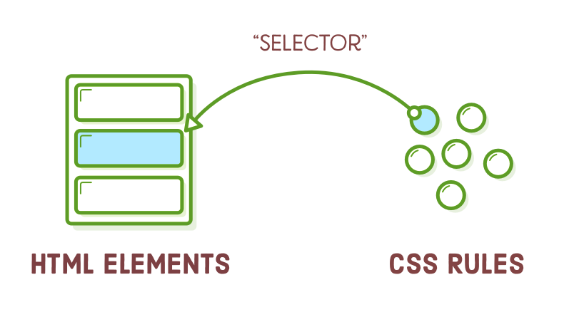
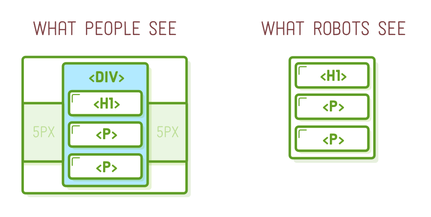
In the Links and Images chapter from earlier, we discovered how to link an HTML document to various files within our project. "CSS selectors" operate in a similar fashion, but instead of navigating between entire files, they enable us to associate a single CSS rule with a particular HTML element. This allows us to apply styles selectively to specific elements while leaving others unaffected.
Unless you aim for a uniform appearance across all sections of your website, this functionality becomes essential. It's what allows us to specify preferences like "I want this paragraph to be in blue, and that other one to be in yellow." Up until this point, we've only had the capability to make all our paragraphs either blue or yellow, without individual control.
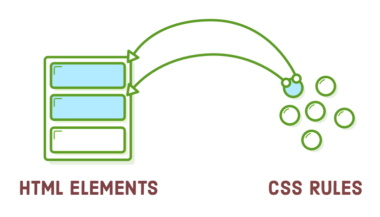
Up to this point, we've primarily used the "element selector" as our CSS selector, which applies to all elements of a specific type on a page. In this chapter, we'll delve into more refined methods of styling a webpage. These methods include class selectors, descendant selectors, pseudo-classes, and ID selectors, allowing for more precise and nuanced control over styling.
Setup
For our example in this chapter, we'll require just one HTML file and a CSS stylesheet. Begin by setting up a new directory named "css-selectors" and crafting a fresh webpage named "selectors.html" with the following code:
<!DOCTYPE html>
<html lang='en'>
<head>
<meta charset='UTF-8'/>
<title>CSS Selectors</title>
<link rel='stylesheet' href='styles.css'/>
</head>
<body>
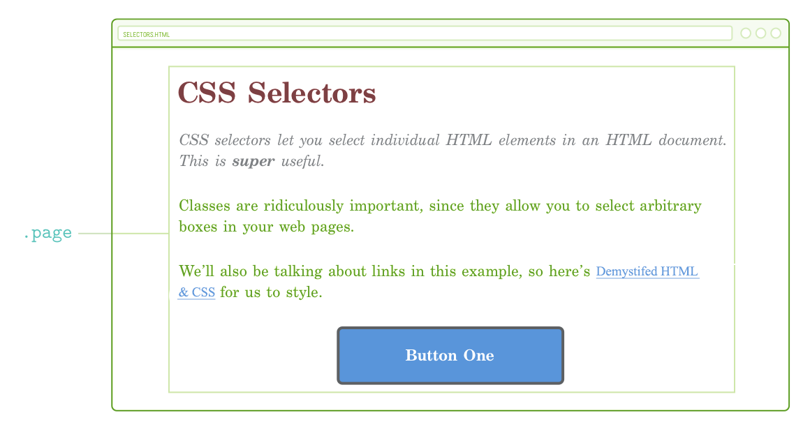
<h1>CSS Selectors</h1>
<p>CSS selectors let you <em>select</em> individual HTML elements in an HTML
document. This is <strong>super</strong> useful.</p>
<p>Classes are ridiculously important, since they allow you to select
arbitrary boxes in your web pages.</p>
<p>We’ll also be talking about links in this example, so here’s
<a href='https://quizzets.wgu.edu/tutorial/demystified/index.html'>Demystified HTML & CSS</a> for us to
style.</p>
<div>Button One</div>
</body>
</html>
Feel free to generate the "styles.css" stylesheet in the same directory as well. This equips us with all the necessary tools to delve into CSS selectors.
If you're new to this tutorial series, take a moment to glance through the Introduction to get yourself ready with the project setup.
Class Selectors
"Class selectors" enable you to assign CSS styles to a particular HTML element, allowing you to distinguish between HTML elements of the same type. For example, in the previous chapter, when we had two <div> elements and wished to style only one of them. Class selectors necessitate two key components:
- An attribute with a class designation applied to the relevant HTML element.
- A corresponding CSS class selector within your stylesheet.
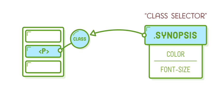
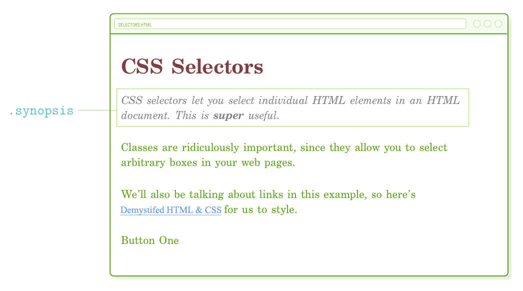
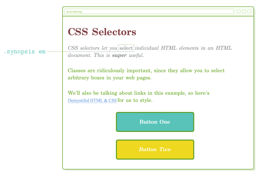
We can employ a class selector to apply a distinct style to the initial paragraph on our sample page, setting it apart from the others. This might represent, for example, the summary of a newspaper article. To begin, let's include a class attribute to the intended paragraph:
<p class='synopsis'>CSS selectors let you <em>select</em> individual HTML
   elements in an HTML document. This is <strong>super</strong> useful.</p>
Now, we can specifically target the <p class='synopsis'> element in our CSS by adding the following code to styles.css:
.synopsis {
  color: #7E8184;        /* Light gray */
  font-style: italic;
}
This rule exclusively affects elements that possess the corresponding class attribute. Take note of the dot (.) preceding the class name. This dot differentiates class selectors from the type selectors we have used in previous chapters.
Class Naming Conventions
You can assign (almost) any value you prefer to the HTML class attribute, as long as it aligns with the selector in your CSS. A commonly accepted convention for naming classes is to employ all lowercase letters and hyphens for spaces, similar to how you name files and folders.
Incorporating a class attribute doesn't change the inherent semantic meaning of your HTML document; its purpose is solely to connect with your CSS stylesheet. Nonetheless, it's generally advisable to refrain from naming classes solely based on their visual characteristics. For instance, if we decided to name our class .italic, it would limit us to making it italic in our CSS, potentially causing confusion. Opting for a more semantic name like .synopsis provides greater flexibility for our CSS to define how that synopsis should be presented.
More Useful DIVs
The class attribute isn't restricted to <p> elements; it can be applied to any HTML element. Consequently, with the aid of CSS class selectors, our generic <div> and <span> containers from the previous chapter gain significantly enhanced versatility. They can be employed for styling both individual elements and arbitrary portions of our web page.
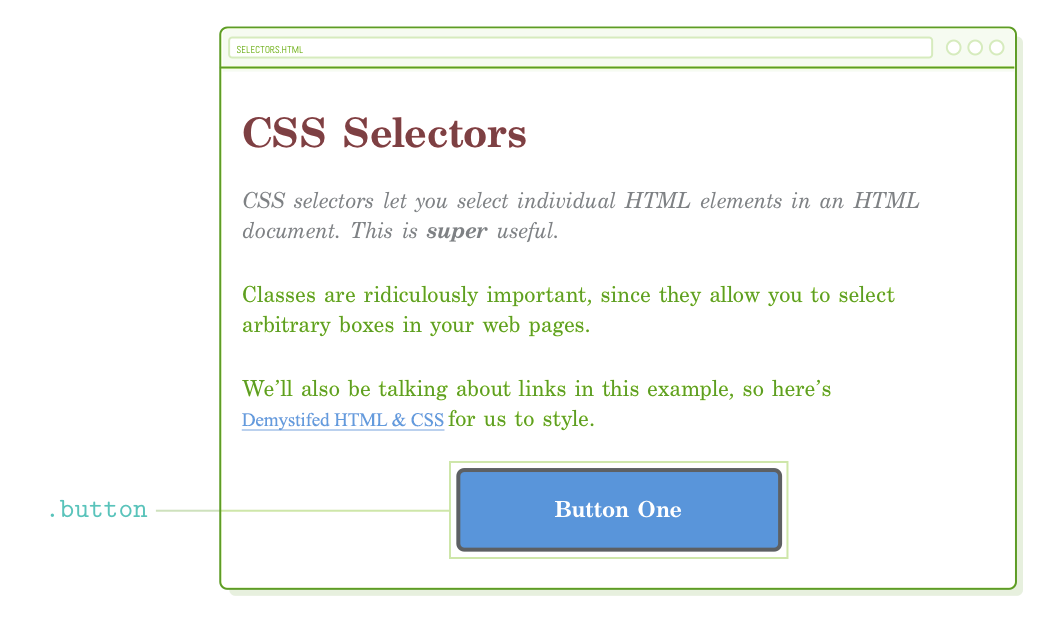
To begin, we'll focus on individual elements by reconstructing the button we created in the previous chapter. This time, we'll utilize a class instead of a div selector. Include the following code in styles.css:
.button {
  color: #FFF;
  background-color: #5995DA;    /* Blue */
  font-weight: bold;
  padding: 20px;
  text-align: center;
  border: 2px solid #5D6063;    /* Dark gray */
  border-radius: 5px;

  width: 200px;
  margin: 20px auto;
}
Naturally, for this to function correctly, we must introduce a corresponding class attribute. Modify the <div> element in selectors.html to align with the following:
<div class='button'>Button One</div>
In contrast to the previous chapter, where all the <div> elements shared the same style, this approach allows us to utilize it for purposes beyond just buttons.
Container DIVs
Keep in mind that using <div> doesn't change the underlying semantic structure of a page. This makes it a valuable tool for establishing the visual layout of a web page. By enveloping other HTML elements with <div> tags, we can arrange our site into larger, design-oriented sections without affecting how search engines interpret our content.
As an illustration, let's attempt to craft a fixed-width layout using the auto-margin method we studied in the preceding chapter. Initially, encompass our entire document within a generic <div> element and assign it a distinctive class:
<body>
  <div class='page'>  <!-- Add this -->
    <h1>CSS Selectors</h1>

    <p  class='synopsis'>CSS selectors let you <em>select</em> individual HTML
    elements in an HTML document. This is <strong>super</strong> useful.</p>

    <p>Classes are ridiculously important, since they allow you to select
    arbitrary boxes in your web pages.</p>

    <p>We’ll also be talking about links in this example, so here’s
    <a href='https://quizzets.wgu.edu/tutorial/demystified/index.html'>Demystified HTML & CSS</a> for us to
    style.</p>

    <div class='button'>Button One</div>
  </div>  <!-- And this -->
</body>
Next, append the following code to styles.css:
.page {
  width: 600px;
  margin: 0 auto;
}
Irrespective of how you adjust the size of the browser window, our webpage will consistently maintain a width of 600 pixels and remain centered within the available space. It's worth noting that this approach mirrors how we centered our button earlier, but now we're applying it to multiple elements simultaneously by enclosing them within a generic container.
This is the method by which layouts are structured in more intricate web pages. For example, if our page included a sidebar, we would enclose all the sidebar elements within another <div> element having a .sidebar class. We'll observe this in practice in the forthcoming chapter. At this moment, the fundamental point to grasp is that, without class selectors to distinguish our <div> elements, none of these layout arrangements would be achievable.
Reusing Class Styles
A single class can be assigned to multiple elements within a single HTML document. Consequently, we gain the ability to reuse specific CSS declarations wherever needed. To generate another button, simply insert an additional HTML element with the identical class:
<div class='button'>Button One</div>
<div class='button'>Button Two</div>
This grants us a second button with an appearance identical to the first, and all of this is accomplished without the need to write any additional CSS code! Structuring similar visual components into reusable CSS rules in this manner significantly simplifies the tasks of web development. If, for instance, we decided to modify the button's color, we'd only need to make the change in one location, and all of our buttons would promptly reflect the update.
Modifying Class Styles
Suppose we wish to make some adjustments to our second button. Thankfully, we can assign multiple classes to the same HTML element as well. This allows us to apply styles from each class to the element, enabling us to reuse styles from the .button class while also overriding them with a new class.
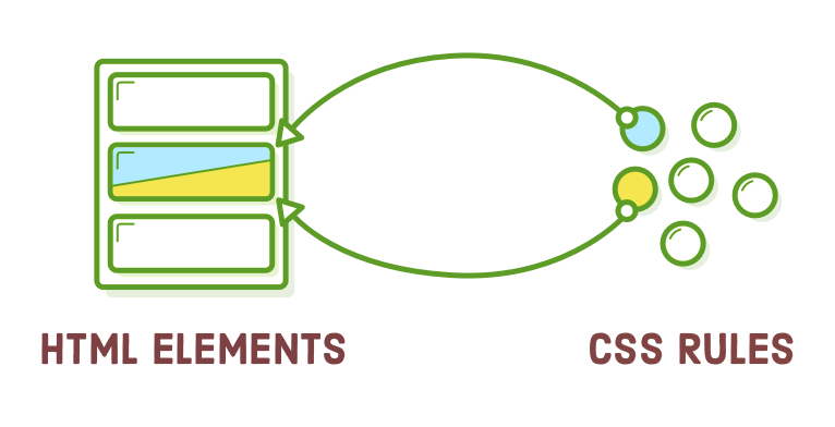
Feel free to include an additional class in our second button using the following code. Observe how multiple classes coexist within the same class attribute, separated by spaces:
<div class='button call-to-action'>Button Two</div>
Now, this element possesses two distinct classes, and we have the flexibility to apply styling using either of them. This provides various possibilities. Common styles shared by both buttons can be defined within the .button class (as they are currently), while styles specific to the second button can be specified in the .call-to-action class (make sure to include this after the .button rule):
.call-to-action {
  font-style: italic;
  background-color: #EEB75A;    /* Yellow */
}
Order Matters
A couple of significant aspects are in play with our second button at this point:
- It's incorporating an additional font-style declaration into the initial .button rule.
- It's replacing a pre-existing background-color style from the .button class.
The reason for this override is the arrangement of .call-to-action and .button in our stylesheet. When two conflicting properties exist in a CSS file, the one defined last takes precedence. Therefore, if you were to place .call-to-action at the beginning of styles.css, the .button would have the ultimate say in determining the background-color value, and it would retain its blue color.
This implies that the sequence of class attributes in our HTML element does not influence the override behavior. When multiple classes are assigned to a single element, they are applied with equal weight, and the order of rules in styles.css exclusively determines precedence. In essence, the following elements are essentially the same:
<!-- These result in the same rendered page -->
<div class='button call-to-action'>Button Two</div>
<div class='call-to-action button'>Button Two</div>
However, things become more intricate when CSS specificity comes into play, a topic we will delve into at the conclusion of this chapter.
Descendant Selectors
You might have observed that the <em> tag in our initial paragraph is now indistinguishable from the surrounding text because our .synopsis rule italicized everything.
To modify the <em> element, we could assign an additional class directly to it, but this approach wouldn't lead to easily maintainable code. Our goal is to consider .synopsis as a standalone component that we can style entirely using CSS, without needing to make changes to our HTML solely for styling purposes.
This is where "descendant selectors" come into play. They enable you to focus exclusively on elements that are nested within another element. For instance, we can extract the <em> tag within the .synopsis paragraph using the following method:
.synopsis em {
  font-style: normal;
}
Incorporating this rule into styles.css will cause the <em> tag to be rendered as regular (roman) characters, thereby distinguishing it from the italics applied to the entire <p> text. The remaining <em> elements on the page will remain unaffected.
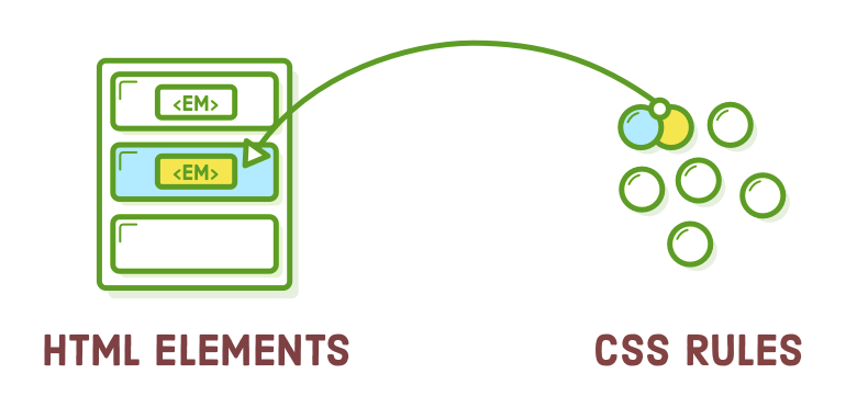
Descendant selectors are not restricted to class selectors; you can combine them with any other set of selectors in a similar manner. For example, if we wished to target only <em> elements nested within headings, we could utilize a construction like this:
h1 em {
  /* Some other styles */
}
Once more, the aim of this chapter is to empower you to apply styles precisely to the desired elements. Descendant selectors serve as an excellent tool for achieving this goal. If you have additional space in your toolkit, you might also want to explore the "child selector," which is closely related and can be found on w3shools.com.
Don't Overdo It
You can nest descendant selectors to any level, but exercise caution and avoid going overboard. Things become confusing and messy when you start crafting rules that resemble this:
/* Try to avoid this */
.article h2 .subheading em {
  /* Special styles */
}
This lacks reusability because it exclusively matches the following HTML structure:
<div class='article'>
  <h2>
    <span class='.subheading'>This is <em>really</em> special text</span>
  </h2>
</div>
If you ever wished to apply these styles to an <h2> heading that isn't enclosed within <div class='article'> tags, you'll encounter difficulties. Similarly, if you want to apply them to an <h3> heading anywhere on the page, you'll face the same issue. This type of CSS also contributes to a specificity dilemma.
Link Pseudo-Classes
Up to this point, all the CSS selectors we've encountered directly correspond to a segment of HTML markup that we have created. Nonetheless, a rendered web page contains more than just our authored HTML content. It also encompasses "stateful" information about the user's actions, distinct from the content we've generated.
A prime illustration of this concept is a hyperlink. In your role as a web developer, you craft an <a href> element. Subsequently, when the browser displays it, the user can engage with this hyperlink. They have the capability to hover over it, click on it, and navigate to the specified URL.
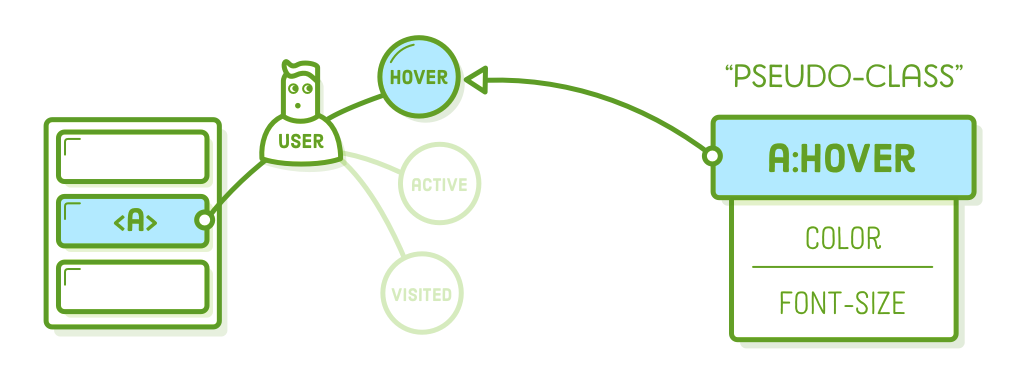
CSS "pseudo-classes" offer a means to tap into this sort of temporary user data. An <a href> element can assume various states at any moment, and you can employ pseudo-classes to apply distinct styles to each of these states. Consider them as predefined class selectors integrated into the browser, eliminating the need for you to define them manually.
Basic Link Styles
Pseudo-classes commence with a colon, followed by the name of the intended class. The most frequently used link pseudo-classes include:
- :link – A hyperlink that the user hasn't previously visited.
- :visited – A hyperlink that the user has previously visited.
- :hover – A hyperlink when the user's mouse pointer is positioned over it.
- :active – A hyperlink that is currently being clicked on with a mouse (or finger).
Now, let's examine all of these by incorporating the subsequent rules into our CSS stylesheet (also observe our utilization of keyword colors instead of the customary hex codes):
a:link {
  color: blue;
  text-decoration: none;
}
a:visited {
  color: purple;
}
a:hover {
  color: aqua;
  text-decoration: underline;
}
a:active {
  color: red;
}
If you've never visited the Quizzets.wgu.edu homepage, you will encounter a blue hyperlink. Conversely, if you have previously visited it, the link will appear purple. When you hover your cursor over the link, it will transform into an aqua color, and when you click on it, it will change to red.
Visited Hover State
The previous code snippet works well for the majority of websites. However, pay attention to the behavior of a:visited by modifying the href attribute to a URL you've visited before. Our a:hover style is applied to both visited and unvisited links. To further enhance our links, we can combine pseudo-classes. Include the following code below the previous snippet:
a:visited:hover {
  color: orange;
}
This establishes a distinct hover style for visited links. When you hover over an unvisited link, it shifts to aqua, and when you hover over a visited link, it changes to orange. It works wonderfully! However, there's a catch: it disrupts our a:active style because of certain intricate CSS mechanisms that you probably don't want to delve into. Consequently, when you click on a link, it will no longer change to red.
Visited Active State
We can resolve this issue using a:visited:active. Append the following code to the conclusion of our stylesheet. Keep in mind that, similar to our .call-to-action class, the sequence in which these are defined in styles.css holds significance:
a:visited:active {
  color: red;
}
These final two sections enable you to apply distinct styles to visited links, completely distinct from those applied to unvisited ones. It's a valuable option to have, but of course, you can choose to stick with basic link styles if that's all you require.
Button Pseudo-Classes
Pseudo-classes serve a broader purpose beyond styling text links; they can be used with various selectors, not limited to type selectors. Instead of applying styles to a:link and similar elements, in this section, we'll be using pseudo-classes to enhance our .button class. This approach allows us to create functional buttons that lead to specific destinations.
Link Elements, Not DIV Elements
To start, we should transform our buttons into <a href> elements instead of generic <div> elements, as demonstrated below:
<a class='button' href='nowhere.html'>Button One</a>
<a class='button call-to-action' href='nowhere.html'>Button Two</a>
Upon reloading this in your browser, you'll notice that some of our styles have disappeared, despite using the same classes. This occurs because the <a> element is inherently inline and comes with a default color value.
We must convert it into a block element and eliminate some of the default link styling.
Button Styles
Let's begin with the :link and :visited variations. We're following a similar pattern as in the previous section, but since these are buttons, we intend to keep the color the same for both unvisited and visited states. Modify the existing .button rules to align with the following:
.button:link,                 /* Change this */
.button:visited {             /* Change this */
  display: block;             /* Add this */
  text-decoration: none;      /* Add this */

  color: #FFF;                /* The rest is the same */
  background-color: #5995DA;
  font-weight: bold;
  padding: 20px;
  text-align: center;
  border: 2px solid #5D6063;
  border-radius: 5px;

  width: 200px;
  margin: 20px auto;
}
Take note of the addition of the :link and :visited pseudo-classes in the selector. Without them, our color wouldn't override the default a:link style set by the browser. For a more in-depth explanation, you can refer to CSS specificity. Now, moving on to the hover states:
.button:hover,
.button:visited:hover {
  color: #FFF;
  background-color: #76AEED;  /* Light blue */
}
Both of our buttons will display a lighter blue color when hovered over. Lastly, we'll make them slightly darker when the user presses the mouse down using the :active pseudo-class:
.button:active,
.button:visited:active {
  color: #FFF;
  background-color: #5995DA;  /* Blue */
}
What's excellent about this is that all the styles we've just defined are entirely reusable. Simply apply the .button class to any HTML element, and it will transform into an interactive button.
The Other Button
Now, let's address the second button. It's intended to have a yellow background, but it lost that styling due to the code from the previous section. The specificity of our .button:link selector outweighed our existing .call-to-action rule, giving it higher precedence. We'll delve deeper into this topic towards the end of the chapter.
For the time being, let's resolve this by adding certain pseudo-classes to our .call-to-action rule. Replace the current rule with the following (ensure it comes after the new .button styles introduced in the previous section):
.call-to-action:link,
.call-to-action:visited {
  font-style: italic;
  background-color: #EEB75A;     /* Yellow */
}

.call-to-action:hover,
.call-to-action:visited:hover {
  background-color: #F5CF8E;     /* Light yellow */
}

.call-to-action:active,
.call-to-action:visited:active {
  background-color: #EEB75A;     /* Yellow */
}
Because we've applied the .call-to-action class solely to our second button, it's the only one that will adopt the yellow color. However, we must retain the .button class on both <a> elements because it establishes common styles such as padding, border radius, and font weight.
Structure Pseudo-Classes
Link states represent only one facet of pseudo-classes. There are numerous other pseudo-classes that offer additional insights into an element's context. For instance, the :last-of-type pseudo-class chooses the last element of a specific type within its parent element. This provides an alternative to using class selectors for targeting specific elements.
As an example, we can utilize :last-of-type to introduce some spacing following the final paragraph on our sample page:
p:last-of-type {
  margin-bottom: 50px;
}
By doing this, we prevent the selection of the first two <p> elements, all without necessitating the addition of a new class attribute to the last paragraph:

We could even utilize a :first-of-type pseudo-class as a replacement for our .synopsis class. Substituting the current .synopsis rule with the following code snippet should produce an identical page:
p:first-of-type {
  color: #7E8184;
  font-style: italic;
}
There are advantages and disadvantages to employing this approach instead of traditional classes. For example, this approach is effective only if our synopsis is represented as a <p> element. If we ever wished to create a multi-paragraph synopsis by enclosing several <p> elements within a <div class='synopsis'>, we would need to adjust our CSS accordingly. However, the pseudo-class approach allows us to style particular elements without any need to modify the HTML at all. This offers a clear separation of content and presentation.
Caveats
Alright, in reality, the pseudo-class approach can be somewhat more intricate. Nevertheless, they remain a valuable tool, provided you understand their intricacies. The :first-of-type and :last-of-type selectors exclusively function within their respective parent elements. In other words, p:first-of-type selects the initial <p> within each container element.
We currently have a single generic <div> encompassing our content (.page), so this doesn't pose an issue for us. Nonetheless, contemplate the implications when we append this to the end of our .page element:
<div class='sidebar'>
  <p>If this page had a sidebar...</p>
  <p>We’d have some problems with pseudo-classes.</p>
</div>
Creating an actual sidebar will have to wait until the next chapter, but this situation underscores the intricacies associated with using pseudo-classes for structural purposes. In this scenario, the first <p> element will also be considered a match for p:first-of-type, given that the pseudo-class's scope is confined to the parent element.
Suppose you aim to exclude the paragraphs within the sidebar and specifically target the first <p> within our <div class='page'>. In that case, you should restrict its scope using a child selector, as demonstrated here:
.page > p:first-of-type {
  color: #7E8184;
  font-style: italic;
}
Once again, this serves as a reminder of the numerous approaches available in the diverse realm of HTML and CSS. Various developers align with distinct philosophies. Some appreciate the semantic essence of pseudo-classes, whereas others adopt the extensive use of explicit class attributes on every HTML element.
ID Selectors
"ID selectors" represent a stricter option compared to class selectors. They function in a similar manner, with one significant difference: you can only have one element with the same ID per page, rendering style reuse impossible. Instead of using a class attribute, they necessitate an id attribute on the HTML element you wish to target. Consider adding one to our second button:
<a id='button-2' class='button' href='nowhere.html'>Button Two</a>
The associated CSS selector should start with a hash sign (#) instead of a period. Including the following in styles.css will alter the text color of our yellow button:
#button-2 {
  color: #5D6063;  /* Dark gray */
}
The issue here is that if we wanted to apply this style to another button, we'd need to assign it a different unique id attribute. Before long, our CSS code would become quite complex:
/* (This is painful to maintain) */
#button-2,
#button-3,
#checkout-button,
#menu-bar-call-to-action {
  color: #5D6063;
}
Due to this limitation, ID selectors are typically discouraged. It's advisable to opt for class selectors instead.
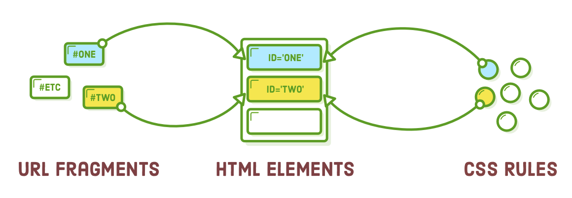
URL Fragments
ID attributes must be unique because they serve as targets for "URL fragments," a concept we briefly touched upon in our discussion of URLs. Fragments are a means of directing the user to a particular section of a web page. They resemble an ID selector attached to the end of a URL.
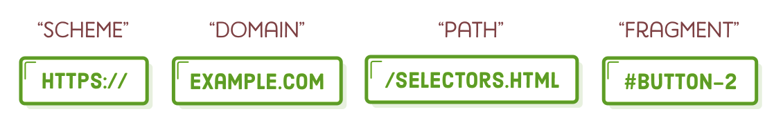
As an illustration, if our intention was to guide the user to our second button, we could employ the following approach. It's important to mention that we can entirely exclude the URL if we're linking to another section within the same page:
<!-- From the same page -->
<a href='#button-2'>Go to Button Two</a>

<!-- From a different page -->
<a href='selectors.html#button-2'>Go to Button Two</a>
When you insert the first option into our selectors.html page and click it, you'll observe the URL in the browser altering. To observe it scroll down to the second button, you might need to incorporate additional placeholder content on the page or reduce the window height considerably, as the browser usually restricts scrolling to the visible part of the page.
The dual functionality described here provides further incentive to steer clear of ID selectors. They establish a connection between your website's URLs and your CSS styles. Consider a scenario where you utilize id attributes on your headings for both URL fragments and ID selectors. If you happened to overlook updating your stylesheet each time you modified a section's URL, you could inadvertently disrupt your website's functionality.
CSS Specificity
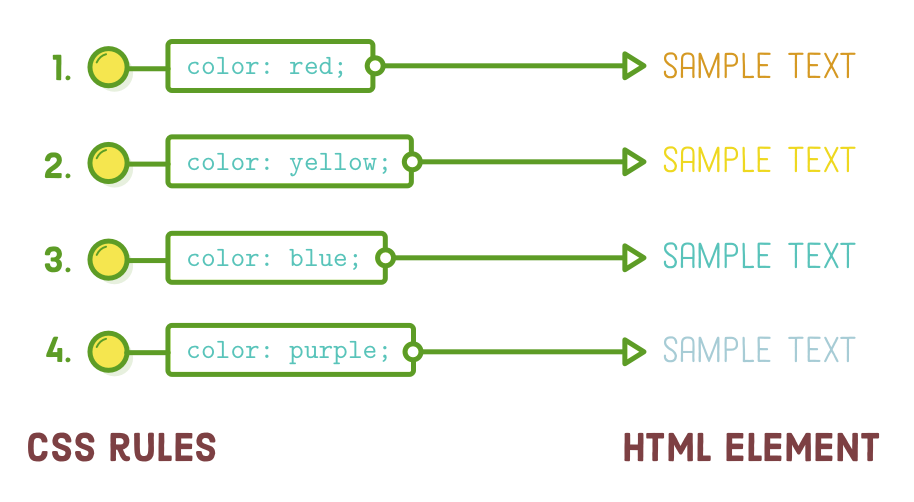
In a previous section of this chapter, we discussed the significance of rule order in an external stylesheet. When all other factors are equal, rules are implemented from top to bottom. This systematic approach enables us to effectively override rules as needed.
Regrettably, not all CSS selectors possess the same level of importance. "CSS specificity" assigns varying significance to various categories of selectors. Consequently, certain selectors will consistently take precedence over others, regardless of their position in the stylesheet.
Let's begin by identifying where this won't cause any issues. If you insert the following code after our existing .call-to-action rules, it will supersede the previous background-color. However, if you place it at the beginning of the file, it will be overridden later, preventing our button from turning red. This behavior is as anticipated.
.call-to-action:link,
.call-to-action:visited {
  background-color: #D55C5F;    /* Red */
}
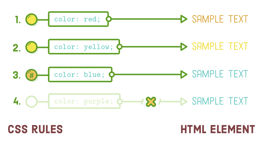
Now, observe the outcome when attempting the same approach with an ID selector. Firstly, make sure to remove the previous code snippet, and then attempt to insert this prior to our existing .call-to-action rules:
#button-2 {
  background-color: #D55C5F;    /* Red */
}
ID selectors possess greater specificity compared to class selectors, resulting in our second button turning red even when we attempt to define the background-color using .call-to-action:link later in our stylesheet. The notion that "order matters" in CSS rules is applicable only when all the rules share the same level of specificity.
The specificity levels of the selectors we've encountered in this chapter are presented below, arranged from highest to lowest:
- #button-2
- .button:link
- a:link and .synopsis em (they're equal)
- .button
- a
This can become quite perplexing. It's such a significant challenge that an entire approach known as "BEM" has emerged. BEM strives to enhance the reusability of CSS rules by converting everything into class selectors. This approach entirely eradicates the possibility of specificity conflicts.
BEM falls beyond the scope of this tutorial. The key point to remember is that CSS rules may not always be applied in a linear sequence, but it's advisable to craft CSS that maintains uniform specificity to encourage consistent behavior in the browser.
Summary
In this chapter, we gained practical experience with class selectors, descendant selectors, pseudo-classes, link styling, and ID selectors. The objective throughout was to learn how to precisely target HTML elements using CSS. Among these options, class selectors prove to be the most versatile and entail the fewest drawbacks. Consequently, they will undoubtedly become a fundamental component of your daily routine as a web developer.
Whether you find it challenging or not, this chapter introduced a significant increase in complexity. We now possess the capability to make our CSS interact with an HTML document in several diverse ways. Additionally, in the upcoming chapters, we'll start recognizing the relationship between the structure of our HTML and the overall layout of a web page. Given the intricate interplay between CSS and HTML, it can be daunting to determine where to begin when constructing a new web page.
The division between content and presentation plays a crucial role in navigating this procedure. Typically, you start by marking up your raw content with HTML tags because you require content before you can present it. Once the content is prepared, you can proceed to attach class attributes to your elements and style them individually. It's when you identify a need for additional structure to achieve a specific layout, such as transforming a group of elements into a sidebar, that you begin encapsulating your content within container <div> elements.
In this chapter, we've explored nearly all the CSS selectors essential for building real websites. We now possess the necessary tools to delve further into intricate CSS layouts. In the upcoming segment of "Demystifying HTML & CSS," we'll discover how to establish columns and sidebars using CSS floats.