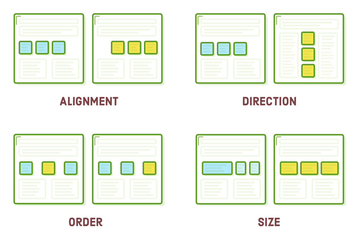
The "Flexbox" or "Flexible Box" layout mode provides an alternative to Floats for determining the overall look of a web page. While floats are limited to horizontal positioning of boxes, flexbox offers comprehensive control over box alignment, direction, order, and size.
The web is presently experiencing a significant transformation, making it appropriate to delve into the industry's current state. Over the past decade, floats were the exclusive choice for designing intricate web pages. Consequently, they are well-supported, even in older browsers, and developers have employed them to construct countless web pages. This implies that you will inevitably encounter floats in the course of your web development career, so the previous chapter was not without value.
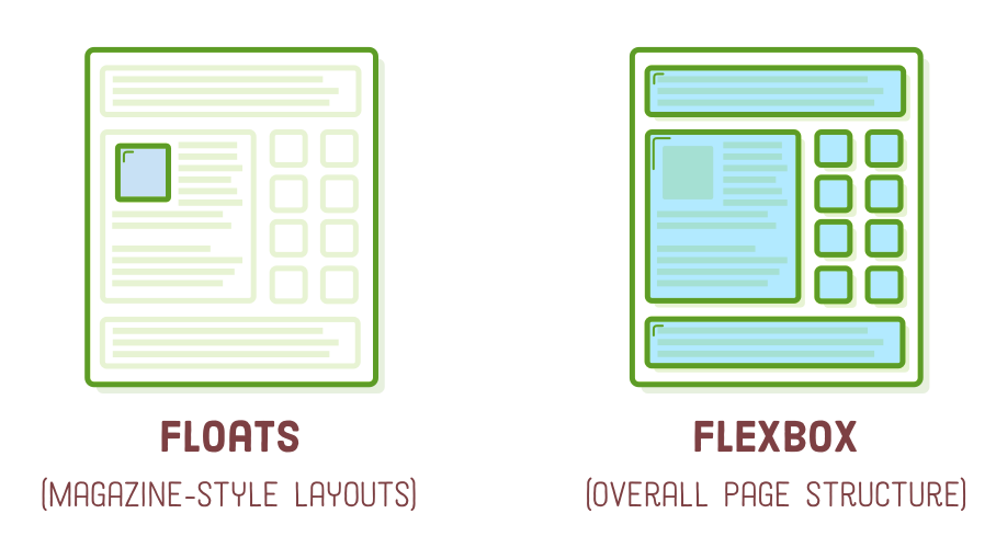
Nonetheless, floats were initially designed for the magazine-style arrangements we discussed in the "Floats for Content" section. Contrary to what we explored in the previous chapter, the range of layouts achievable with floats is somewhat constrained. Even a basic sidebar layout is, from a technical standpoint, somewhat unconventional. Flexbox was introduced to overcome these constraints.
We have now reached a stage where browser support has become widespread, allowing developers to construct complete websites using flexbox. Our suggestion is to utilize flexbox for the majority of your web page layouts, reserving floats for scenarios where you require text to wrap around a box (such as in a magazine-style layout) or when you must accommodate older web browsers.
Within this chapter, we will systematically delve into the complete flexbox layout model. By the end, you should feel confident in your ability to construct virtually any layout that a web designer might request.
Setup
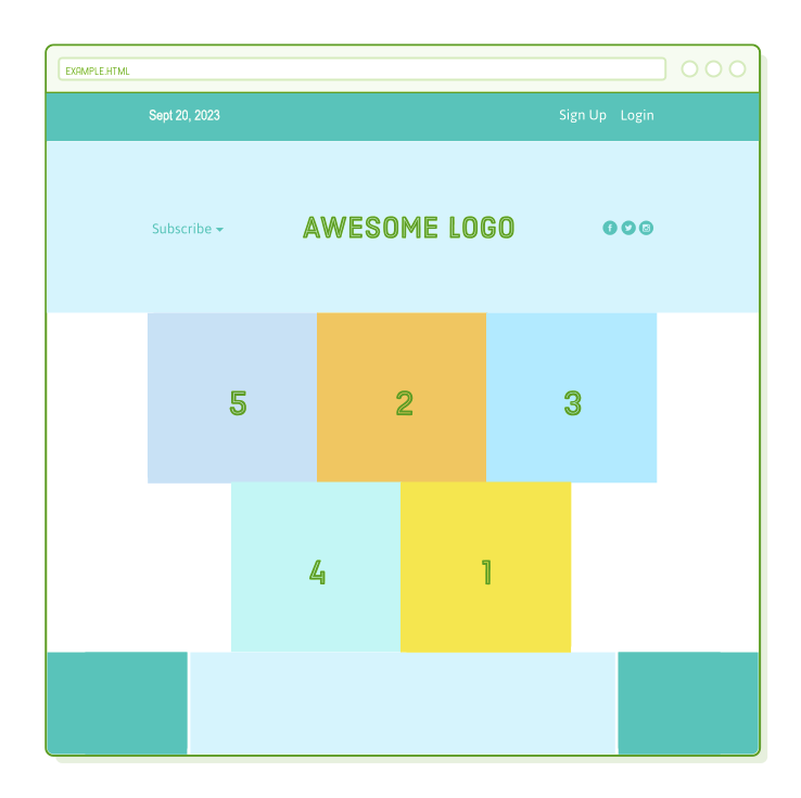
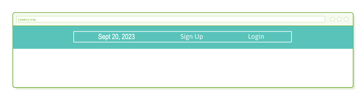
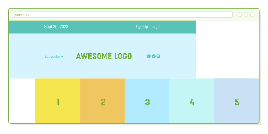
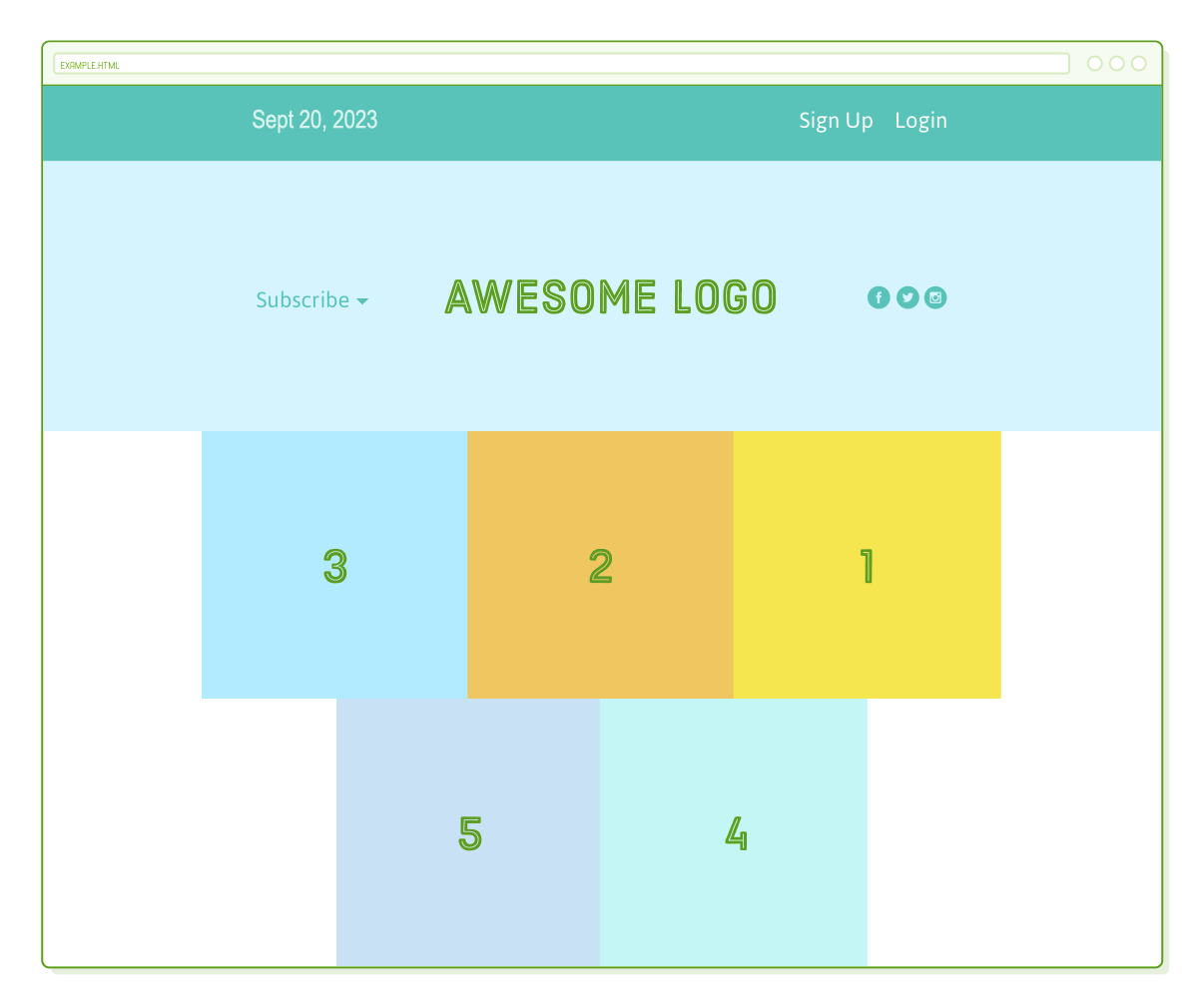
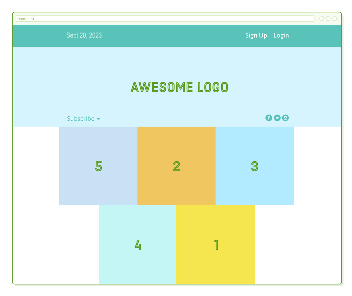
The illustration for this chapter may appear uncomplicated, yet it effectively illustrates all the crucial flexbox attributes. By the end, we'll achieve a result resembling this:
To begin, we require a blank HTML document consisting solely of a menu bar. Establish a new project folder named "flexbox" to organize all the sample files for this chapter. Afterward, generate a file named "flexbox.html" and insert the following HTML code:
<!DOCTYPE html>
<html lang='en'>
  <head>
    <meta charset='UTF-8'/>
    <title>Some Web Page</title>
    <link rel='stylesheet' href='styles.css'/>
  </head>
  <body>
    <div class='menu-container'>
      <div class='menu'>
        <div class='date'>Sept 20, 2023</div>
        <div class='signup'>Sign Up</div>
        <div class='login'>Login</div>
      </div>
    </div>
  </body>
</html>
Now, let's generate the corresponding "styles.css" stylesheet. Initially, it won't appear elaborate – it's essentially a full-width blue menu bar containing a white-bordered box. It's important to highlight that we'll utilize flexbox instead of our typical auto-margin approach to center the menu.
* {
  margin: 0;
  padding: 0;
  box-sizing: border-box;
}

.menu-container {
  color: #fff;
  background-color: #5995DA;  /* Blue */
  padding: 20px 0;
}

.menu {
  border: 1px solid #fff;  /* For debugging */
  width: 900px;
}
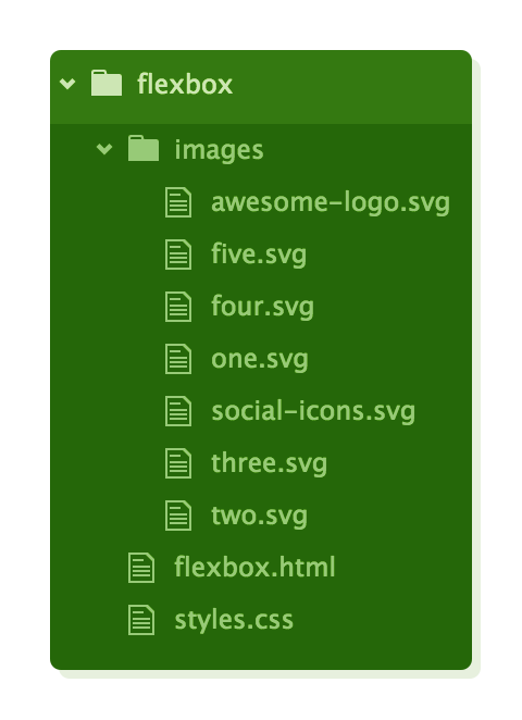
Lastly, obtain some images to incorporate into our sample web page. Unzip these images into the "flexbox" project, making sure to maintain the parent "images" directory. Your project's structure should resemble this before proceeding further:
FlexBox Overview
Flexbox introduces two new box types that are unfamiliar to us: "flex containers" and "flex items." The role of a flex container is to gather a collection of flex items and determine their positioning.
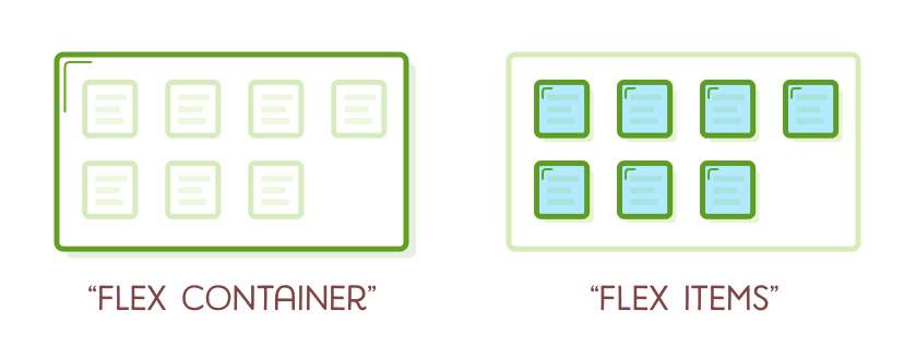
Each HTML element that directly resides within a flex container is considered an "item." While flex items can be adjusted individually, the container primarily dictates their arrangement. The primary role of flex items is to inform their container about the quantity of items it needs to arrange.
Similar to layouts based on floats, creating intricate web pages using flexbox revolves around the concept of nesting boxes. You align multiple flex items within a container, and these items, in turn, can act as flex containers for their own set of items. As you progress through the examples in this chapter, keep in mind that the core objective of arranging a web page remains unchanged: it involves moving a series of nested boxes.
Flex Containers
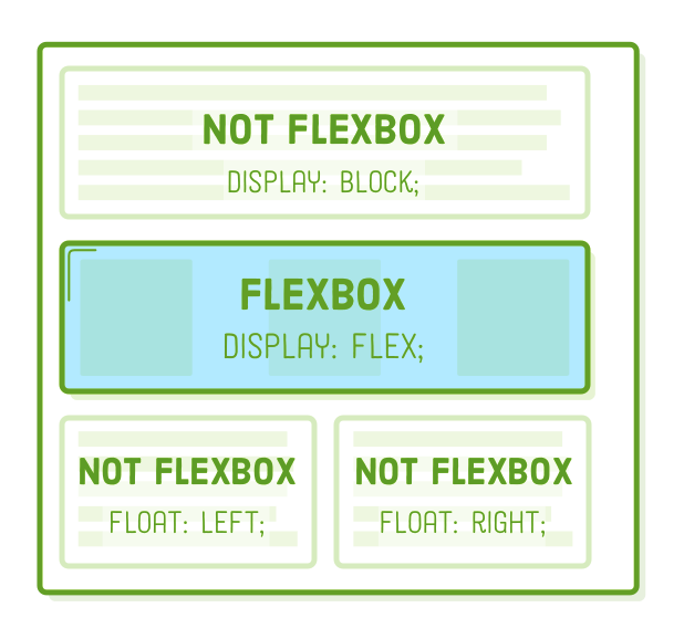
The initial step in employing flexbox is to transform one of our HTML elements into a flex container. We achieve this by modifying the display property, a concept you might recognize from the CSS Box Model chapter. When we set it to "flex," we're instructing the browser to render all contents within the box using flexbox rather than the default box model.
Include the following line within our ".menu-container" rule to convert it into a flex container:
.menu-container {
  /* ... */
  display: flex;
}
This activates the flexbox layout mode; without it, the browser would disregard all the forthcoming flexbox properties we are going to discuss. By explicitly specifying flex containers, you have the flexibility to combine flexbox with other layout models, such as floats and the advanced positioning techniques we will explore later.
Excellent! We now have a flex container containing a single flex item. However, the appearance of our page remains unchanged because we haven't instructed the container on how to present its item.
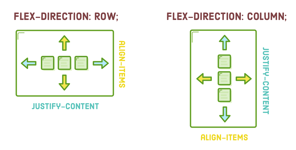
Aligning a Flex Item
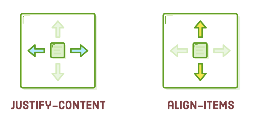
Once you have established a flex container, your next task is to specify the horizontal alignment of its items. This is where the "justify-content" property comes into play. We can employ it to center our ".menu," as follows:
.menu-container {
  /* ... */
  display: flex;
  justify-content: center;    /* Add this */
}
This achieves the identical outcome as including a "margin: 0 auto" declaration for the ".menu" element. However, it's important to observe that we accomplished this by applying a property to the parent element (the flex container) rather than directly to the element we aimed to center (the flex item). This practice of manipulating items through their containers is a prevalent concept in flexbox, deviating slightly from our previous box positioning methods.
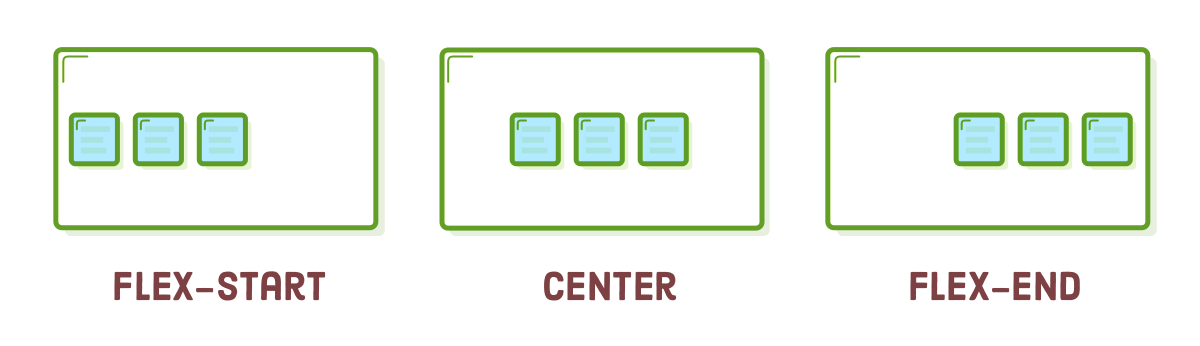
Below, you can find alternative values for "justify-content":
- center
- flex-start
- flex-end
- space-around
- space-between
Experiment by switching the "justify-content" property to "flex-start" and "flex-end." This will align the menu to the left and right side of the browser window, respectively. Remember to revert it to "center" before proceeding. The last two options are most beneficial when you have multiple flex items within a container.
Distributing Multiple Flex Items
You might be thinking, "What's the fuss?" After all, we can achieve left/right alignment with floats and centering using auto-margins, which is true. However, the true power of flexbox becomes evident when we have multiple items within a container. The "justify-content" property also enables you to evenly distribute items inside a container.
Modify our ".menu" rule to match the following:
.menu {
  border: 1px solid #fff;
  width: 900px;
  display: flex;
  justify-content: space-around;
}
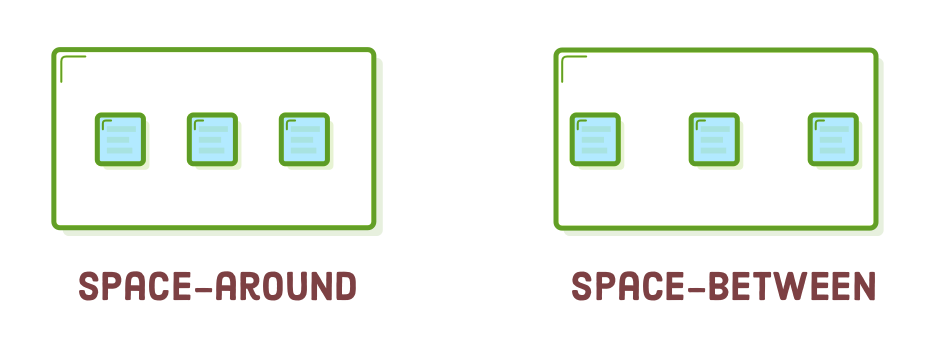
This transforms our ".menu" into a nested flex container, and the "space-around" value evenly distributes its items across the entire width. You should observe something akin to this:
The flex container automatically allocates additional horizontal space to both sides of each item. The "space-between" value operates in a similar manner, but it only introduces that additional space between items. This is precisely what we need for our sample page, so please go ahead and revise the "justify-content" line as follows:
justify-content: space-between;
Certainly, you have the option to use "center," "flex-start," or "flex-end" here if you prefer to align all the items to one side or the other. However, for now, let's keep it as "space-between."
Grouping Items
Flex containers are skilled at arranging elements that exist within one level of depth, specifically their child elements. They are indifferent to the content within their flex items. This implies that grouping flex items within an additional <div> can dramatically alter the appearance of a web page.
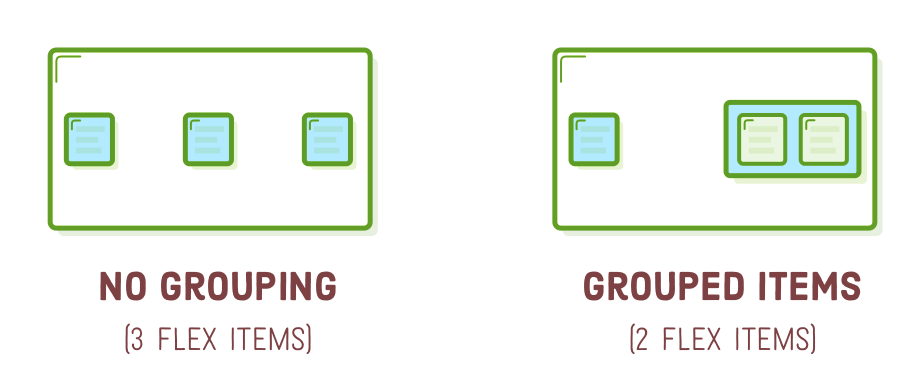
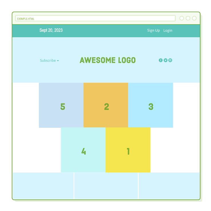
As an illustration, suppose you wish to position both the "Sign Up" and "Login" links on the right side of the page, as shown in the screenshot below. To achieve this, simply place them within an additional <div>:
<div class='menu'>
  <div class='date'>Sept 20, 2023</div>
  <div class='links'>
    <div class='signup'>Sign Up</div>      <!-- This is nested now -->
    <div class='login'>Login</div>         <!-- This one too! -->
  </div>
</div>
Instead of containing three items, our ".menu" flex container now accommodates only two (".date" and ".links"). Given the current "space-between" behavior, they will align to the left and right sides of the page.
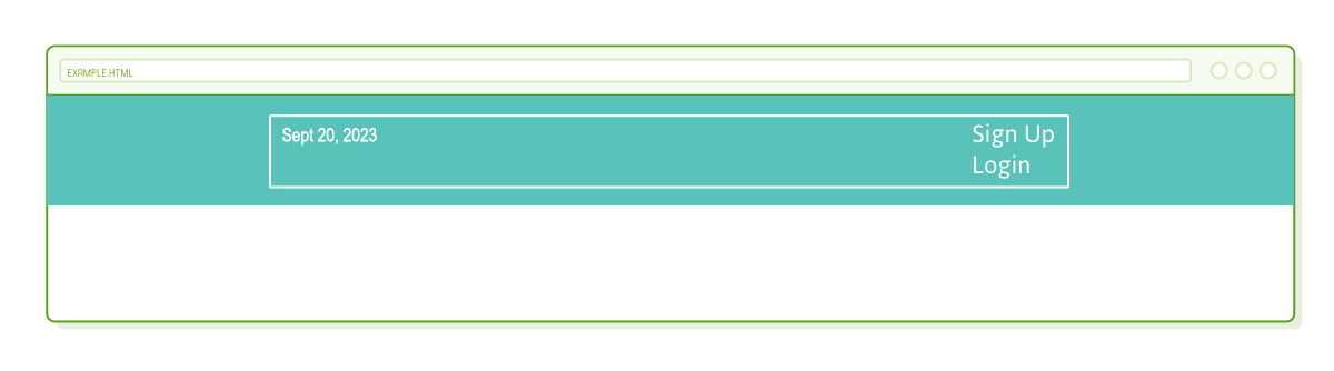
Now, we must arrange the ".links" element because it currently employs the default block layout mode. The solution is to introduce more nested flex containers! Insert a new rule into our "styles.css" file that transforms the ".links" element into a flex container:
.links {
  border: 1px solid #fff;  /* For debugging */
  display: flex;
  justify-content: flex-end;
}

.login {
  margin-left: 20px;
}
This will position our links precisely where we intend them to be. It's worth noting that margins function in a similar manner to how they do in the CSS Box Model. Additionally, in flexbox, auto margins hold a unique significance (although we will delve into this topic towards the conclusion of the chapter).
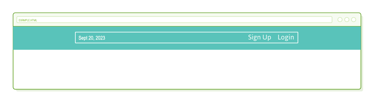
The white borders are no longer necessary, so feel free to remove them if you prefer.
Cross-Axis (Vertical) Alignment
Up to this point, we've been adjusting horizontal alignment, but it's worth noting that flex containers can also determine the vertical alignment of their items. This is a capability that isn't achievable with floats.
To delve into this aspect, let's introduce a header below our menu. Append the following markup to "flexbox.html" following the ".menu-container" element:
<div class='header-container'>
  <div class='header'>
    <div class='subscribe'>Subscribe ▾</div>
    <div class='logo'><img src='images/awesome-logo.svg'/></div>
    <div class='social'><img src='images/social-icons.svg'/></div>
  </div>
</div>
Subsequently, incorporate some fundamental styles to ensure its alignment with our ".menu" element:
.header-container {
  color: #5995DA;
  background-color: #D6E9FE;
  display: flex;
  justify-content: center;
}

.header {
  width: 900px;
  height: 300px;
  display: flex;
  justify-content: space-between;
}
This should seem quite familiar; nevertheless, the situation differs slightly from our menu. Because ".header" has a specified height, elements can be vertically aligned within it. In the official specification, this is referred to as "cross-axis" alignment (we'll understand why shortly), but for our context, it's essentially "vertical" alignment.
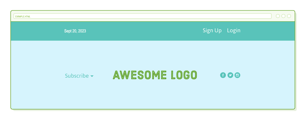
Vertical alignment is determined by including an "align-items" property within a flex container. To align our example page as shown in the screenshot above, use the following line:
.header {
  /* ... */
  align-items: center;  /* Add this */
}
The choices for "align-items" are akin to those for "justify-content":
- center
- flex-start (top)
- flex-end (bottom)
- stretch
- baseline
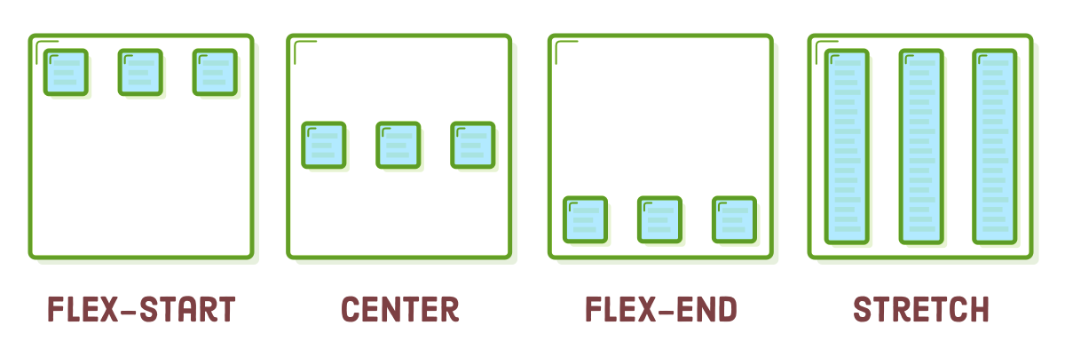
The majority of these options are fairly self-explanatory. It's worthwhile to explore the "stretch" option for a moment as it allows you to reveal the background of each element. Let's briefly examine this by incorporating the following into "styles.css":
.header {
  /* ... */
  align-items: stretch;    /* Change this */
}

.social,
.logo,
.subscribe {
  border: 1px solid #5995DA;
}
The box for each item spans the entire height of the flex container, regardless of the content's quantity. This behavior is frequently employed for generating columns of equal height, even when the content varies, a task that can be quite challenging to achieve with floats.
Before proceeding, ensure that you remove the modifications made above and vertically center our content within ".header."
Wrapping Items
Flexbox represents a more robust substitute for grid layouts based on floats. It not only allows you to present items in a grid but also provides control over their alignment, direction, order, and size. To establish a grid, we make use of the "flex-wrap" property.
Insert a row of photographs into "flexbox.html" so that we have content to operate with. This should be placed within the <body>, below the ".header-container" element:
<div class='photo-grid-container'>
  <div class='photo-grid'>
    <div class='photo-grid-item first-item'>
      <img src='images/one.svg'/>
    </div>
    <div class='photo-grid-item'>
      <img src='images/two.svg'/>
    </div>
    <div class='photo-grid-item'>
      <img src='images/three.svg'/>
    </div>
  </div>
</div>
Once more, the associated CSS should resemble what we've covered in previous sections:
.photo-grid-container {
  display: flex;
  justify-content: center;
}

.photo-grid {
  width: 900px;
  display: flex;
  justify-content: flex-start;
}

.photo-grid-item {
  border: 1px solid #fff;
  width: 300px;
  height: 300px;
}
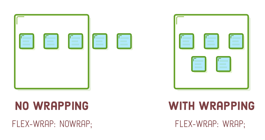
This should perform as anticipated. However, observe the outcome when we introduce more items than the flex container can accommodate. Include an additional pair of photos into the ".photo-grid":
<div class='photo-grid-item'>
  <img src='images/four.svg'/>
</div>
<div class='photo-grid-item last-item'>
  <img src='images/five.svg'/>
</div>
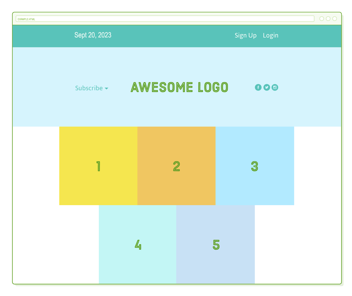
By default, they extend beyond the page's boundaries:
If you intend to construct a hero banner that allows users to horizontally scroll through numerous photos, the current behavior might be suitable. However, this isn't our objective. To address this, introducing the "flex-wrap" property below will cause items that exceed the container's width to be moved to the next row:
.photo-grid {
  /* ... */
  flex-wrap: wrap;
}
Presently, our flex items exhibit behavior akin to floated boxes. Nevertheless, flexbox provides us with greater influence over the alignment of "extra" items in the final row, achieved through the "justify-content" property. For instance, the last row is currently aligned to the left. Experiment with centering it by modifying our ".photo-grid" rule as follows:
.photo-grid {
  width: 900px;
  display: flex;
  justify-content: center;    /* Change this */
  flex-wrap: wrap;
}
Trying to accomplish this with layouts based on floats is exceptionally convoluted.
Flex Container Direction
The term "direction" pertains to whether a container displays its items horizontally or vertically. Up to this point, all the containers we've encountered have employed the default horizontal direction, where items are arranged sequentially in the same row before shifting to the next column when space is exhausted.
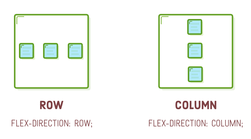
One of the remarkable features of flexbox is its capacity to convert rows into columns with just a single line of CSS. Experiment by incorporating the following "flex-direction" declaration into our ".photo-grid" rule:
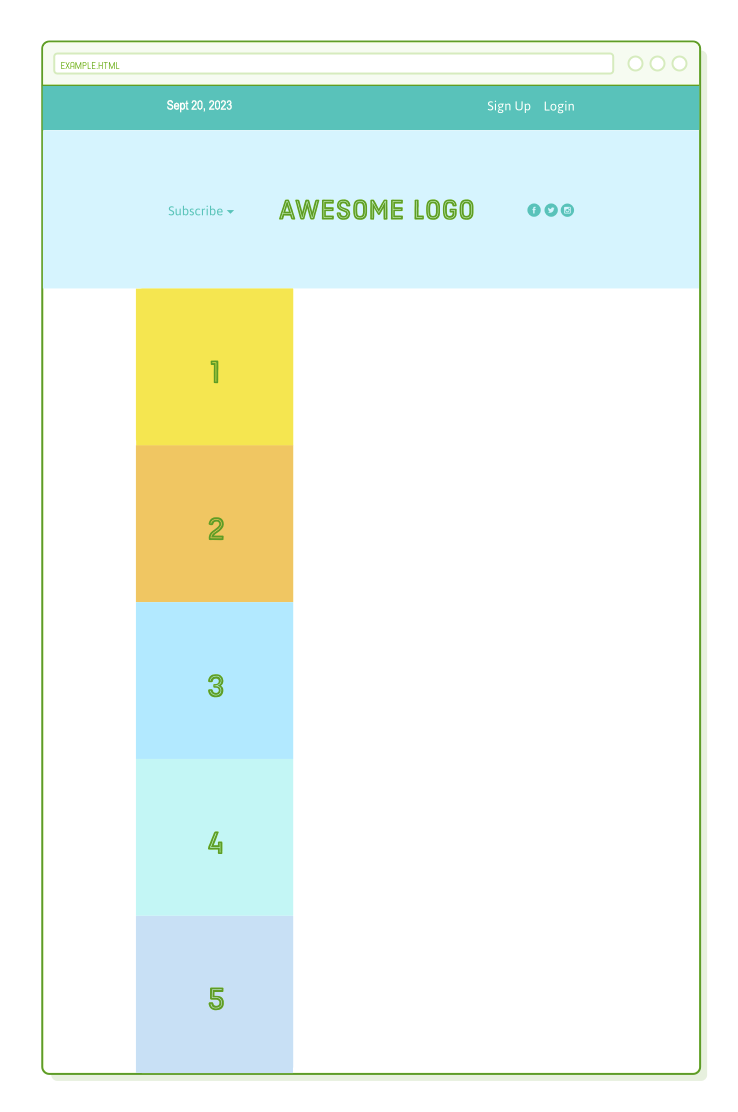
.photo-grid {
  /* ... */
  flex-direction: column;
}
This alters the container's direction from the default "row" value. Instead of a grid, our page now exhibits a single vertical column:
A fundamental principle of responsive design is to offer identical HTML markup to both mobile and desktop users. However, this poses a challenge because most mobile layouts are single-column, while most desktop layouts arrange elements horizontally. You can anticipate how valuable "flex-direction" will become when we begin crafting responsive layouts.
Alignment Considerations
Observe that the column aligns itself to the left edge of its flex container, even with our "justify-content: center;" declaration. When you change the direction of a container, you also change the orientation of the "justify-content" property. It now pertains to the container's vertical alignment, not its horizontal alignment.
To center our column horizontally, we must specify an "align-items" property for our ".photo-grid":
.photo-grid {
  /* ... */
  flex-direction: column;
  align-items: center;      /* Add this */
}
Flex Container Order
So far, there has been a strong connection between the order of our HTML elements and how boxes are displayed on a web page. Whether using floats or the flexbox methods we've explored, the only means to arrange a box before or after another one was to adjust the underlying HTML structure. However, that's about to undergo a transformation.
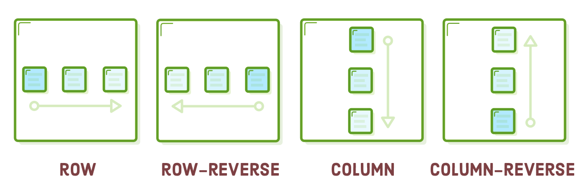
The "flex-direction" property provides the means to manipulate the sequence in which items are displayed, using the "row-reverse" and "column-reverse" properties. To witness this in practice, let's revert our column into a grid, but this time, we'll reverse the order of everything:
.photo-grid {
  width: 900px;
  display: flex;
  justify-content: center;
  flex-wrap: wrap;
  flex-direction: row-reverse;  /* <--- Really freaking cool! */
  align-items: center;
}
Both rows are now displayed from right to left rather than left to right. However, it's important to observe that this merely exchanges the order on a per-row basis; the first row doesn't commence at 5, but at 3. This behavior is valuable for many prevalent design patterns, with "column-reverse" in particular offering diverse possibilities for mobile layouts. We'll delve into achieving even more precise control in the following section.
Rearranging elements directly from within a stylesheet is a significant advancement. Prior to flexbox, web developers often had to employ JavaScript workarounds to achieve such tasks. Nevertheless, it's essential not to misuse your newfound capabilities. As we discussed in the initial chapter of this tutorial, it's crucial to uphold the principle of separating content from presentation. Altering the order, as done here, is strictly for presentation purposes—your HTML should remain coherent and meaningful even without these styles applied to it.
Flex Item Order
The entirety of this chapter has revolved around positioning flex items by means of their parent containers. However, it's equally feasible to adjust individual items. The subsequent part of this chapter will divert attention away from flex containers and instead concentrate on the items they hold.
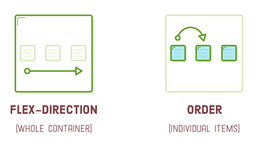
Incorporating an "order" property for a flex item establishes its position within the container without impacting neighboring items. The default value is 0, and modifying it upwards or downwards shifts the item to the right or left, correspondingly.
This capability can be employed, for instance, to exchange the positions of the ".first-item" and ".last-item" elements within our grid. Additionally, we should revert the "row-reverse" value from the previous section to "row" because it will enhance the clarity of our modifications:
.photo-grid {
  /* ... */
  flex-direction: row;  /* Update this */
  align-items: center;
}

.first-item {
  order: 1;
}

.last-item {
  order: -1;
}
Unlike applying "row-reverse" and "column-reverse" to a flex container, the "order" property operates across both row and column boundaries. The provided snippet will interchange our first and last items, even if they are situated on different rows.
Flex Item Alignment
We can apply the same concept to vertical alignment. Suppose we desire to position the "Subscribe" link and the social icons at the bottom of the header instead of the center. In such cases, we align them individually. This is where the "align-self" property becomes useful. When added to a flex item, it supersedes the "align-items" value set for its container:
.social,
.subscribe {
  align-self: flex-end;
  margin-bottom: 20px;
}
This action will relocate them to the bottom of the ".header." It's worth mentioning that margins (and padding) function as you would anticipate.
You can align elements using the same values as those found in the "align-items" property, conveniently listed below:
- center
- flex-start (top)
- flex-end (bottom)
- stretch
- baseline
Flexible Items
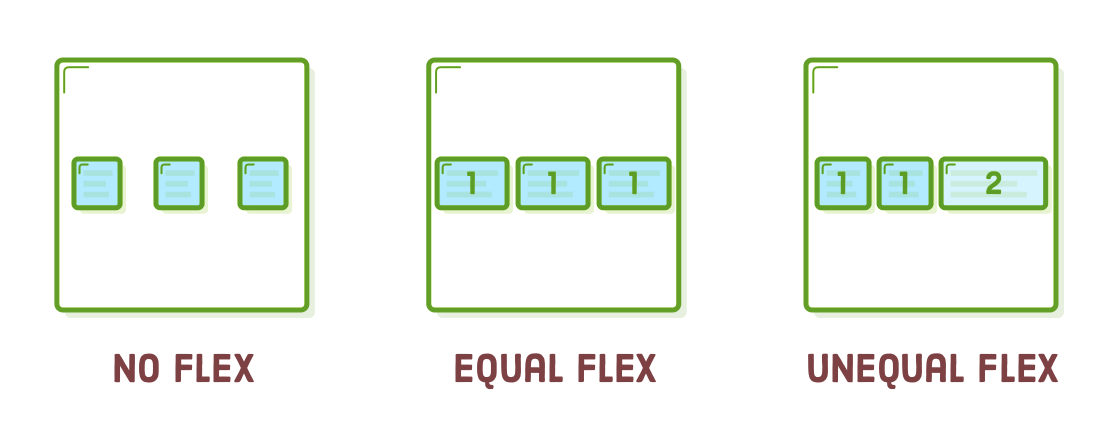
All the examples we've explored so far have dealt with items that have either fixed widths or widths determined by their content. While this approach allowed us to emphasize the positioning capabilities of flexbox, it also led us to overlook its core characteristic as a "flexible box." Flex items possess flexibility; they can contract or expand to adapt to the width of their containers.
The "flex" property specifies the width of individual items within a flex container, or to be more precise, it grants them the ability to have adaptable widths. It functions as a weight, indicating to the flex container how to allocate additional space among each item. For instance, an item with a "flex" value of 2 will expand twice as rapidly as items with the default value of 1.
First, we require a footer to use for experimentation. Place the following code after the ".photo-grid-container" element:
<div class='footer'>
  <div class='footer-item footer-one'></div>
  <div class='footer-item footer-two'></div>
  <div class='footer-item footer-three'></div>
</div>
Next, apply some CSS styling:
.footer {
  display: flex;
  justify-content: space-between;
}

.footer-item {
  border: 1px solid #fff;
  background-color: #D6E9FE;
  height: 200px;
  flex: 1;
}
The line with "flex: 1;" instructs the items to expand and match the width of ".footer." Because they all have an equal weight, they will stretch uniformly:
Elevating the weight of one of the items causes it to expand more rapidly than the others. As an illustration, we can accelerate the growth of the third item to be twice as fast as the other two using the following rule:
.footer-three {
  flex: 2;
}
Contrast this with the "justify-content" property, which allocates additional space between items. While the concept is akin, here we are distributing that space among the items themselves. The outcome is complete authority over how flex items adjust within their containers.
Static Item Widths
We can even blend flexible boxes with those having fixed widths. When using "flex: initial," it reverts to the item's defined width property. This enables us to create intricate combinations of static and flexible boxes.
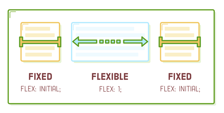
We're going to configure our footer to exhibit behavior similar to the diagram above. The central item will be flexible, while the ones on either side will maintain a constant size. To achieve this, simply introduce the following rule into our stylesheet:
.footer-one,
.footer-three {
  background-color: #5995DA;
  flex: initial;
  width: 300px;
}
Without the "flex: initial;" line, the "flex: 1;" declaration would be inherited from the ".footer-item" rule, resulting in the width properties being disregarded. "initial" resolves this issue, ensuring we achieve a flexible layout that incorporates fixed-width items. When you adjust the size of the browser window, you'll observe that only the middle box in the footer undergoes resizing.
This layout is quite prevalent, not only in footers but elsewhere as well. For instance, numerous websites feature a sidebar or multiple fixed-width sidebars alongside a flexible content block that houses the primary text of the page. Essentially, it's a taller rendition of the footer we've just fashioned.
Flex Items and Auto-Margins
Auto-margins in flexbox possess a unique quality. They can serve as a substitute for an additional <div> when attempting to align a set of items to the left or right within a container. Visualize auto-margins as a form of "divider" for flex items within the same container.
Let's explore this concept by arranging our items in ".menu" as depicted below:
<div class='menu-container'>
  <div class='menu'>
    <div class='date'>Sept 20, 2023</div>
    <div class='signup'>Sign Up</div>
    <div class='login'>Login</div>
  </div>
</div>
Refreshing the page should distribute the items evenly throughout our menu, much like it was at the start of the chapter. We can recreate this layout by inserting an auto-margin between the items we wish to space apart, as illustrated below:
.signup {
  margin-left: auto;
}
Auto-margins consume all the surplus space within a flex container. Consequently, rather than distributing items uniformly, this action shifts ".signup" and any subsequent items (such as ".login") to the right side of the container. This results in precisely the same layout as before but without the need for an additional nested <div> to group them. Occasionally, it's advantageous to maintain a more streamlined HTML structure.
Summary
Flexbox has bestowed upon us a multitude of remarkable tools for structuring web pages. When you compare these techniques to what we could achieve with floats, it becomes evident that flexbox provides a more streamlined approach to designing contemporary websites:
- Employ "display: flex;" to establish a flex container.
- Utilize "justify-content" to specify horizontal alignment for items.
- Apply "align-items" to determine vertical alignment for items.
- If you require columns instead of rows, utilize "flex-direction."
- Utilize "row-reverse" or "column-reverse" values to invert the order of items.
- Customize the order of individual elements using "order."
- Use "align-self" for vertical alignment of individual items.
- Leverage "flex" to generate flexible boxes capable of expanding and contracting.
Bear in mind that these flexbox properties serve as a means to communicate to browsers how to organize a collection of HTML elements. The true challenge lies not in composing the HTML and CSS code, but in conceptually determining, perhaps on paper, the behavior of all the essential boxes required to construct a specific layout.
When a designer provides you with a mockup for implementation, your initial step involves sketching a series of boxes on it and ascertaining how they should be arranged, expanded, and contracted to realize the intended design. After you've completed this conceptual phase, coding it using these fresh flexbox techniques should be a relatively straightforward process.
The flexbox layout mode is suitable for the majority of your web pages. However, it may not be the best choice for tasks such as fine-tuning element positions and isolating them from interactions with the rest of the page. Once we delve into these advanced positioning techniques in the upcoming chapter, you'll gain expertise in HTML and CSS positioning.