The preceding chapter covered CSS's fundamental text formatting features, which constitute just one facet of page styling. Defining the layout of a web page is a distinct challenge, and that's precisely what this chapter addresses.
The "CSS box model" comprises guidelines governing the rendering of all web pages online. CSS views each element in your HTML document as a "box" with various attributes dictating its position on the page. Until now, our web pages have consisted of elements displayed sequentially. The box model serves as our toolbox for tailoring this default layout structure.
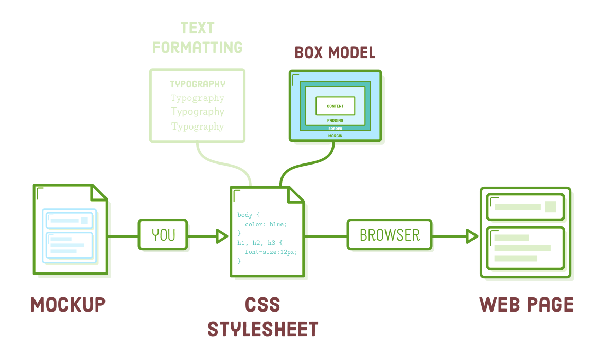
A significant aspect of your role as a web developer involves utilizing the principles of the CSS box model to transform a design prototype into an actual web page. While progressing through this chapter, you might ponder why we need to grasp these rules instead of simply uploading a single static image of a web page (i.e., a mockup) to a web server and concluding the process.
Certainly, this approach would offer convenience. Nevertheless, without the division of content into HTML, search engines would lack the means to deduce our web pages' structure, rendering our site unresponsive and devoid of the potential for incorporating elaborate animations or interactivity through JavaScript. This trade-off underscores the significance of CSS in our endeavors.
In this chapter, we delve into the fundamental elements of the CSS box model, including padding, borders, margins, block boxes, and inline boxes. This can be seen as the detailed examination of CSS layouts at the micro level, where we define the individual characteristics of these boxes. Subsequent chapters will expand on how HTML structure and the CSS box model come together to create a variety of intricate page layouts.
Setup
To begin, we'll initiate the process by establishing a fresh directory named "css-box-model" and placing a new web page named "boxes.html" within it. Proceed by inserting the following code:
<!DOCTYPE html>
<html lang='en'>
<head>
<meta charset='UTF-8'/>
<title>Boxes Are Easy!</title>
<link rel='stylesheet' href='box-styles.css'/>
</head>
<body>
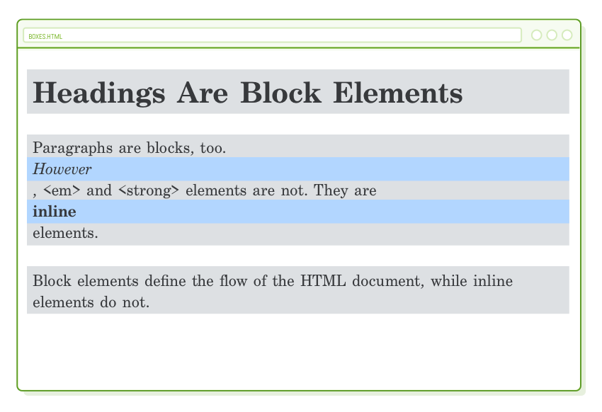
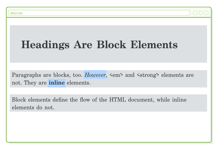
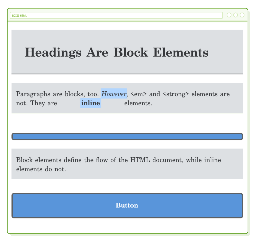
<h1>Headings Are Block Elements</h1>
<p>Paragraphs are blocks, too. <em>However</em>, <em> and <strong>
elements are not. They are <strong>inline</strong> elements.</p>
<p>Block elements define the flow of the HTML document, while inline elements
do not.</p>
</body>
</html>
As you may recall from our previous encounter with "Hi, CSS," this HTML file is linked to a CSS stylesheet housed in a file named "box-styles.css." Please proceed to generate this file as well; for now, you can leave it without any content.
Note: If you copy and paste the above example code into your boxes.html, you need to replace the actual HTML reserved characters (<,>) with their equivalent HTML entities (<, >) around the 'em' and 'strong' in the second sentence of the first paragraph for them to display as code examples in the browser view. Otherwise, they'll be interpreted by the browser. Welcome to web development!
You likely have become quite adept at utilizing your preferred editor for these file and folder creation assignments.
Block and Inline Elements
In the "Web Page Basics" section, we briefly discussed how CSS employs "boxes" to determine the layout of a web page. Every HTML element displayed on the screen is essentially a box, and these boxes can be categorized into two types: "block" boxes and "inline" boxes.
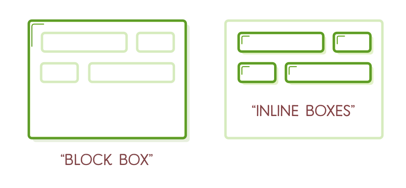
All the HTML elements we've been utilizing possess a default box type. For instance, <h1> and <p> represent block-level elements, whereas <em> and <strong> are considered inline elements. To gain a more comprehensive understanding of these boxes, let's include the following code in the "box-styles.css" file:
h1, p {
  background-color: #DDE0E3;    /* Light gray */
}

em, strong {
  background-color: #B2D6FF;    /* Light blue */
}
The background-color property exclusively colors the background of the designated box, providing us with a transparent view of the structure of the current sample page. We should observe gray backgrounds for our headings and paragraphs, whereas our emphasis and strong elements should display a light blue background.

This illustrates a couple of highly significant behaviors linked to block and inline boxes:
- Block boxes consistently position themselves beneath the preceding block element. This represents the "natural" or "static" flow of an HTML document as it is rendered by a web browser.
- Block boxes' width is automatically determined by the width of their parent container. In this scenario, our blocks always match the width of the browser window.
- The inherent height of block boxes relies on their content. If you reduce the browser window's width, the <h1> element spans two lines, and its height adapts accordingly.
- Inline boxes do not influence vertical spacing; they are not intended for layout purposes but rather for styling elements within a block.
- The width of inline boxes is determined by the content they hold, not by the width of the parent element.
Changing Box Behavior
We have the ability to modify the default box type of HTML elements using the CSS display property. For instance, if we wished to transform our <em> and <strong> elements from inline to block elements, we could adjust our rule in "box-styles.css" in the following manner:
em, strong {
  background-color: #B2D6FF;
  display: block;
}
At present, these elements behave similarly to our headings and paragraphs: they initiate on a separate line and occupy the full width of the browser. This proves beneficial when you intend to transform <a> elements into buttons or format <img/> elements (both of which are originally inline boxes).
Nonetheless, it is rarely advisable to convert <em> and <strong> into block elements. Therefore, let's revert them to inline boxes by modifying their display property to "inline," as shown below:
em, strong {
  background-color: #B2D6FF;
  display: inline;             /* This is the default for em and strong */
}
Content, Padding, Border, and Margin
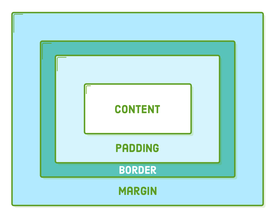
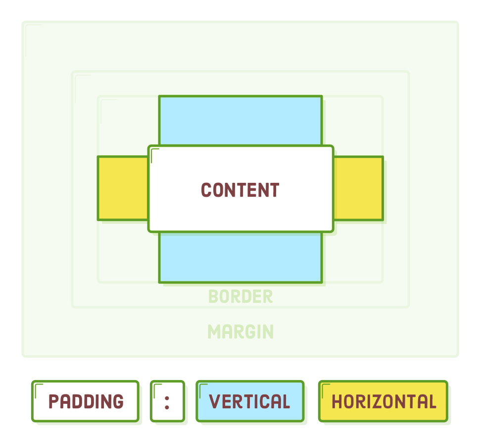
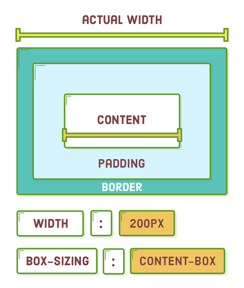
The "CSS box model" consists of regulations governing the size of every element on a web page. It attributes four properties to each box, whether it's an inline or block element:
- Content - refers to the text, images, or other media contained within the element.
- Padding - denotes the gap between the content of the box and its border.
- Border - is the line that separates the padding of the box from its margin.
- Margin - represents the area between the box and the adjacent boxes.
Collectively, these components provide all the information a browser requires to display an element's box. Content comprises what you create in an HTML document and is the sole component with semantic significance (which is why it's included in the HTML). The remaining elements are entirely related to presentation, and as such, their attributes are specified through CSS rules.
Padding
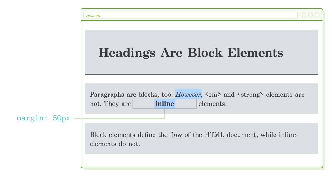
Let's start from the innermost part and progress outward. We've already been dealing with content, so now we'll move on to padding. The padding property, as you might have guessed, establishes the padding for the chosen element:
h1 {
  padding: 50px;
}
This appends 50 pixels to each side of the <h1> heading. Observe how the background color extends to occupy this area. This is consistently the case with padding since it resides within the border, and anything within the border receives a background.
Occasionally, you may wish to customize just one side of an element. To accomplish this, CSS offers the following properties:
p {
  padding-top: 20px;
  padding-bottom: 20px;
  padding-left: 10px;
  padding-right: 10px;
}
You have the flexibility to employ any unit for an element's padding, not limited to pixels. Em units, in particular, prove valuable for ensuring your margins adjust proportionally with the base font size.
Shorthand Formats
Writing out all of these properties individually can be cumbersome. CSS offers a more efficient "shorthand" version of the padding property, allowing you to establish both the top/bottom and left/right padding using a single line of CSS. When you supply two values to the padding property, it is interpreted as the vertical and horizontal padding values, respectively.
This implies that we can rephrase our previous rule as follows:
p {
  padding: 20px 10px;  /* Vertical  Horizontal */
}
Alternatively, when you input four values, you have the option to configure the padding for each side of an element separately. These values are interpreted in a clockwise fashion, beginning at the top:
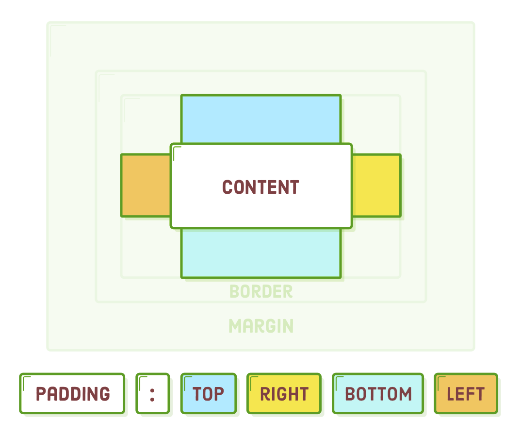
Let's test this by eliminating the 10px right padding from the prior rule. This adjustment should result in 20 pixels of padding on the top and bottom of each paragraph, 10 pixels on the left, while leaving no padding on the right side:
p {
  padding: 20px 0 20px 10px;  /* Top  Right  Bottom  Left */
}
The choice of whether to employ shorthand forms or not primarily depends on personal preference and team practices. Some developers appreciate the concise nature of shorthand, while others find the longer form more straightforward to grasp at first glance (and therefore easier to manage). Nonetheless, you'll probably encounter both forms at some point in your web development journey.
Borders
As we progress outward from the core of the CSS box model, we encounter the border – a line encircling the content and padding of an element. The border property employs a distinct syntax that may be unfamiliar. Initially, we specify the border's stroke width, then its style, and finally, its color.
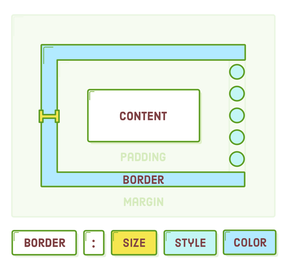
Experiment with outlining a border around our <h1> heading by modifying the rule in the "box-styles.css" file:
h1 {
  padding: 50px;
  border: 1px solid #5D6063;
}
This instructs the browser to encircle our heading with a slender gray line. Observe that the border closely adjoins the padding without any gap in between. Furthermore, if you resize your browser to the point where the heading spans two lines, both the padding and the border will remain intact.
Encompassing the entire heading with a border gives it a somewhat dated appearance, reminiscent of the 1990s. How about we restrict it to only the bottom of the heading? Similar to padding, there are variants for the border property that allow you to target the top, bottom, left, and right sides:
border-bottom: 1px solid #5D6063;
Borders serve as frequent design components and are equally indispensable for debugging purposes. When you're uncertain about how a box is being displayed, include a declaration like border: 1px solid red; to it. This will distinctly reveal the box's padding, margin, and overall dimensions with just a single line of CSS. Once you've identified the issue, you can easily remove the rule.
For further details on border styles, I recommend consulting w3schools.com.
Margins
Margins delineate the area outside of an element's border, or more precisely, the gap between a box and the boxes surrounding it. Now, let's introduce some spacing at the bottom of each
element:
p {
  padding: 20px 0 20px 10px;
  margin-bottom: 50px;          /* Add this */
}
This illustrates a version of the margin property that allows you to specify margins for specific sides. Additionally, it accommodates the same shorthand formats as padding.
Margins and padding often serve similar purposes in various situations, making it challenging to determine which one is the more suitable option. The primary factors influencing your choice between them include:
- A box's padding features a background, whereas margins are consistently transparent.
- Padding is encompassed within the clickable area of an element, whereas margins are not.
- Margins collapse vertically, whereas padding does not (we will delve deeper into this in the following section).
If none of these guidelines assist you in determining whether to opt for padding or margin, don't worry too much—simply select one. In CSS, there are frequently multiple approaches to resolving a problem.
Margins on Inline Elements
One of the most noticeable distinctions between block-level elements and inline elements is how they treat margins. Inline boxes entirely disregard the top and bottom margins of an element. To illustrate, observe the outcome when we apply a significant margin to our <strong> element:
strong {
  margin: 50px;
}
The horizontal margins appear as anticipated, but they do not impact the vertical space surrounding our <strong> element in the slightest.
If we switch from margin to padding, we'll realize that the situation differs when it comes to a box's padding. Padding will display the blue background, but it won't influence the vertical arrangement of the surrounding boxes.
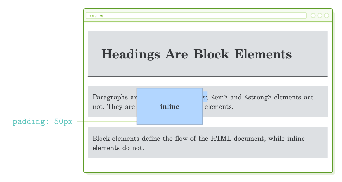
The reason for this stems from the fact that inline boxes are primarily responsible for formatting text runs within a block, and as a result, their influence on the overall page layout is constrained. If you intend to manipulate the vertical spacing of a page, you need to work with block-level elements (fortunately, we've already learned how to alter an element's box type).
Before you become frustrated trying to understand why your top or bottom margin isn't functioning as expected, don't forget to review your display property. Believe us, this is a situation you'll encounter sooner or later.
Vertical Margin Collapse
Another peculiar aspect of the CSS box model is referred to as "vertical margin collapse." When two boxes with vertical margins are positioned immediately adjacent to each other, these margins will collapse. Instead of combining the margins as one might anticipate, only the larger one is rendered.
As an illustration, consider adding a top margin of 25 pixels to our <p> element:
p {
  padding: 20px 0 20px 10px;

  margin-top: 25px;
  margin-bottom: 50px;
}
You might expect each paragraph to have 50 pixels at the bottom and 25 pixels at the top, resulting in a total space of 75 pixels between our <p> elements. However, that's not the case! There will still be only 50 pixels between them because the smaller top margin collapses into the larger bottom one.
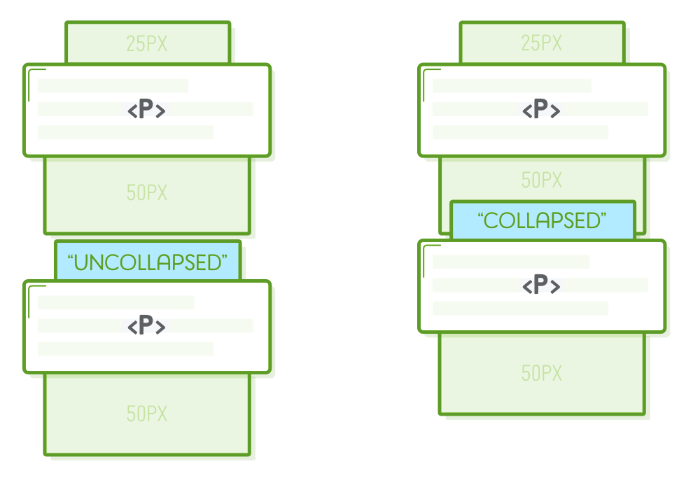
This behavior can prove highly advantageous when dealing with a variety of elements and aiming to establish their layout as the minimum space between other elements.
Preventing Margin Collapse
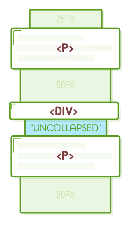
It can also become quite frustrating. Occasionally, you do wish to avoid the margins from collapsing. In such cases, all you have to do is insert an additional invisible element in between them:
<p>Paragraphs are blocks, too. <em>However</em>, <em> and <strong>
elements are not. They are <strong>inline</strong> elements.</p>

<div style='padding-top: 1px'></div>  <!-- Add this -->

<p>Block elements define the flow of the HTML document, while inline elements
do not.</p>
We'll delve further into the <div> element in the upcoming section. What's crucial to note here is that only consecutive elements can collapse into each other. Placing an element with a non-zero height (as indicated by the padding-top) between our paragraphs compels them to exhibit both the 25px top margin and the 50px bottom margin.
Keep in mind that padding never collapses. An alternative approach would be to employ padding to create space between our paragraphs instead of using the margin property. However, this method is only effective if you're not already using padding for another purpose (which is currently the case, so let's stick with the <div> approach).
Another option to circumvent margin collapse is to adhere to a convention where you use either bottom-only or top-only margins. For instance, if all your elements exclusively specify a bottom margin, there's no chance for them to collapse.
In the flexbox layout scheme, collapsing margins are not a concern, making it a non-issue for contemporary websites.
Generic Boxes
Up to this point, each HTML element we've encountered has imbued additional significance to the content it encloses. Undoubtedly, this is the core purpose of HTML. However, there are numerous instances when we require a generic container solely for the purpose of styling a web page. This is precisely what <div> and <span> serve.
Both <div> and <span> are "container" elements that do not alter the semantic structure of an HTML document. Nevertheless, they do offer a means to apply CSS styles to various sections of a web page. For instance, there are times when you require an invisible container to prevent margin collapse, or perhaps you intend to assemble the initial paragraphs of an article into a summary with slightly distinct text formatting.
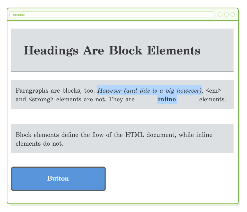
We will employ numerous <div> elements in the remaining portions of this tutorial. For the time being, let's generate a basic button by appending the following code to the end of our "boxes.html" file (but still inside the <body> element of course):
<div>Button</div>
Here are the corresponding styles that should be included in the "box-styles.css" file. Most of these should be recognizable from the previous chapter, although we've introduced a new property, "border-radius":
div {
  color: #FFF;
  background-color: #5995DA;
  font-weight: bold;
  padding: 20px;
  text-align: center;
  border: 2px solid #5D6063;
  border-radius: 5px;
}
This configuration will result in a sizable blue button that stretches across the entire width of the browser:
Naturally, these styles also extend to the hidden <div> we utilized to resolve the margin collapse issue in the prior section. It's evident that we require a means to individually target <div> elements for them to be useful. This is where class selectors come into play, and we'll introduce them in the upcoming chapter. For now, let's either remove or comment out that concealed <div>.
The primary distinction between a <div> and a <span> is that the former is intended for block-level content, whereas the latter is designed for inline content.
Explicit Dimensions
Until now, we've allowed our HTML elements to determine their dimensions automatically. The paddings, borders, and margins we've experimented with have all adjusted themselves around the content contained within the element's box. If you introduce more text into our <em> element, everything will expand accordingly to accommodate it:
However, on occasion, our intended layout necessitates a specific dimension, such as a sidebar that is precisely 250 pixels wide. In such cases, CSS offers the width and height properties, which override the default size of a box's content.
Let's assign a specific width to our button by including the following property in the "box-styles.css" file:
div {
  /* [Existing Declarations] */
  width: 200px;
}
Instead of spanning the entire width of the browser window, our button now measures 200 pixels in width and aligns snugly to the left side of the page:
Additionally, observe that if you extend the button's title, it will naturally wrap to the next line, causing the element to expand vertically to accommodate the additional content. You have the option to modify this default behavior using the white-space and overflow properties.
Content Boxes and Border Boxes
The width and height properties exclusively establish the dimensions of a box's content. Padding and border are both applied in addition to any explicit dimensions you specify. This clarifies why, when you capture a screenshot of our button, you'll obtain an image that is 244 pixels wide, despite the presence of a width: 200px declaration assigned to it.
It's evident that this can be somewhat counterintuitive when you're attempting to structure a page. Envision the challenge of populating a 600px container with three boxes, each set to width: 200px, yet they fail to fit because they all possess a 1px border (resulting in an actual width of 202px).
Thankfully, CSS provides the flexibility to alter how a box's width is computed through the box-sizing property. By default, it employs a value of content-box, which results in the behavior outlined earlier. Let's observe the outcome when we modify it to border-box:
div {
  color: #FFF;
  background-color: #5995DA;
  font-weight: bold;
  padding: 20px;
  text-align: center;
  border: 2px solid #5D6063;
  border-radius: 5px;

  width: 200px;
  box-sizing: border-box;  /* Add this */
}
This compels the effective width of the box to be 200px, encompassing both padding and borders. Naturally, this signifies that the content width is now determined automatically:
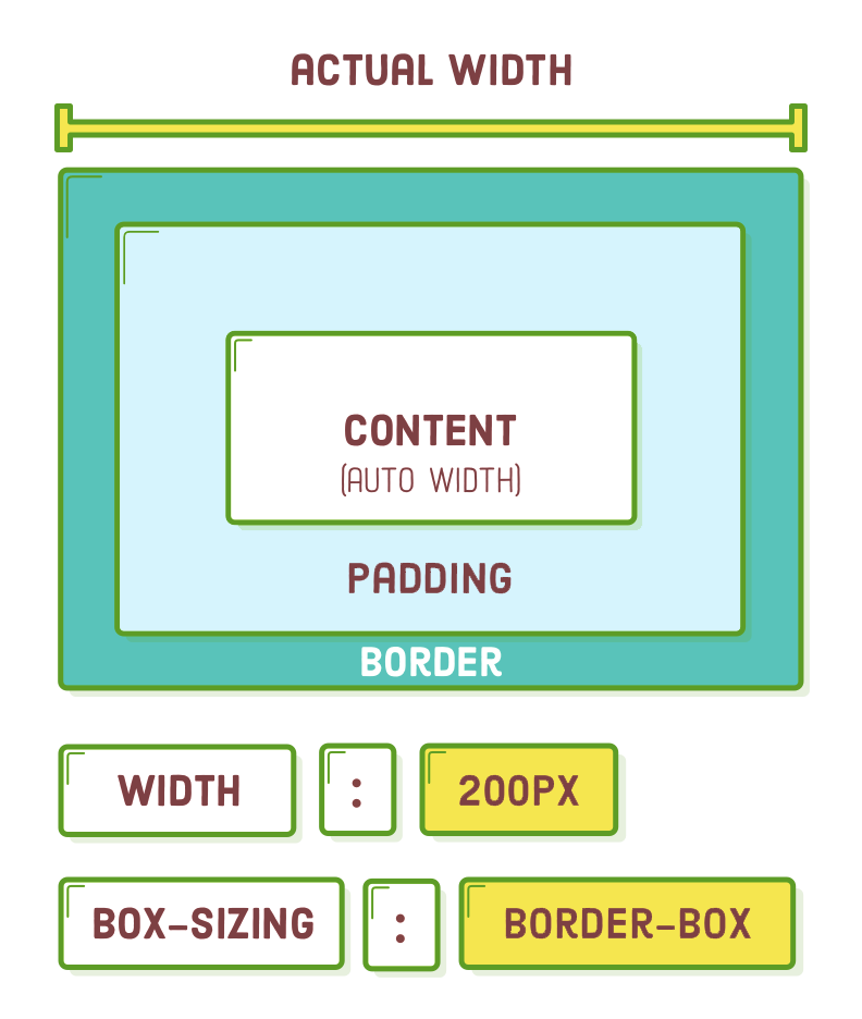
This approach is considerably more intuitive, and consequently, adopting border-box for all your boxes is regarded as a best practice by contemporary web developers.
Aligning Boxes
Horizontally aligning boxes is a frequent task for web developers, and the box model provides numerous methods to accomplish this. We've already examined the text-align property, which aligns the content and inline boxes within a block-level element. However, aligning block-level boxes presents a different challenge.
Give this rule a try by incorporating it into our stylesheet. It will exclusively align the content within our block boxes, leaving the alignment of the blocks themselves unaffected. As a result, our <div> button remains left-aligned, regardless of the text alignment specified for the <body>:
body {
  text-align: center;
}
There are three approaches to horizontally aligning block-level elements: "auto-margins" for center alignment, "floats" for left or right alignment, and "flexbox" for comprehensive control over alignment. Regrettably, block-level alignment is entirely distinct from the text-align property.
Centering with Auto-Margins
Floats and flexbox are intricate subjects that we've dedicated entire chapters to. However, we have the foundational knowledge to address auto-margins at present. By configuring the left and right margins of a block-level element as auto, you can achieve center alignment of the block within its parent element.
For instance, we can achieve center alignment for our button using the following code:
div {
  color: #FFF;
  background-color: #4A90E2;
  font-weight: bold;
  padding: 20px;
  text-align: center;

  width: 200px;
  box-sizing: border-box;
  margin: 20px auto; /* Vertical  Horizontal */
}
Please bear in mind that this method is effective only for blocks that possess an explicitly defined width. If you remove the line width: 200px, our button will stretch across the entire width of the browser, rendering "center alignment" meaningless.
Resetting Styles
Observe the white band surrounding our page? That's a default margin or padding added by your browser. Various browsers employ distinct default styles for all their HTML elements, which can complicate the process of crafting consistent stylesheets.
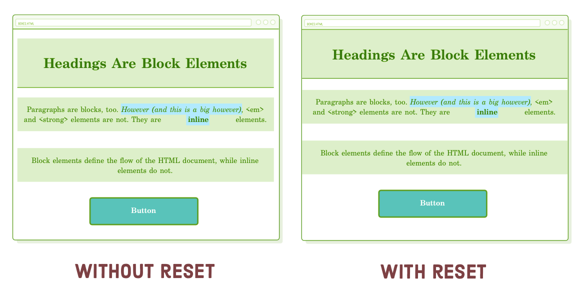
It's often advisable to replace default styles with a predictable value using the "universal" CSS selector (*). Consider adding this code at the beginning of our "box-styles.css" file:
* {
  margin: 0;
  padding: 0;
  box-sizing: border-box;
}
This selector applies to every HTML element, effectively resetting the margin and padding properties for our web page. Additionally, we've transformed all our boxes into border-box, aligning with the best practices.
You'll encounter a comparable reset at the outset of nearly every global CSS stylesheet across the web. While these resets can become considerably more intricate, the three straightforward declarations presented above enable us to make adjustments to the CSS box model for our specific needs without concerns about unexpected interactions with default browser styles.
Summary
As we delve further into building intricate web pages, we'll gain a better understanding of the practical applications of the CSS box model. For the time being, consider it as a valuable addition to your CSS toolkit. Armed with the key concepts from this chapter, you should now feel better prepared to transform a design mockup into a fully functional web page:
- Every element is a box.
- Boxes can assume either inline or block-level form.
- Boxes consist of content, padding, borders, and margins.
- They also adhere to seemingly arbitrary rules regarding their interactions.
- Proficiency in the CSS box model empowers you to structure the majority of web pages.
Similar to the previous chapter, the CSS properties we've just discussed may appear straightforward—and to some extent, they are. However, when you begin examining the websites you frequent with a focus on the CSS box model, you'll notice that these concepts are ubiquitously applied.
Our examination of generic boxes (<div> and <span>) was somewhat restricted because we lacked a method to specifically target an individual HTML element from our web page. We'll address this in the upcoming chapter with a more comprehensive exploration of CSS selectors.