In the preceding chapters, we've gained the knowledge to adjust box sizes and manage the spacing around them. However, we predominantly adhered to the default vertical page flow. Block elements consistently followed one another vertically, essentially confining us to a single-column layout.
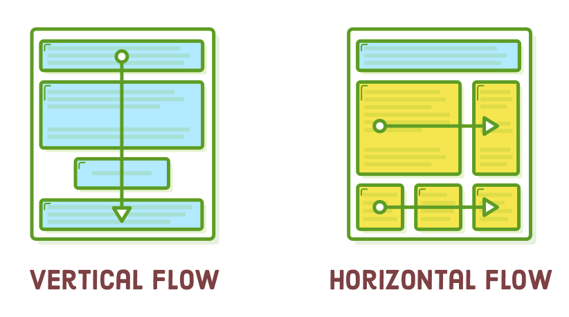
"Floats" enable you to position block-level elements next to each other rather than stacking them vertically. This is a significant capability as it empowers us to construct a wide range of layouts, encompassing sidebars, multi-column pages, grids, and magazine-style articles with text wrapping around images. This is where we begin the journey of crafting genuine web pages.
Modern websites have predominantly shifted away from float-based layouts in favor of Flexbox. However, it's essential to emphasize that this chapter remains valuable to read. For more than a decade, floats played a pivotal role as the basis for the majority of websites on the Internet. Consequently, you're bound to come across them at some juncture in your professional journey.
Even more significantly, the constrained characteristics of floats make them a more approachable entry point to CSS layouts compared to Flexbox. Rather than being inundated with the myriad possibilities of Flexbox, we'll have the opportunity to concentrate more on the step-by-step process of constructing an intricate web page layout.
Setup
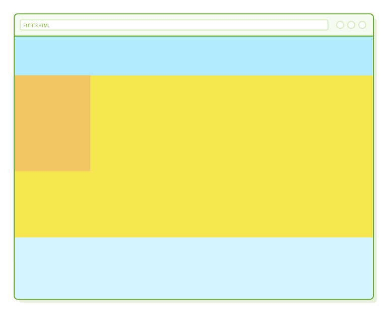
In this chapter, we'll explore CSS floats through a relatively straightforward sample project. Instead of manipulating genuine HTML content as we've done in previous chapters, our focus will be on styling a collection of empty <div> elements. The end result will resemble the example below, marking a noticeable departure from the types of web pages we've constructed up to this point.
To begin, establish a fresh directory named "floats," and subsequently, introduce a new web page titled "floats.html" with the subsequent markup:
<!DOCTYPE html>
<html lang='en'>
  <head>
    <meta charset='UTF-8' />
    <title>Floats</title>
    <link rel='stylesheet' href='styles.css'/>
  </head>
  <body>
    <div class='page'>
      <div class='menu'>Menu</div>
      <div class='sidebar'>Sidebar</div>
      <div class='content'>Content</div>
      <div class='footer'>Footer</div>
    </div>
  </body>
</html>
This provides us with the fundamental framework for the majority of websites on the Internet. It furnishes designated areas for a navigation menu, a sidebar, the primary content of the page, and a footer. Consider these as container divs where you can insert your actual HTML content.
When you open "floats.html" in a browser, you won't observe much since empty elements possess no height. We'll address this issue in the upcoming section.
* {
  margin: 0;
  padding: 0;
  box-sizing: border-box;
}
Additionally, ensure you generate a "styles.css" stylesheet that resets the default box behavior, as illustrated previously.
Default HTML Layout Behavior
Floats modify the standard layout of a web page, so it's advisable to begin by revisiting the precise characteristics of this "default" behavior. We previously touched on this in the discussion of block elements versus inline elements, but its significance is about to escalate.
We can enhance the visibility of our sample page by incorporating background colors and explicitly defining heights for each of our <div> elements. Include the following code snippet in "styles.css":
.menu {
  height: 100px;
  background-color: #B2D6FF;    /* Medium blue */
}

.sidebar {
  height: 300px;
  background-color: #F0C661;    /* Orange */
}

.content {
  height: 500px;
  background-color: #F5E64F;    /* Yellow */
}

.footer {
  height: 200px;
  background-color: #D6E9FE;    /* Light blue */
}
This produces a colorful rainbow effect, which isn't our intended outcome, but it does illustrate some valuable concepts.
The crucial point to note is that every block-level element occupies 100% of its parent element's width (in this instance, <div class='page'>), and they are stacked vertically, one after another. As previously mentioned, this essentially confines us to a single-column layout.
Usually, you'd prefer to allow the height of these boxes to adapt automatically based on their content. However, in this chapter, our primary focus is on layout control rather than dealing with extensive real content. That's why we find it necessary to specify explicit height properties.
It's worthwhile to examine the consequences of reducing an element's width. Modify our .sidebar rule to align with the following:
.sidebar {
  width: 200px;                 /* Add this */
  height: 300px;
  background-color: #F0C661;
}
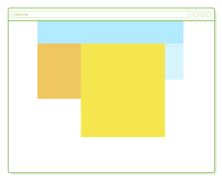
The sidebar element becomes narrower, but the other boxes remain in their original positions. All the blocks are still displayed vertically, one after another. This is the behavior that we'll be modifying using floats.
Floating an Element
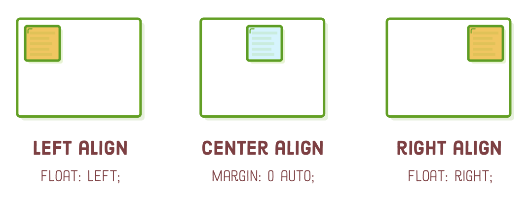
The CSS float property empowers us to govern the horizontal positioning of an element. When we "float" the sidebar to the left, we instruct the browser to position it on the left side of the page. Feel free to apply the float to our sidebar using the following line:
.sidebar {
  float: left;                  /* Add this */
  width: 200px;
  height: 300px;
  background-color: #F0C661;
}
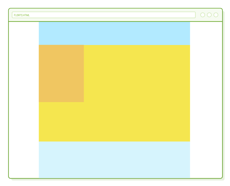
Nonetheless, this not only positions the sidebar but also instructs adjacent elements that they can wrap around the sidebar rather than starting beneath it. It's akin to placing the sidebar within the .content block, causing any HTML content within .content to encircle the sidebar's box. This results in a magazine-style layout:
You also have the option to float elements to the right, as demonstrated below (let's maintain our sidebar floated to the left). Alternatively, if you're overriding a float declaration, you can nullify it by using the "none" value. These are the most frequently used values for the float property.
float: right;  /* Right-aligned */
float: none;   /* Revert to default flow */
We've acquired all the essential tools for positioning block-level elements: floats for left or right alignment and auto-margins for center alignment. It's essential to bear in mind that this pertains exclusively to block boxes. Inline boxes are aligned using the text-align property, as explored in the previous chapter.
Floating Inside of Parents
Floated boxes consistently align either to the left or right of their parent element. In our illustration, the sidebar's parent is <div class='page'>, which spans the full width of the browser window. This is the reason our sidebar floats to the extreme left of the page.
Let's alter this by implementing a fixed-width layout for our page. Once more, the auto-margin centering technique proves to be useful. Incorporate the following code into styles.css:
.page {
  width: 900px;
  margin: 0 auto;
}
Presently, we can observe that .sidebar floats to the left of the .page container, rather than aligning with the edge of the browser window.
Arranging nested container divs in this manner constitutes the foundation for constructing intricate website layouts. In this instance, we initiated with .page to centralize everything, and within that centered page, we positioned a left-aligned sidebar. While layouts can become significantly more intricate, our straightforward example underscores a fundamental principle of CSS layouts: everything is essentially a box within another box within yet another box.
Multiple Floats
To gain a deeper understanding of our current magazine-style float layout, let's delve further by specifying a width for our .content block:
.content {
  width: 650px;                 /* Add this */
  height: 500px;
  background-color: #F5E64F;
}
This vividly illustrates that our sidebar is indeed situated within the .content block. If you were to capture a screenshot of them, you would obtain an image that measures 650 pixels in width, as opposed to 850 pixels (accounting for our sidebar's width of 200 pixels).
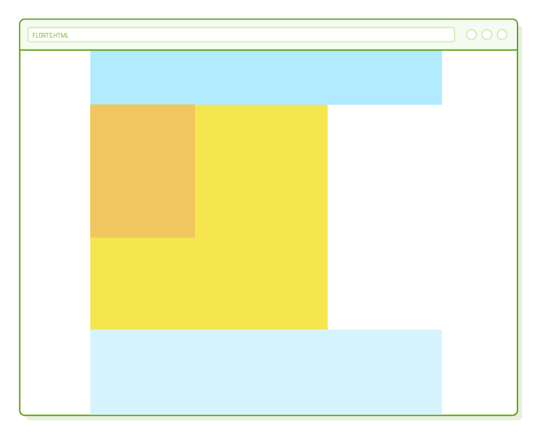
This float behavior is suitable for images (which we'll explore later), but for page layout, our objective is to position the content block alongside the sidebar rather than wrapping around it. To achieve this, we must instruct the content block to float left as well. Include one additional line in the .content rule:
.content {
  float: left;                  /* Add this */
  width: 650px;
  height: 500px;
  background-color: #F5E64F;
}
When you float multiple elements in the same direction, they will arrange horizontally, somewhat resembling the default vertical layout, but rotated by 90 degrees. The code provided above results in our entire content block being positioned to the right of the sidebar instead of encircling it.
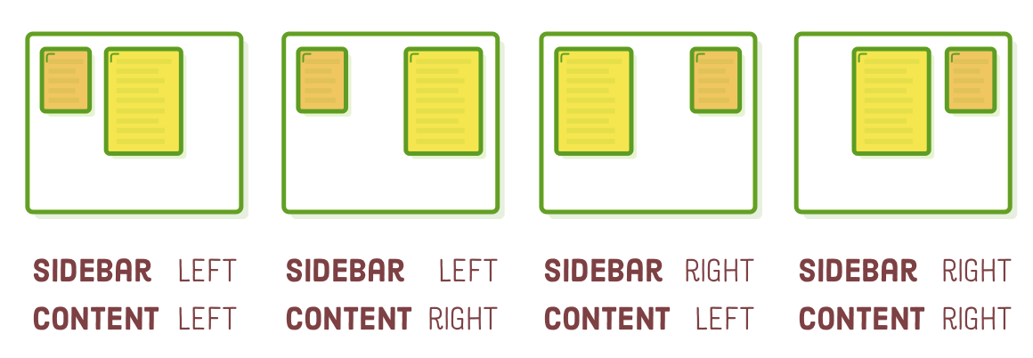
This grants us genuine authority over the horizontal alignment of our block boxes. Experiment with different float values for both .sidebar and .content, and you'll realize that we already possess a couple of distinct layouts at our disposal:
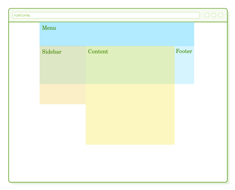
Ensure that both of them are set to float left before proceeding. This addresses the layout for the sidebar and content blocks, but regrettably, it has disrupted our .footer element...
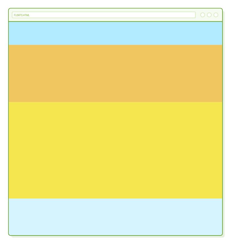
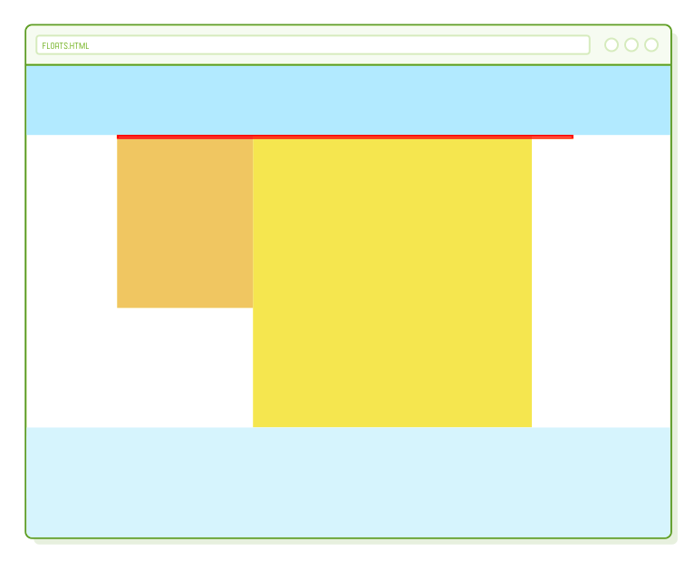
After A Float
You likely observed that our footer is displayed in the upper right corner, directly beneath .menu. This occurs because floated boxes are excluded from the standard page flow. The height of our floated elements doesn't influence the vertical placement of the footer, causing it to position itself beneath the last element that wasn't floated.
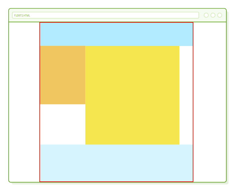
We can gain a clearer perspective on this by introducing a red border around our .page element:
.page {
  width: 900px;
  margin: 0 auto;
  border: 1px solid red;  /* Add this */
}
Observe that the border encompasses only the .menu and .footer elements, almost as if the floated elements didn't exist. There are two approaches to resolve this: clearing a float and concealing overflow.
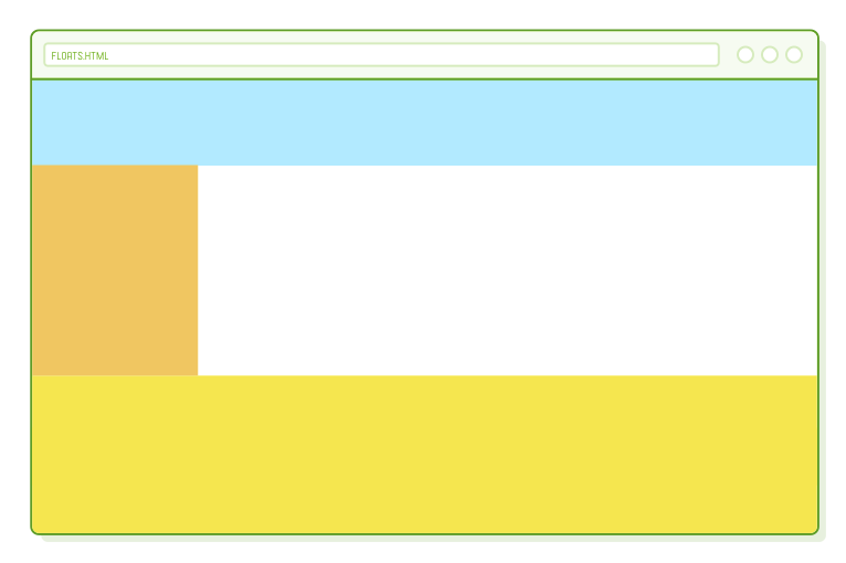
Clearing Floats
"Clearing" a float involves instructing a block to disregard any floats that precede it. Instead of accommodating the floated box within its layout, a cleared element consistently positions itself after any floats. It's akin to compelling a box to revert to the standard vertical flow of the page.
We can employ the clear property to ensure that our .footer descends to the bottom of the page:
.footer {
  clear: both;            /* Add this */
  height: 200px;
  background-color: #D6E9FE;
}
Typically, you'd opt to clear both left and right floats, as demonstrated here. However, you have the option to clear only one side or the other using the "left" or "right" values. It's worth noting that the red border now encompasses the entirety of the footer, signifying that the floated elements do contribute to the height of the .page container:
Depending on the specific layout you aim to achieve, this represents a completely viable solution. We could conclude at this point, but we will delve further into float behavior by transitioning our page into a full-bleed layout, with background colors extending across the entire browser window.
Observe the changes that occur when we remove the menu and footer from the .page element. Alter the <body> element to correspond with the following:
<body>
  <div class='menu'>Menu</div>

  <div class='page'>
    <div class='sidebar'>Sidebar</div>
    <div class='content'>Content</div>
  </div>

  <div class='footer'>Footer</div>
</body>
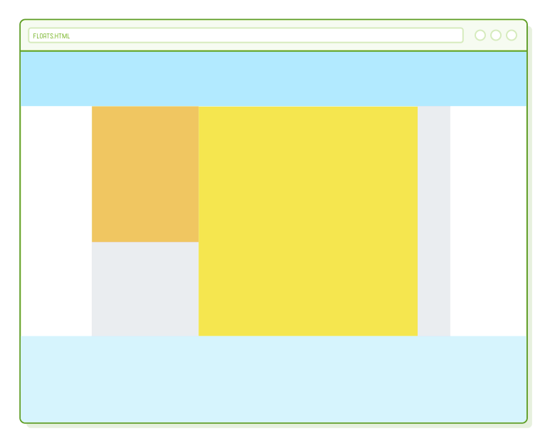
As .menu and .footer now exist outside of our fixed-width .page container, they span the entire width of the window, which aligns with our intent for a full-bleed layout. Nevertheless, it's important to note that .page once again lacks height, even though the footer effectively clears the sidebar and content blocks.
Once more, the only elements residing within .page are floated, and therefore, they do not contribute to its height. In essence, relocating the footer outside of the .page container has disrupted our clearing solution.
Hiding Overflow
Clearing floats effectively resolves the height problem only when there exists an element inside the container to which we can apply the clear property. Now that our footer has been relocated outside of .page, we require an alternative method to ensure that floated elements influence the height of their container.
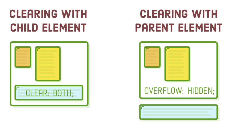
The remedy lies in the CSS overflow property. By including an overflow: hidden declaration within a container div, we are instructing it to acknowledge the height of any floated elements it encompasses. This is the means by which we can introduce a background color to our .page element and observe it being correctly displayed:
.page {
  width: 900px;
  margin: 0 auto;
  overflow: hidden;             /* Add this */
  background-color: #EAEDF0;    /* Add this */
}
You should now be able to observe a light gray background within .page, departing from the default white. However, this isn't yet a full bleed layout (we will tackle that in the next section). The critical aspect to note is the behavior of overflow: hidden. Without it, the .page container's background would remain hidden due to its zero height.
In summary, when you have an additional non-floated HTML element at the bottom of a container div, employ the clear solution. Alternatively, if there isn't such an element, introduce an overflow: hidden declaration to the container element. The fundamental concept behind both approaches is to provide the browser with a mechanism to consider floats in the calculation of their container element's height, enabling their backgrounds to become visible.
Full-Bleed Layouts
Next, our aim is to extend the background of our .page to occupy the entire browser window without altering the alignment of our sidebar or content blocks. The predicament we face is that our .page is primarily engaged in centering elements, and we can't utilize it for a full-bleed background since centering necessitates an explicitly defined width property.
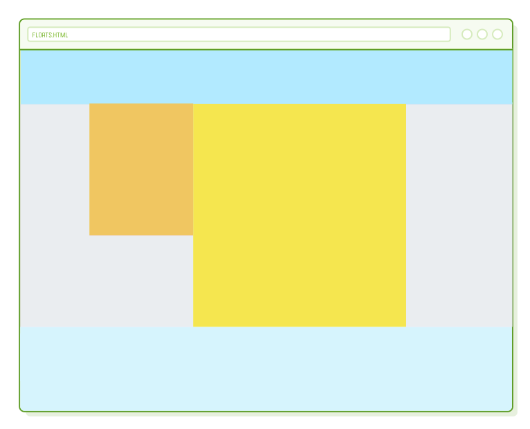
It's time to introduce yet another container div. Enclosing .page within a box enables it to retain its centering functionality while affording us an opportunity to specify a background-color property. Adjust our <body> element to align with the following code:
<body>
  <div class='menu'>Menu</div>

  <div class='container'>                 <!-- Add this -->
    <div class='page'>
      <div class='sidebar'>Sidebar</div>
      <div class='content'>Content</div>
    </div>
  </div>                                  <!-- Add this -->

  <div class='footer'>Footer</div>
</body>
Keep in mind that the default block-rendering behavior dictates that elements should expand to occupy the width of their container. Therefore, we should be able to transfer our background-color declaration to a .container rule in order to achieve a full-bleed background:
.page {
  width: 900px;
  margin: 0 auto;
}

.container {
  overflow: hidden;
  background-color: #EAEDF0;
}
Similar to what we did in the previous section, we must retain the overflow: hidden property to compel the .container to acknowledge the height of the floated elements. Omitting it would result in our background color being invisible, as the .container would possess zero height.
This setup involves three layers of nested <div> elements, each serving a specific purpose in structuring our page: a .container wrapper for the full-bleed background color, a fixed-width .page for centering content, and, lastly, left-aligned .sidebar and .content blocks. This hierarchical nesting and alignment approach is quite common in various website layouts.
Floats for Equal-Width Columns
Up to this point, we've explored a sidebar layout, a fixed-width layout, and a full-bleed layout. Floats can also be effectively employed to design multi-column layouts. The process is akin to what we did with our .sidebar and .content floats; the key difference is that we're working with a greater number of columns.
Our next step involves introducing three columns of equal width into our footer. Modify the <footer>element as follows:
<div class='footer'>
  <div class='column'></div>
  <div class='column'></div>
  <div class='column'></div>
</div>
We can apply styling to each of these columns in a manner similar to how we designed the other sections of our page. Incorporate a new rule into styles.css as shown below:
.column {
  float: left;
  width: 31%;
  margin: 20px 1.15%;
  height: 160px;
  background-color: #B2D6FF;    /* Medium blue */
}
This marks the initial instance in which we've employed percentage values instead of specific pixel values. In CSS, percentages are relative to the width of the parent element. Consequently, we now have three columns that dynamically adjust to one-third of the browser window's width. Experiment by resizing the browser window, and you'll observe our columns expanding and contracting accordingly. This represents the foundation of responsive design.
Anyway, let's stay focused on the core idea of this chapter: floats empower us to arrange elements horizontally rather than vertically. By adjusting the widths of the floated elements, we can achieve various layouts, ranging from sidebars to multi-column structures to grids.
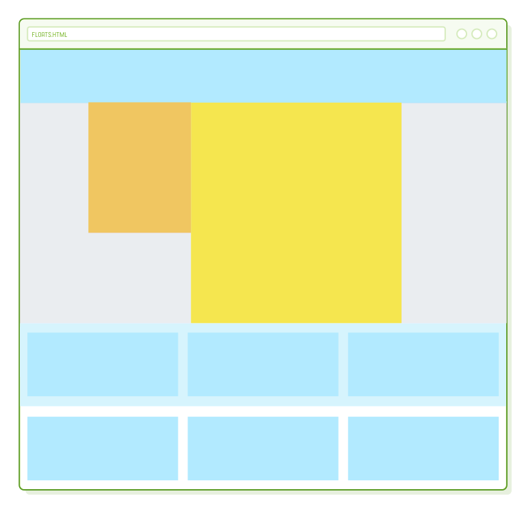
Floats for Grids
Interested in having a grid in the footer instead of three columns? That's easily achievable! When there isn't sufficient space to arrange a floated element side by side, it automatically moves to the next line. All we have to do is introduce additional .column elements:
<div class='footer'>
  <div class='column'></div>
  <div class='column'></div>
  <div class='column'></div>
  <div class='column'></div>
  <div class='column'></div>
  <div class='column'></div>
</div>
Voilà! A grid! Well, nearly there...
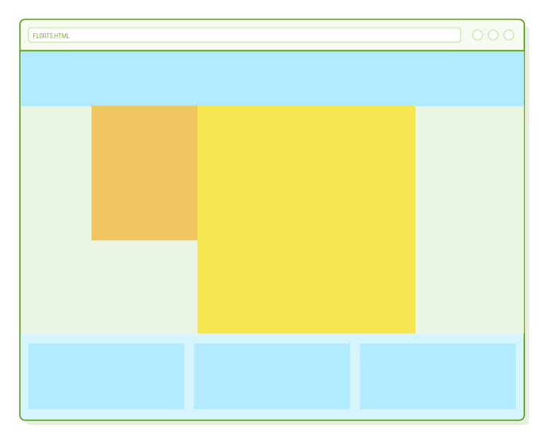
The background of our footer is too short. Luckily, we already have a solution for this. Let's replace the fixed height of the footer with another overflow: hidden property so that it can adapt to accommodate any number of grid items:
.footer {
  overflow: hidden;
  background-color: #D6E9FE;
}
You can apply this identical method to create grids of various sizes. For instance, crafting a photo gallery with numerous thumbnails is as straightforward as placing the grid items within .page instead of the footer and incorporating <img/> elements into them. However, it's essential to keep in mind that flexbox represents a more contemporary approach for building these types of layouts.
A Brief Note on Naming Conventions
The .column class name is no longer entirely appropriate. This situation illustrates the importance of avoiding class names that solely pertain to appearance. "Column" isn't ideal because the content it contains doesn't always have to be displayed in multiple columns (e.g., for a mobile layout, there may only be one column). A more suitable name could be something like .footer-item, but we'll leave it to you to make that adjustment.
Floats for Content
Defining a web page layout involves two aspects. Firstly, you have your overarching page structure, which we've been addressing throughout this entire chapter. This pertains to elements like the placement of your sidebar, the size of your navigation menu, and so on. The second aspect of layouts involves styling the individual HTML components (your actual content) that fit within this overarching page structure.
The process for the latter is identical; it's just nested within the former. Now, let's incorporate some dummy content into our .content element so we have material to work with:
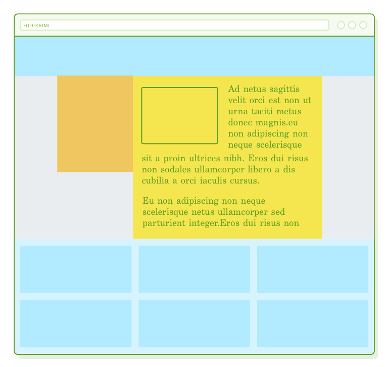
<div class='container'>
  <div class='page'>
    <div class='sidebar'></div>
    <div class='content'>

      <img src='?' class='article-image'/>

      <p>Ad netus sagittis velit orci est non ut urna taciti metus donec magnis
      hendrerit adipiscing mauris sit a proin ultrices nibh.</p>

      <p>Enim suspendisse ac scelerisque nascetur vestibulum parturient sed mi a
      dolor eu non adipiscing non neque scelerisque netus ullamcorper sed
      parturient integer.Eros dui risus non sodales ullamcorper libero a dis
      cubilia a orci iaculis cursus.</p>

      <p>Egestas at aliquam a egestas accumsan cum elementum consectetur conubia
      tristique eu et vitae condimentum in ante consectetur suscipit a a duis
      vestibulum gravida morbi sagittis.Parturient scelerisque facilisis
      ullamcorper a a pretium a nisl parturient semper senectus accumsan ipsum
      mus scelerisque eget ridiculus.Accumsan dolor a.</p>

      <p>Ligula taciti vel primis sit a tincidunt habitant parturient parturient
      in parturient ante nulla consectetur sem.Facilisis parturient litora.</p>

    </div>
  </div>
</div>
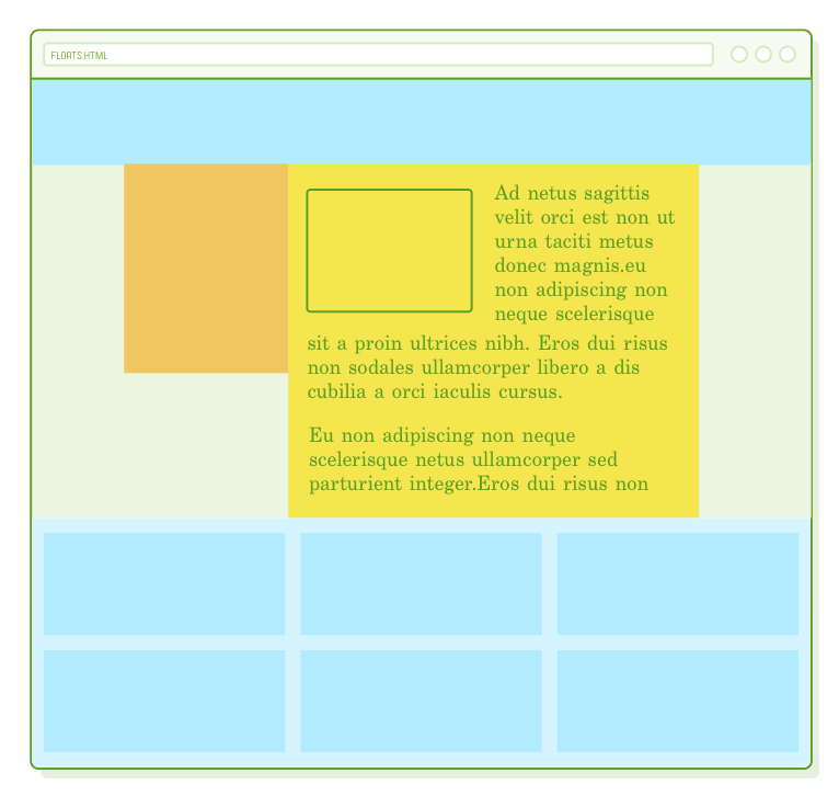
We have an image and several paragraphs that we can style in the same way as our structural divs. To illustrate, let's establish a magazine-style layout by floating the image and allowing the text to wrap around it. Include a couple of additional rules in our stylesheet:
.content {
  padding: 20px;
}

.article-image {
  float: left;
  width: 300px;
  height: 200px;
  margin-right: 20px;
  margin-bottom: 20px;
}

p {
  margin-bottom: 20px;
}
Take note of how we have a nested float, and everything functions smoothly. The process of designing a website is recursive: you establish a top-level structure to operate within, and then you populate it with your real content. More intricate layouts may necessitate an additional layer or two of nesting, but the principle remains consistent.
Hiding Overflow (for Content)
You'll encounter instances of nested layouts frequently. For our last illustration, envision a simple user-comment thread. You have an image aligned to the left with a heading and text positioned alongside it:
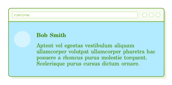
Let's attempt to construct this in our footer. Within your preferred .column element, or .footer-item element if you've been following along, insert the following:
<div class='column'>
  <div class='avatar'></div>
  <h3 class='username'>Bob Smith</h3>
  <p class='comment'>Aptent vel egestas vestibulum aliquam ullamcorper volutpat
  ullamcorper pharetra hac posuere a rhoncus purus molestie torquent. Scelerisque
  purus cursus dictum ornare a phasellus. A augue venenatis adipiscing.</p>
</div>
And here are the corresponding CSS rules:
.avatar {
  float: left;
  width: 60px;
  height: 60px;
  margin: 25px;
  border-radius: 40px;
  background-color: #D6E9FE;
}

.username {
  margin-top: 30px;
}

.comment {
  margin: 10px;
  overflow: hidden;  /* This is important */
}
This illustrates another scenario where our overflow: hidden technique comes in handy. Applying it to our .comment box ensures that the text is "horizontally cleared" (not a technical term) around the floated image. Without it, the last line of the .comment text would wrap underneath the image.
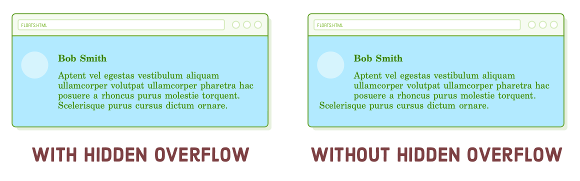
In simpler terms, overflow: hidden disrupts the magazine-style layout we saw earlier, but it does so in a beneficial manner.
Summary
In this chapter, we delved into creating practical web page layouts. We explored floating divs to achieve left and right alignments, handling content following a float, and combining floats with the auto-margin centering technique introduced in the Box Model chapter. These techniques are the building blocks for crafting sidebars, grids, and magazine-style layouts.
Let's not forget the crucial role of web developers in the website creation process. As a web developer, your responsibility is to transform a well-crafted design concept into the HTML and CSS code that browsers render for end users. While floats represent a significant step in this direction, it's worth noting that they are gradually giving way to the more modern and flexible flexbox layout scheme.
In the upcoming chapter, we will delve further into creating intricate website layouts through flexbox. While the CSS properties may be different, the fundamental process will remain consistent with what we've learned in this chapter: aligning containers within containers, and so on, until we achieve the desired layout.