In our previous lesson on Responsive Design, we grasped the concept of using media queries to establish distinct layouts for mobile, tablet, and desktop screens. Now, we're taking it a step further by integrating images into this equation. Similar to how media queries allow us to selectively apply CSS rules, our goal is to showcase different images depending on the user's device.
The challenge lies in the fact that images come with fixed dimensions. We can't simply stretch an image that's, for example, 500x250 pixels to fit a larger width because it will result in pixelation. The presence of retina displays and various mobile devices adds further complexity. To achieve responsive images, we need to address three key factors:
- The device's dimensions
- The images's dimensions
- The device's screen resolution
This will present a greater challenge compared to media queries, which mainly dealt with device width. However, there are established solutions for each of these issues, and we'll guide you through them, step by step.
Setup
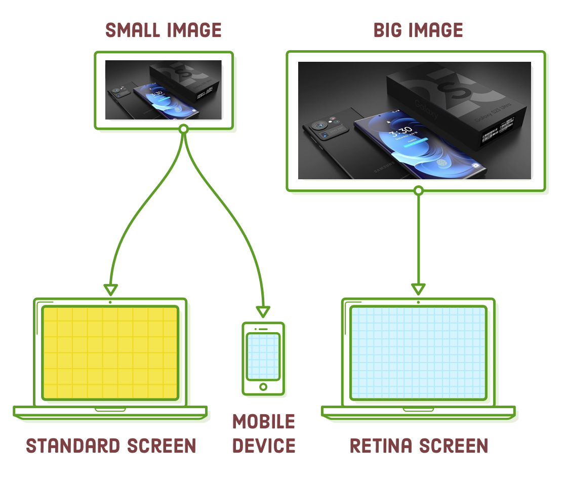
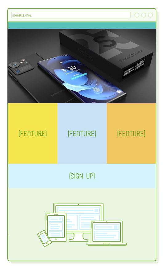
To explore responsive images, we'll need a responsive website as our foundation. This chapter builds upon the example web page created in the previous chapter. We'll be incorporating two images into the page, giving it the appearance shown below. The interesting part is that these images will adapt based on the user's device, which is quite fascinating.
If you're coming from the previous chapter, all you need to do is download these image assets and place them in your project's "images/" folder.
If you're new to this tutorial, please download the complete example project, unzip it, and then open it using your preferred text editor.
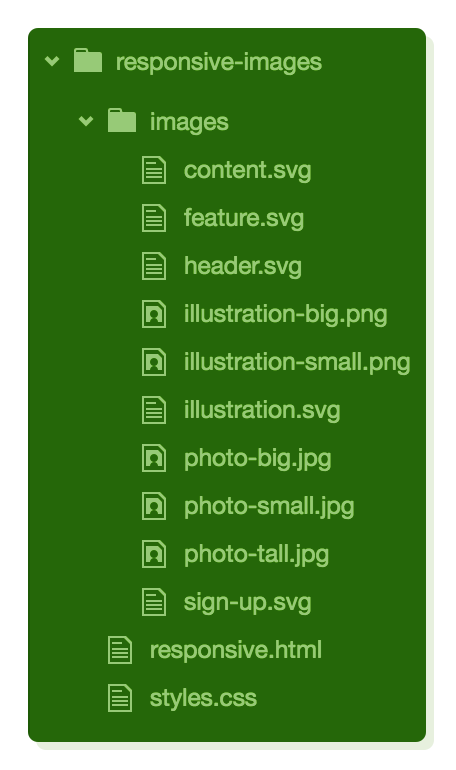
Regardless of your starting point, your project files should appear as shown here before proceeding. Pay attention to the presence of multiple copies of PNG and JPG images (e.g., illustration-big.png and illustration-small.png). We will allow the browser to determine which one to load based on the device's size and screen resolution.
Retina Screens
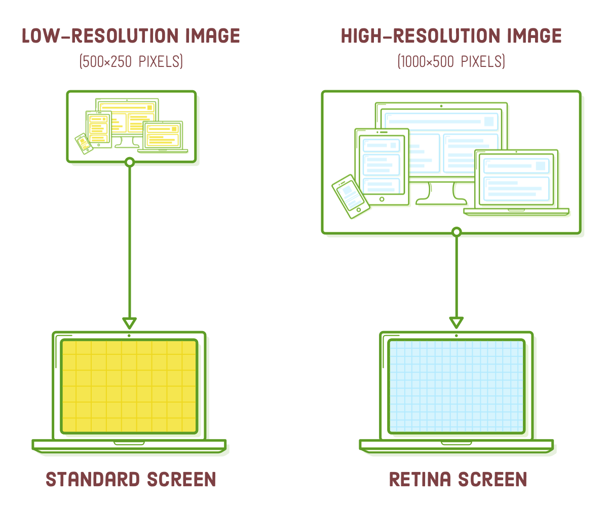
This is our first encounter with retina devices, so let's delve into screen resolution for a moment. Retina screens boast twice the number of pixels per inch compared to standard-resolution screens. In simpler terms, each retina pixel corresponds to four standard pixels. This difference significantly affects how images are rendered in a web browser.
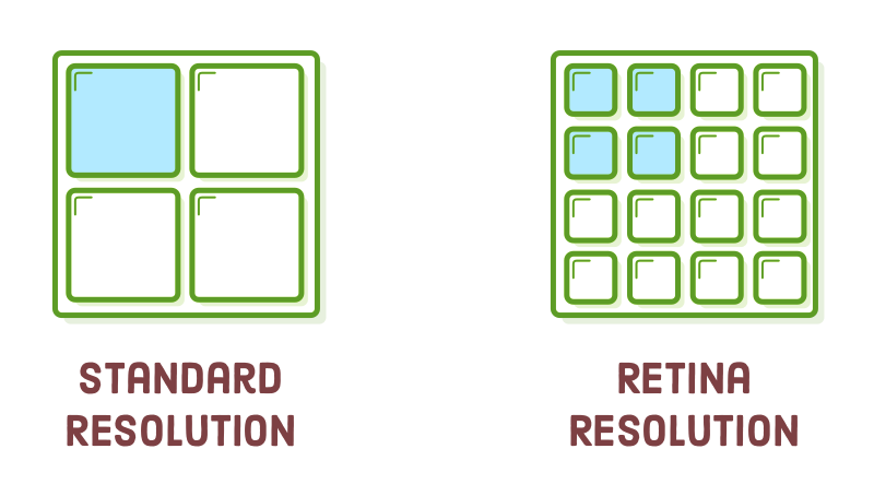
To display accurately on a retina device, an image must be twice the size of its eventual display dimensions. For instance, if you intend to include a 500x250 pixel image on the page, the corresponding image file should be 1000x500 pixels.
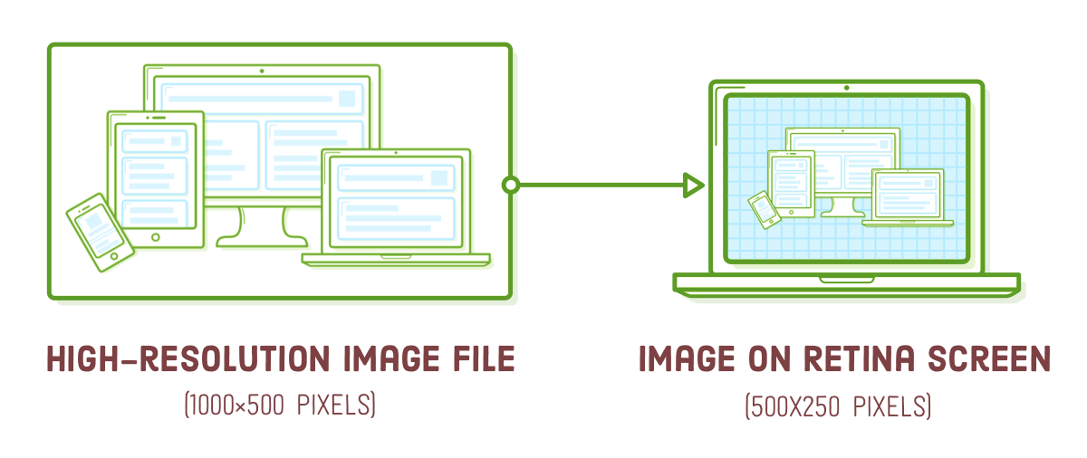
This is a simplification because not all retina screens have the same pixel density. For example, the iPhone 6 Plus has three times as many pixels per inch as a standard screen. While this tutorial primarily covers the 2x retina case, the same principles apply to 3x retina screens.
Furthermore, standard displays and smaller devices don't require the additional pixels found in high-resolution images, and delivering such excessive data typically leads to a suboptimal user experience.
Responsive SVG Images
The simplest way to address all these challenges is by using SVG images. They work seamlessly. Because they are vector-based, SVGs bypass the screen resolution issues we'll encounter later in this section. Let's examine this by incorporating an illustration into our responsive.html page. Replace the current image in the .content div to match the following:
<div class='section content'>
  <img class='illustration' src='images/illustration.svg' />
</div>
Web browsers automatically upscale SVGs for retina devices, ensuring that this 500x250 pixel SVG image appears sharp on both standard and retina screens.
SVGs eliminate the need to worry about screen resolution concerns, but we still need to resize the illustration to fit seamlessly within our fluid tablet and mobile layouts. While Firefox handles this resizing automatically, if you open this page in Chrome and narrow your browser window, you'll notice that the image remains the same size.
To achieve a responsive image in Chrome, we should instruct the illustration to consistently occupy the width of its container. Within styles.css, place the following rule alongside the other base styles, outside of the media queries:
.illustration {
    width: 100%;
}
By specifying a 100% width on an image, we indicate that it should maintain its aspect ratio and adjust its height accordingly. While this resolves the mobile layout issue, it results in an excessively large image for the desktop version:
This behavior is suitable for certain designs, such as full-bleed photos, which we'll explore in the next section. However, for our current purpose, we want to limit the illustration's width to its original size, which is 500 pixels. We can achieve this by using an inline style:
<div class='section content'>
  <img class='illustration' src='images/illustration.svg' style='max-width: 500px'/>
</div>
In this case, using an inline style is justified because it describes an intrinsic property of the image. An image's actual dimensions are more related to its content than its presentation, so it's appropriate for this information to be in the HTML rather than the stylesheet.
Responsive PNG, GIF, and JPG Images
Certainly, not all images on the web are SVGs. In some cases, you may need to include a photograph. PNG, GIF, and JPG images are referred to as "raster images," which means they are defined pixel by pixel rather than through vectors. Consequently, they are more affected by screen resolution compared to SVGs.
If you're not concerned about optimization, working with responsive raster images isn't significantly more complicated than using SVG images. You can try replacing our current illustration.svg with a PNG file:
<div class='section content'>
  <div class='illustration'>
    <img src='images/illustration-big.png' style='max-width: 500px'/>
  </div>
</div>
We made some adjustments to the HTML structure, placing our tag inside another container. This change prevents the image from getting distorted because flexbox would otherwise attempt to match its height with the .content container. Consequently, we need to make a slight modification to our .illustration CSS rule as well:
.illustration img {
  width: 100%;
  display: block;
}
Take note of the "-big" suffix in the image file's name. This indicates the high-resolution version of the PNG, which has dimensions of 1000×500 pixels. Retina devices require this "2x" size to display the image sharply. If we were to utilize the low-resolution version of the image (500×250 pixels), it would appear acceptable on standard screens but blurry on retina devices.
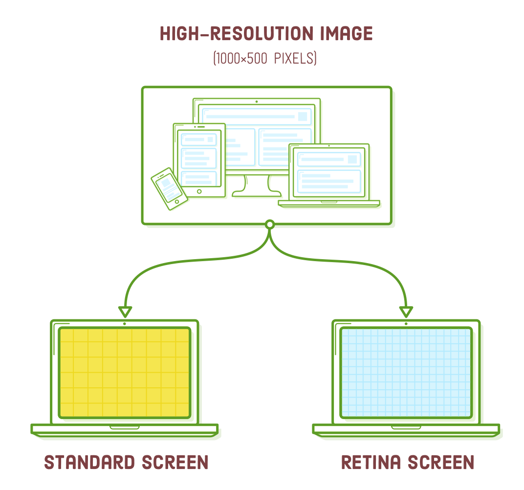
Think of this as a simplified method for generating responsive PNG, GIF, or JPG images, as it presumes that everyone requires a high-resolution image, even if they don't. In other words, a 1000×500 pixel image is excessive for non-retina devices. In the next section, we'll explore a more efficient approach.
Responsive Image Optimization
Various devices come with distinct image needs. Luckily, HTML offers a way to select the most suitable image for the user's device. In the following sections, we'll explore three scenarios for optimizing responsive images:
- A standard-resolution screen that doesn't require a high-quality retina image.
- A retina mobile device that can utilize a standard-quality image because it has been downscaled significantly.
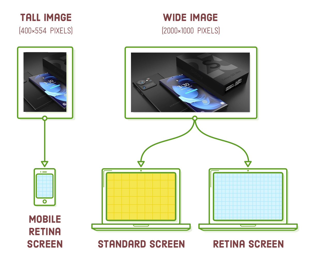
- A desktop layout that incorporates a wide image, and a corresponding mobile layout that features a taller image.
The first approach is the simplest and works well for images that are smaller than 600 pixels wide, as they don't benefit significantly from the second method. The second approach is a crucial optimization for larger images, particularly full-bleed photos. The third method is for those looking to add a touch of sophistication to their design.
Retina Optimization Using SRCSET
High-resolution images come with a significant size overhead. For instance, our illustration-big.png file occupies over twice the storage space compared to its low-resolution version. It's not practical to deliver all that additional data when it's unnecessary for the user.
By including a srcset attribute in our <img/> element, we can selectively provide the high-resolution image to retina devices while reverting to the low-resolution version for standard screens. Modify our .illustration element as follows:
<div class='illustration'>
  <img src='illustration-small.png'
       srcset='images/illustration-small.png 1x,
               images/illustration-big.png 2x'
       style='max-width: 500px'/>
</div>
The srcset attribute references a collection of alternative image files, accompanied by descriptors that specify the conditions under which the browser should utilize each image. The "1x" descriptor indicates that the browser should load "illustration-small.png" for standard-resolution screens, while "2x" indicates that "illustration-big.png" is intended for retina screens. In the event of older browsers lacking support for srcset, they will resort to the src attribute.
Usually, the low-resolution and high-resolution versions of an image would be identical, except for their dimensions. However, we've made "illustration-small.png" yellow and the retina version blue to provide a clear visual distinction between them.
Seeing this in action can be challenging without a live website, so we've included the code snippet on this page. The image below should appear blue if you're viewing it on a retina device. For standard-resolution screens, it will be displayed in yellow.

If you're working on these examples on a computer with a retina screen, you can experiment by temporarily changing the "2x" to "1x" to observe how a non-retina image appears. It might appear slightly fuzzy and yellow in this case.
Screen Width Optimization Using SRCSET
Excellent! This approach helps us save some extra data for non-retina devices. However, there's a drawback to the srcset technique outlined above. It doesn't address a crucial scenario for larger images: when a user with a retina smartphone ends up downloading the high-resolution image even when the standard version would suffice.
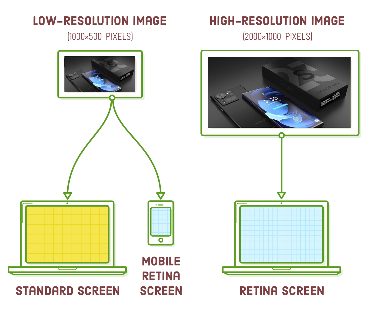
Let's say we want to showcase a large photo within our .header element. In our desktop layout, the header spans 960 pixels in width, so for the image to look sharp on retina screens, it should be at least 1920 pixels wide. Additionally, we'll provide a 960-pixel wide version of the photo for standard screens. Now, let's think about a scenario involving a smartphone with a retina display. Typically, smartphones in portrait mode are narrower than 400 pixels wide, which means that a retina-quality image for this device would only need to be around 800 pixels wide.
Hey there! We can offer our standard-resolution photo to retina smartphones!
The key takeaway here is that we want to optimize larger images based on their final displayed dimensions, not just the device's screen resolution. Let's proceed and add that large photo to our .header element:
<div class='section header'>
<div class='photo'>
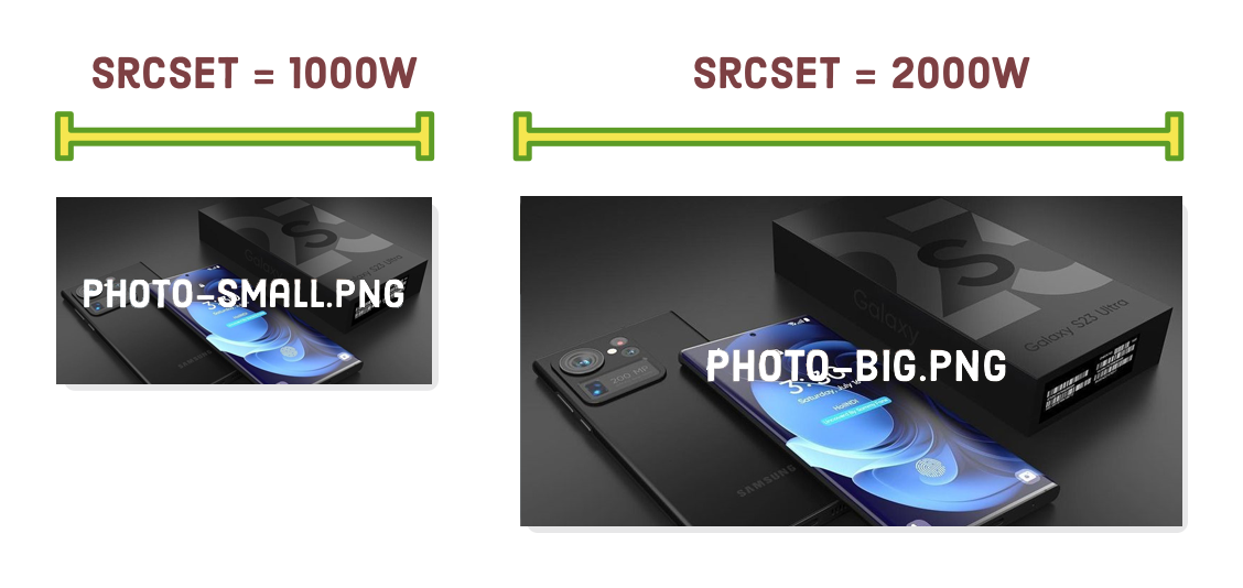
<img src='images/photo-small.jpg'
srcset='images/photo-big.jpg 2000w,
images/photo-small.jpg 1000w'
sizes='(min-width: 960px) 960px,
100vw'/>
</div>
</div>
We've included the same srcset attribute as in the previous section, but this time, instead of the 1x and 2x descriptors, we're specifying the inherent physical width of the image. The 2000w indicates to the browser that the photo-big.jpg file has a width of 2000 pixels. Similarly, the 1000w denotes that photo-small.jpg is 1000 pixels wide. If you're curious about the "w" character, it's a special unit used specifically for this type of image optimization scenario.
The image's width alone isn't sufficient for a device to determine which image to load. We also need to inform it about the eventual rendered width of the image. This is where the "sizes" attribute becomes important. It specifies a set of media queries along with the image's rendered width when each of these media queries is applicable.
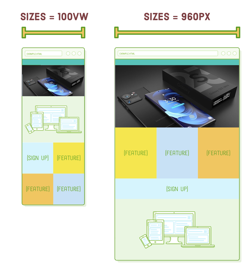
In this context, we're indicating that when the screen width is at least 960 pixels, the image will also be set to 960 pixels in width. Otherwise, the default value of 100vw informs the browser that the image's width will be 100% of the "viewport width," which essentially means the screen width. For a more detailed explanation of the "vw" unit, you can refer to MDN. These specifications align with the image resizing behavior defined in our CSS.
Regarding the placement of our new header image, we'll need to make some adjustments. Include both of these rules in our base styles, positioned just before the media query for mobile styles:
.header {
  height: auto;
  justify-content: inherit;
  align-items: inherit;
}

.photo img {
  width: 100%;
  display: block;
}
Keep in mind that our standard-resolution photo is 1000 pixels wide, making it suitable for 2x retina devices as long as their screen width is below 500 pixels. In Firefox, you should now observe the following behavior: the retina version ("Big") displays when the window width exceeds 500 pixels, and the non-retina version ("Small") is shown for narrower widths when resizing the browser window.
Now, we're providing a 115KB image to mobile devices instead of obliging them to load the high-resolution 445KB image. This is a significant improvement, especially for websites that incorporate numerous photos.
Testing With Chrome
This method functions well in Chrome, although it can be challenging to discern because Chrome employs some clever caching. Chrome will consistently utilize the high-resolution version if it's already cached locally, making it challenging to observe the low-resolution version by merely resizing the browser window. To circumvent the local browser cache, you can open a new incognito window and then prevent photo-big.jpg from loading by narrowing the window before loading the page.
Art Direction using <PICTURE>
The previous approach is completely acceptable for optimizing data usage. We could conclude there and achieve good results, but we're going to take it up a notch with "art direction." Consider art direction as a form of responsive image optimization tailored for designers.
Art direction allows you to enhance layouts by delivering entirely distinct images to users based on their devices. This is in contrast to the previous section, which optimized a single image for various devices. Take our header photo, for example; it's quite wide. Wouldn't it be fantastic if we could crop a taller version and offer that to mobile devices instead of the wide desktop version?
To achieve this, we'll utilize the <picture> and <source> elements. The <picture> element serves as a container, while the <source> element selectively loads images based on media queries. Give our .header element the following modification:
<div class='section header'>
  <div class='photo'>
    <picture>
      <source media='(min-width: 401px)'
              srcset='images/photo-big.jpg'/>
      <source media='(max-width: 400px)'
              srcset='images/photo-tall.jpg'/>
      <img src='images/photo-small.jpg'/>
    </picture>
  </div>
</div>
In essence, this approach bears some resemblance to employing media queries in CSS. Within each <source> element, the media attribute dictates when the image should be loaded, and srcset specifies which image file should be loaded. The <img/> element functions as a fallback for older browsers. When you reduce the size of your browser window, you should be able to observe the taller version of the photo:
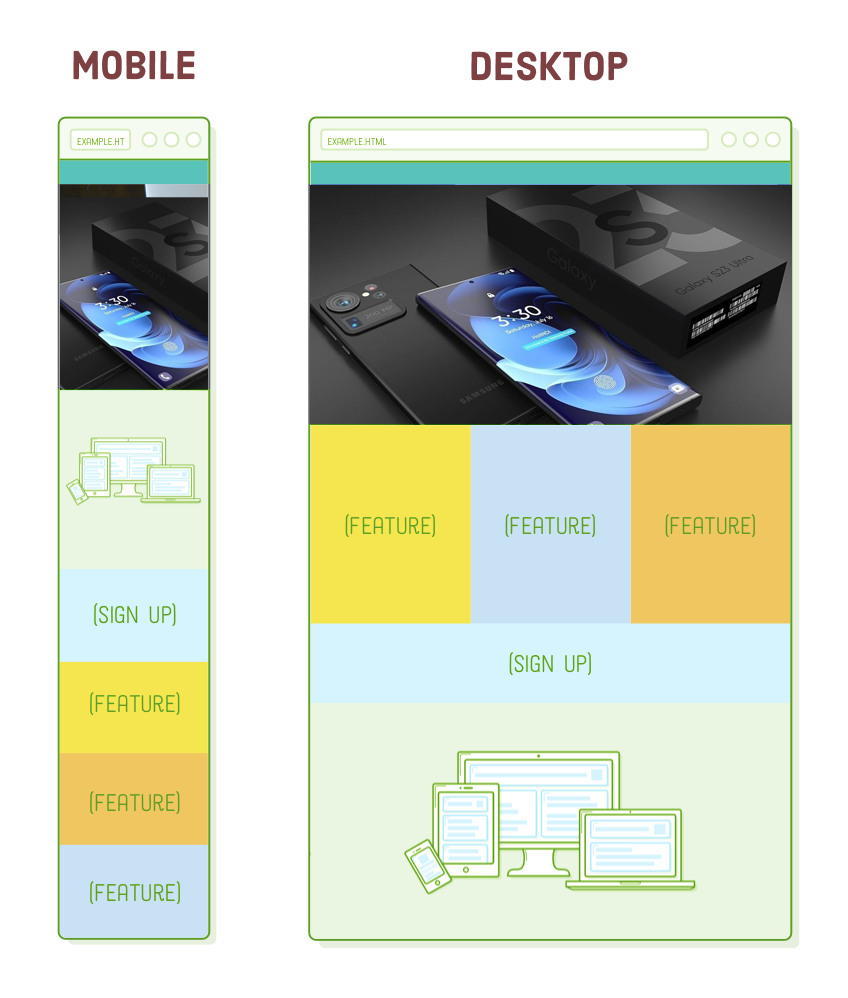
This degree of precision will certainly please your designer, but it comes at the cost of forfeiting the browser's ability to automatically select the most suitable image. Consequently, we've sacrificed our retina optimization from the previous section: if the screen width is 401 pixels or more, the browser will consistently employ the high-resolution, wide-cropped image.
While it's technically feasible to merge these approaches for optimal image handling, it can become quite intricate. Our suggestion is to use the 1x and 2x versions of srcset for images smaller than 600 pixels wide, employ the srcset plus sizes technique explained in the previous section for larger images, and reserve the <picture> element for when you want to implement more intricate design-oriented image solutions.
Summary
Responsive images might appear complex, but in reality, we're primarily addressing two fundamental issues:
- Adapt images to mobile layouts while preserving their inherent dimensions.
- Prevent users from downloading excessively large image files unnecessarily.
We achieved the first goal by ensuring that images always stretch to occupy 100% of their container while constraining their size with an inline max-width style. To address the second objective, we employed srcset to optimize for screen resolution, srcset plus sizes to optimize for device width, and the <picture> element for manual control over image file selection.
Responsive design is a continually evolving field. Despite the fact that responsive design has been the norm for several years, browsers have only recently integrated the image optimization methods discussed in this chapter. While the technology for creating responsive websites may evolve, the core challenge of delivering the same content to various devices will remain constant. So, even if you need to adapt to new tools in the future, the fundamental principles we've just covered will remain valuable.
The preceding five chapters were entirely dedicated to layout topics. We delved into floats, flexbox, advanced positioning, and their application across different screen sizes. This essentially covers the entirety of what you'll require for structuring web pages using HTML and CSS. However, the next chapter will take us back into the realm of HTML, introducing several new elements that will significantly enhance the search engine optimization of our websites.